




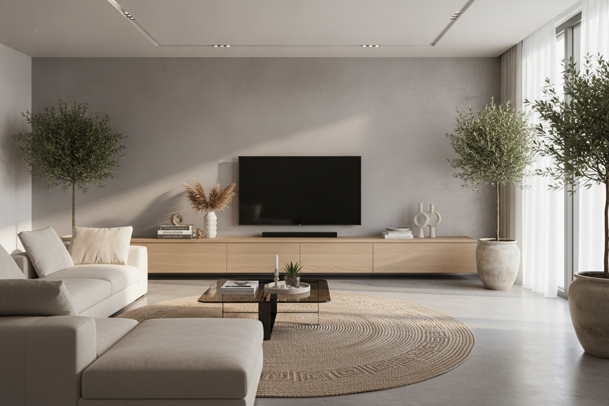
I spent three months staring at my living room wall, convinced that if I just found the 'right' shade of greige, everything would click. Instead, I ended up with a room that felt like a waiting room at a very expensive dentist office. My 65-inch TV looked like a giant, sucking void above my cream-colored sideboard, and the whole space felt flat and uninspired. I finally snapped and ordered a multi color tv console at 2 AM, fully expecting to regret it by sunrise.
Quick Takeaways
- A multicolored unit breaks up the visual 'black hole' created by large televisions.
- Material quality is non-negotiable; solid wood prevents the piece from looking like a children's playroom.
- Balance the 'loudness' of the furniture with neutral rugs and walls.
- Matte finishes and natural grains help multiple colors feel sophisticated rather than chaotic.
The Problem With Playing It Safe Under the TV
We are told to keep big furniture neutral so we don't 'get tired of it.' But here is the reality: a beige console under a black TV against a white wall is a recipe for a depression-den. It provides zero contrast. When you have a massive, 50-pound rectangle of black glass on your wall, you need something with enough visual weight and personality to anchor it. My old white cabinet didn't anchor the TV; it just made the TV look like a mistake.
The 'safe' choice often results in a room that lacks a focal point. You end up buying more and more 'stuff'—candles, vases, trays—to try and give the room a soul. I realized I didn't need more clutter; I needed one piece of furniture that actually did some heavy lifting for the aesthetic.
Why I Finally Embraced the 'Loud' Furniture Piece
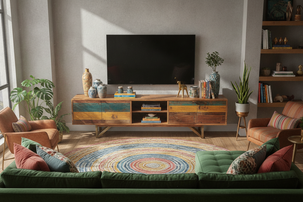
I was terrified that a multicolored unit would be too much. I worried it would scream for attention or clash with my existing pillows. But once I shoved that 72-inch beast into place, the opposite happened. The different tones in the wood and the painted door panels actually tied my mismatched armchair and rug together. It acted like a bridge.
Instead of the TV being the only thing you saw when you walked in, your eyes were immediately drawn to the textures of the console. It turned the media center from a 'tech zone' into a curated part of the home. It’s the ultimate distraction from the ugly cables and the plastic sheen of the soundbar.
Rule #1: Material Matters More Than Color
If you buy a multi-color unit made of cheap, glossy particleboard, it’s going to look like it belongs in a daycare. There is no way around that. The reason my risk paid off is that I looked for a multi color wood tv stand. When the colors are applied to real grain—think mango wood, acacia, or reclaimed oak—the texture softens the impact of the different hues.
I’ve learned the hard way that cheap finishes peel at the corners after six months of holding a heavy receiver. Investing in a tv stand in wood ensures that the piece feels intentional. The natural variations in solid wood provide a mature backdrop for the colors, making the piece feel like a handcrafted find rather than a mass-produced box.
Rule #2: Let the Console Do the Talking
The biggest mistake you can make with a vibrant media unit is trying to match its energy everywhere else. If your console has teal, burnt orange, and slate grey panels, do not buy a teal rug. You want the surrounding elements to be the 'supporting cast.' I kept my rug a low-pile jute and my walls a soft, flat white.
If you're nervous about bold paint, look for pieces that use natural materials to create the color story. Sometimes a barn wood tv stand can offer a beautiful, multi-tonal look just through the different ages and types of reclaimed slats. It’s colorful in a 'nature' way, which is much easier to live with long-term than a neon-painted cabinet.
What to Put Around It (Without Competing for Attention)
Once the console is in place, stop. Don't cover the top in a dozen tiny knick-knacks. I found that three substantial items work best: one tall green plant (like a snake plant or a monstera) to add height, a single matte ceramic bowl for remotes, and maybe one brass accent piece. Brass or copper looks incredible against multicolored wood because it pulls out the warmer tones.
Avoid anything with a busy pattern on top of the console. You want the eye to rest on the furniture itself, not get lost in a sea of small objects. My one regret? Not buying a slightly larger size. If you have the wall space, always go 10-12 inches wider than your TV to keep the proportions from looking top-heavy.
FAQ
Is a multi-color console hard to match with a rug?
Actually, it's easier. Because the console has multiple tones, it likely contains at least one color that already exists in your room. Just stick to a neutral, solid-colored rug to avoid a pattern clash.
Will I get tired of the colors in a year?
Not if you choose a 'muddy' or 'earthy' palette. Avoid primary colors (bright red, blue, yellow) and stick to jewel tones, ochres, and natural wood stains. These feel timeless rather than trendy.
What is the best wood for a multicolored stand?
Mango wood and reclaimed pine are top-tier. They take stain differently across the grain, which creates a natural multi-tonal look even before you add any paint or accent finishes.

Dejar un comentario
Este sitio está protegido por hCaptcha y se aplican la Política de privacidad de hCaptcha y los Términos del servicio.