




I once spent three hours unboxing what I thought was the perfect media console, only to realize it was so blindingly white it made my cream-colored walls look like they were stained with nicotine. It was a disaster. That 'hospital-grade' white is the fastest way to make a living room feel cold and cheap. Choosing an off-white farmhouse tv stand is the smarter move because it actually plays nice with the light in your home rather than fighting it.
Quick Takeaways
- Pure white furniture often looks like plastic; off-white adds depth and texture.
- Check your wall undertones—cool walls need gray-whites, warm walls need creams.
- Visible wood grain (whitewash) is more forgiving with dust and scratches than flat paint.
- A 60-inch stand is the 'Goldilocks' size for most standard living rooms.
The Stark White Problem (And Why Off-White is Better)
Pure, stark white furniture is a trap. Unless you live in a literal art gallery with professional-grade lighting, a modern farmhouse tv stand white finish that lacks any undertone will look clinical. It highlights every speck of dust, every dog hair, and every fingerprint. Worse, when you turn on your warm evening lamps, that stark white surface reflects a weird, sickly blue tint that kills the vibe.
An off-white or rustic white farmhouse tv stand acts as a bridge. It has enough warmth to feel 'lived-in' but remains bright enough to pop against your walls. It feels elevated rather than mass-produced. I’ve found that pieces with a slight ivory or bone hue tend to look more like heirloom furniture and less like something you bought in a flat-pack box at 2 AM.
Decoding Undertones: Warm Creams vs. Cool Grays
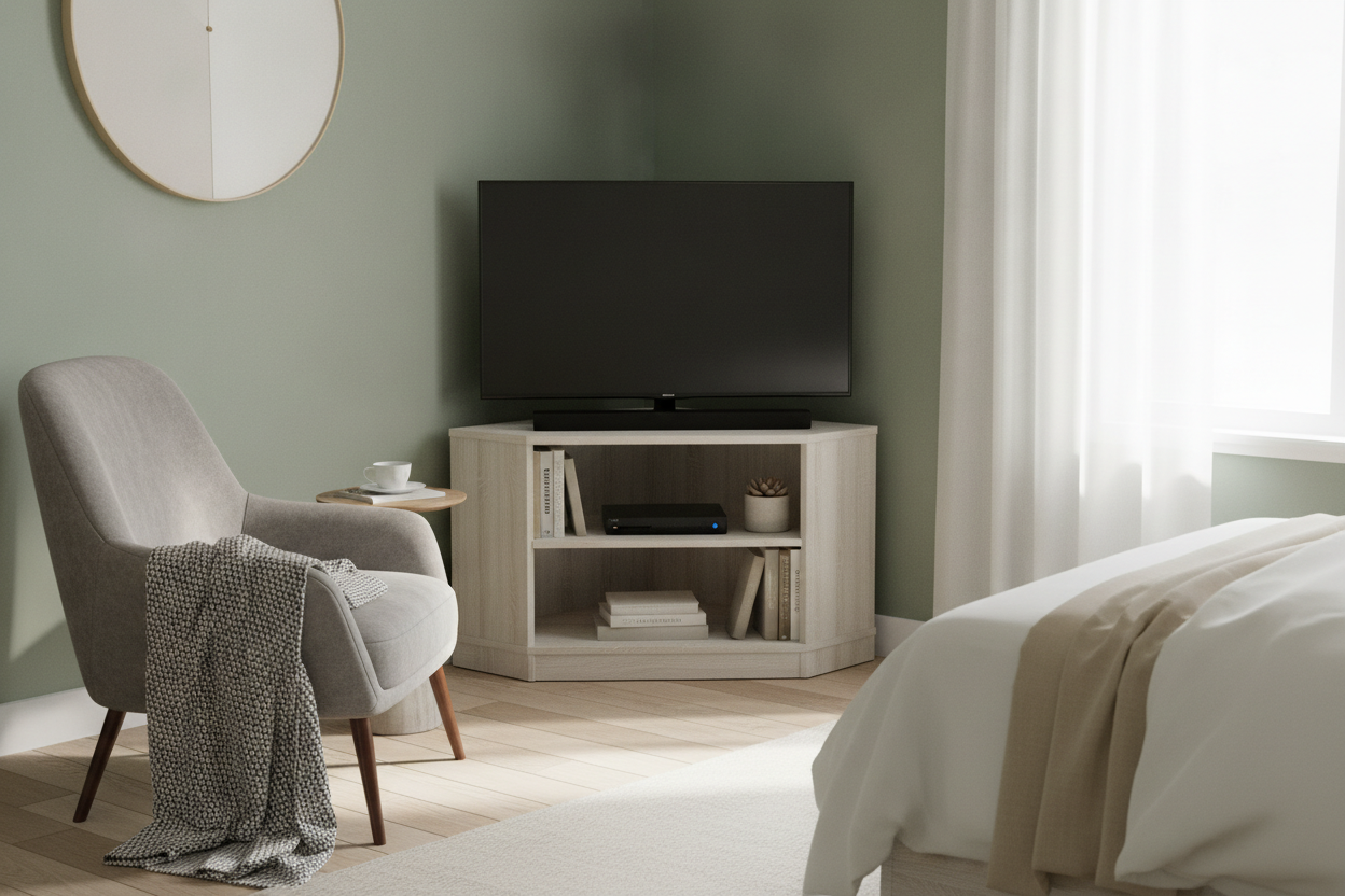
Before you hit 'buy,' look at your walls. If your paint has a blue or true gray base, a white and grey farmhouse tv stand is your best friend. The gray accents in the wood or hardware will pull those cool tones together. If you have 'greige' or tan walls, you need a creamier off-white to keep the room from feeling disjointed. It’s all about the base layer.
I always suggest checking out a designer's take on farmhouse white stands if you’re stuck between two shades. Some 'whites' are secretly yellow, and others are secretly lavender. Getting this right is the difference between a room that feels 'curated' and one that feels like a collection of random parts that don't quite fit.
Texture is Everything: Whitewash vs. Solid Paint
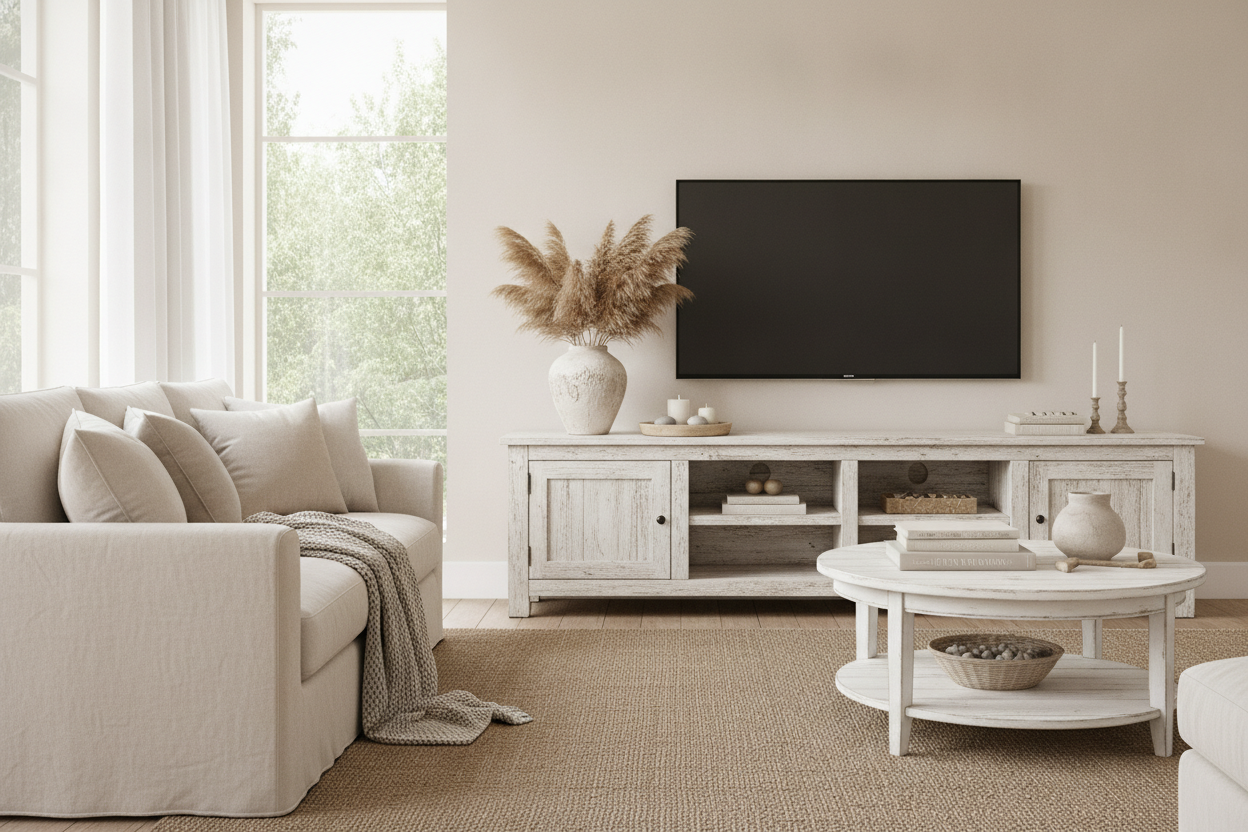
Flat paint is boring. If you want your space to have character, you need texture. A whitewash farmhouse tv stand allows the natural knots and swirls of the wood to peek through. This creates visual interest that a solid coat of paint just can't match. It also means that when your kid inevitably bangs a toy into the corner, the 'distressed' look makes the damage look intentional.
A white barnwood tv stand is another heavy hitter for texture. The rough-hewn surface catches the light differently at different times of day, making the piece feel like a focal point. For more on how to balance these textures, read up on styling a wooden TV stand white so you don't accidentally turn your house into a 2014 Pinterest board.
Getting the Proportions Right for Your Wall
Size matters more than color. A white farmhouse tv stand 60 inch is the sweet spot for a 55-inch or 65-inch TV. It leaves just enough breathing room on the sides so the screen doesn't look like it's overhanging a cliff. If your stand is exactly the same width as your TV, the whole setup will look top-heavy and awkward.
If you’re working with a massive, two-story great room wall, don't buy a standard console. It will look like a postage stamp on a billboard. You need scale. In those cases, I always point people toward an extra long barn door TV stand. Filling that horizontal space makes the room feel anchored and intentional, rather than just 'furnished.'
How to Style It Without Going Full 'Cottage Core'
You can own a white farmhouse style entertainment center without owning a single piece of burlap or a 'Gather' sign. To keep it modern, lean into high-contrast accents. Swap out generic hardware for matte black pulls or sleek brass knobs. It instantly takes a white cottage tv stand from 'shabby chic' to 'modern organic.'
Decorate the shelves with architectural books, matte ceramic vases, or a single oversized green branch. Skip the tiny knick-knacks that create visual clutter. If you're still hunting for the right silhouette, you can browse our full TV stand collection to see how different leg styles and door patterns can completely change the energy of the room.
My Honest Experience
I once bought a 'distressed' white stand that arrived looking like someone had just attacked it with a chain and some sandpaper. It was too much. I ended up lightly sanding the 'distress' marks and hitting it with a very thin off-white glaze. It taught me that 'off-white' is a spectrum. If a piece arrives and feels too stark, you can always soften it with the right lighting—swap your 4000K 'daylight' bulbs for 3000K 'soft white' bulbs and watch the furniture transform.
Frequently Asked Questions
Does off-white furniture yellow over time?
Only if it’s cheap lacquer or exposed to direct, harsh sunlight for years. Most modern finishes have UV inhibitors to prevent that 'old refrigerator' yellowing.
What color hardware looks best on off-white?
Matte black is the classic choice for a reason—it pops. If you want something softer, go with champagne bronze or aged brass. Avoid polished chrome; it looks too 'bathroom' against off-white.
Is a 60-inch stand big enough for a 65-inch TV?
Technically yes, but it’s tight. A 65-inch TV is about 57 inches wide. A 60-inch stand gives you only 1.5 inches of clearance on each side. It works, but a 70-inch stand would look better.

Dejar un comentario
Este sitio está protegido por hCaptcha y se aplican la Política de privacidad de hCaptcha y los Términos del servicio.