




I spent three weeks staring at a blank wall in my living room, paralyzed by choice. My space was a sea of 'safe' beige and oatmeal tones, and it felt like the lobby of a very boring insurance office. I wanted something with a bit of personality, but I was terrified of crossing the line into 'Vegas hotel room' territory. I finally pulled the trigger on a grey and gold media console, and it was the best design risk I have taken in years.
- Grey acts as a neutral anchor, preventing the gold accents from feeling too aggressive.
- Pairing the unit with warm wood tones (like oak or teak) stops the room from feeling sterile.
- Matte textures on top of the unit help balance the reflective metallic hardware.
- Mixing metals is encouraged—you do not need to change your curtain rods to match.
The 'Too Glam' Fear (And Why I Finally Ignored It)
Buying furniture with metallic accents feels like a commitment to a lifestyle I do not necessarily lead. I do not spend my evenings drinking champagne in silk robes; I eat takeout on the couch while wearing sweatpants. I worried that a grey gold tv stand would look like I was trying too hard to be 'luxe.' The fear is real: if the gold is too shiny or the grey is too flat, the whole piece can end up looking like a cheap prop from a budget stage play.
But then I realized that my 'safe' furniture was actually making my room feel smaller and more cluttered because nothing had a defined edge. I needed a piece with some structure. I stopped looking for something that would disappear into the wall and started looking for something that would command the space without screaming for attention. The key is in the finish. Look for brushed or satin metals rather than high-polish chrome. It is the difference between a piece that looks like an heirloom and one that looks like it is made of plastic.
Why a Grey and Gold Media Console Actually Works
Here is the basic color theory: grey is inherently cool and receding. It does not fight for attention. When you add gold hardware or a gold frame, that warmth pops against the cool backdrop without being overwhelming. Unlike a walnut and gold TV stand, which carries a heavy mid-century weight and a lot of visual density, the grey version feels airy and contemporary. It is a bridge between 'boring neutral' and 'bold statement.'
I found that the grey tone actually grounded my 65-inch TV. When you have a massive black screen sitting on a dark wood unit, it looks like a black hole in the room. The grey softens that transition, and the gold legs lift the piece off the floor, creating a sense of space underneath. It is a visual trick that makes a small living room feel significantly larger than it actually is.
My 3 Rules for Styling a Grey Gold TV Stand
Once the box arrived and I spent two hours sweating over an Allen wrench, the real work began. You cannot just plop a metallic piece into a room and hope for the best. You have to integrate it.
Keep the Surrounding Wood Tones Warm
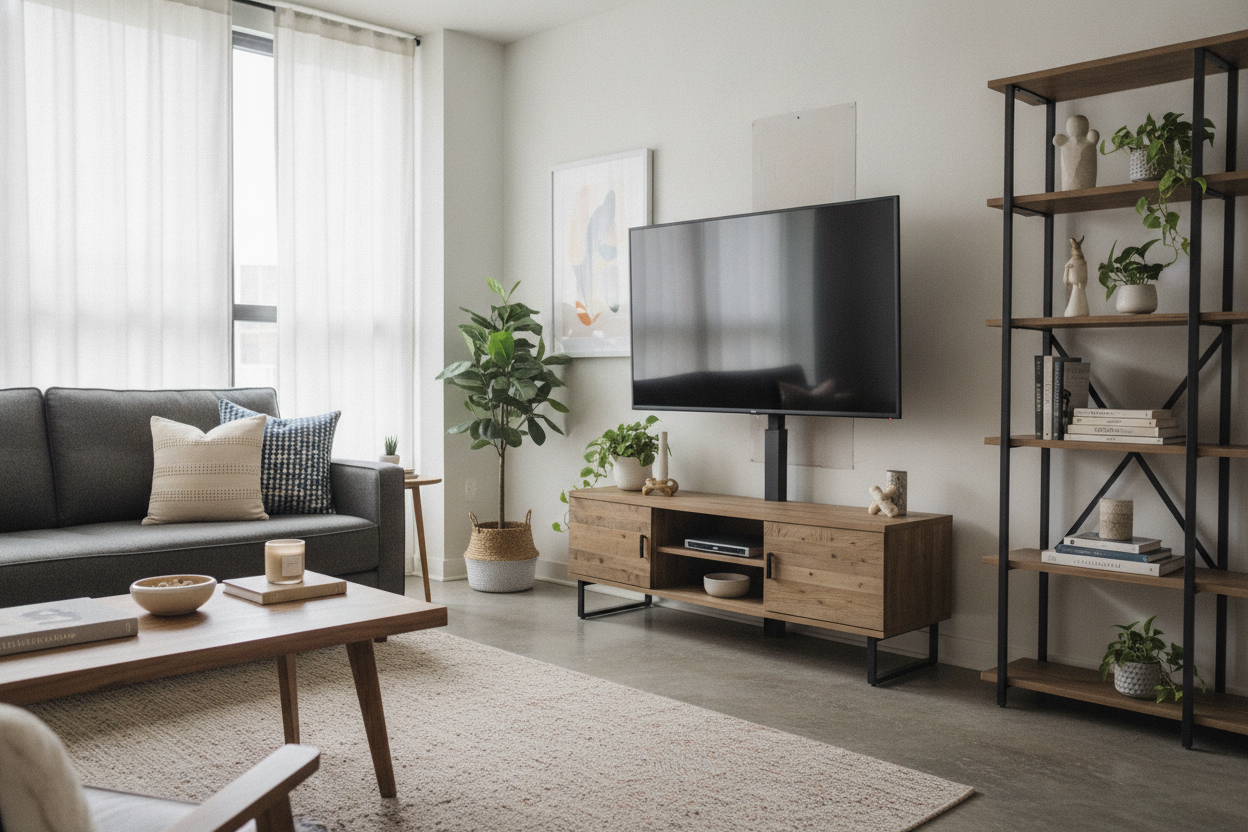
If you put a grey console in a room with grey floors and grey walls, you are living in a prison cell. I added an oak side table and a jute rug nearby. The natural grain of the wood and the organic fibers of the rug soften the hard lines of the metal. This balance is what makes the console feel like a part of a home rather than a piece of office furniture. It creates a 'lived-in' look that is still polished.
Add Matte Textures to Cut the Shine
To keep the gold from looking tacky, I surround it with matte materials. I am talking unglazed ceramic vases, linen-bound books, and a wool throw. I learned this the hard way when I tried to style a gold and white TV stand last year—if every surface is glossy or reflective, the room feels like a hospital. Matte textures absorb light and make the gold accents look like an intentional highlight rather than a gaudy distraction.
Whatever You Do, Don't Match Your Coffee Table
Please, I am begging you: skip the matching set. Buying the matching coffee table and end tables is the fastest way to make your home look like a furniture showroom floor. If your console is grey and gold, go for a chunky reclaimed wood coffee table or a black marble top. Contrast is what makes a room look curated. You want people to think you collected these pieces over time, not that you clicked 'Buy the Room' on a website at 2 AM.
Do You Have to Mix Metals Everywhere Else?
This is the question I get most often: 'If I buy this, do I have to change my silver lamps?' The answer is a hard no. In fact, my curtain rods are black and my floor lamp is aged bronze. Mixing metals is actually better than matching them. If every single metallic surface in your house is the exact same shade of gold, it looks sterile and forced.
The trick is to have at least one other small gold or brass element in the room so the console does not look like an island. A gold picture frame on the gallery wall or a brass tray on the ottoman is enough to create a 'through-line.' As long as the finishes are similar—keep them all in the 'brushed' or 'antique' family—they will play nicely together. It is about creating a vibe, not a uniform.
FAQ
Is gold furniture hard to keep clean?
Gold legs and handles show fingerprints more than wood does. A quick wipe with a dry microfiber cloth once a week usually handles it. Avoid harsh chemical cleaners which can actually strip the metallic finish over time.
What color rug goes best with grey and gold?
I prefer a cream or ivory rug with a subtle pattern. If you want more color, navy blue or a muted sage green looks incredible against the grey. Just avoid a solid grey rug, as it will wash out the console.
Can I put a heavy TV on these units?
Always check the weight capacity. Many 'glam' consoles use thinner metal frames. If your TV is over 55 inches, look for a unit with a center support leg to prevent the top from bowing over time.

Dejar un comentario
Este sitio está protegido por hCaptcha y se aplican la Política de privacidad de hCaptcha y los Términos del servicio.