


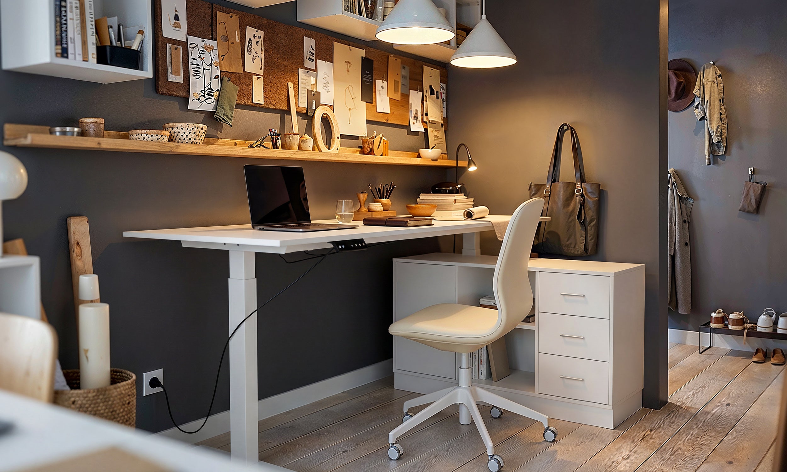
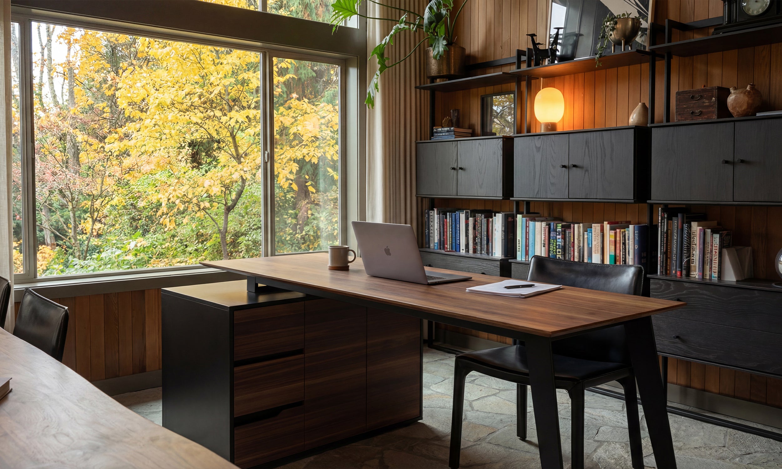


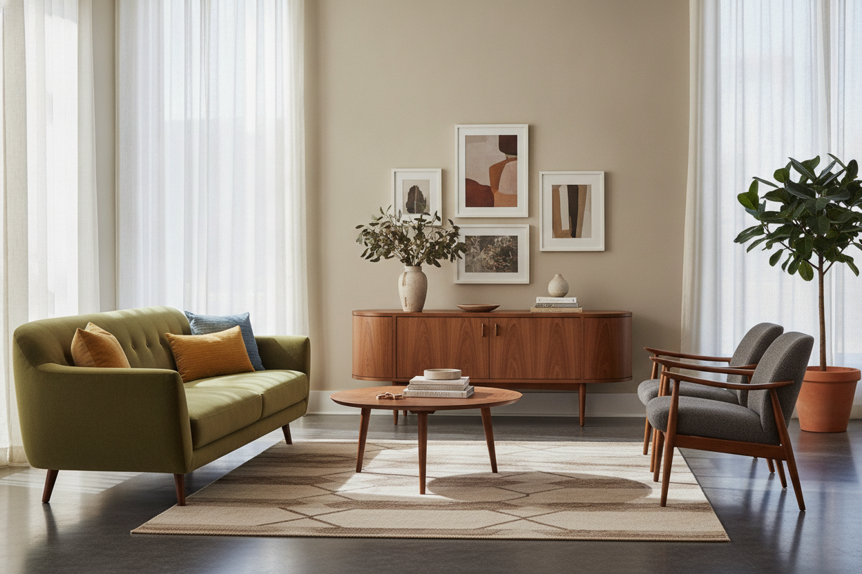
I was three hours deep into a Pinterest rabbit hole when I realized my living room looked less like a curated mid-century loft and more like a chaotic lumber yard. The culprit? A beautiful, honey-toned acorn tv stand that I bought without checking my floor undertones first. It is a classic mistake: you see that warm, 1960s glow online and assume it will bring 'soul' to your space, only to realize your floors are fighting it for dominance.
Quick Takeaways
- Acorn finishes have strong orange and yellow undertones that clash with cool grays.
- A 'buffer rug' in a neutral tone can save a clashing wood-on-wood situation.
- If your floors are ashy or gray LVP, walnut is usually a safer bet than acorn.
- Scale matters—a larger console can sometimes 'own' the room enough to ignore a slight color mismatch.
The Mid-Century Trap: Why We All Want That Warm Wood
There is something about acorn wood that feels like a shortcut to adulthood. It’s that specific, medium-brown stain with a hint of amber that screams 'I have a record collection and know how to make a Negroni.' It’s the default choice for anyone shopping for new TV stands because it feels more intentional than basic black and less heavy than traditional dark cherry.
Most acorn furniture isn't actually made of acorn wood (which doesn't exist in the lumber world like oak or maple does). It’s usually a stain applied to rubberwood or poplar. This means the 'warmth' is actually a pigment. When you see it in a studio-lit photo against a crisp white wall, it looks iconic. But in a real house with real lighting, that amber glow can quickly turn into a neon orange headache if it isn't paired with the right surroundings.
The Gray Floor Disaster (And Why It Happens)
Here is the hard truth: if you have those trendy, cool-toned gray LVP (luxury vinyl plank) floors or ashy oak hardwoods, an acorn finish is going to look terrible. It’s basic color theory. Orange (the base of acorn) and blue-gray are complements, which means they make each other pop. In a painting, that’s great. In your living room, it means your TV stand will look like a giant, glowing sweet potato sitting on a slab of concrete.
I’ve seen dozens of people try to force this look. They buy the stand, assemble it (which usually takes two hours and a lot of swearing), and then stand back only to realize the room feels vibratingly 'off.' The warmth of the wood sucks the life out of the gray floors, making them look muddy, while the floors make the wood look cheap and artificial. It’s a design crime that no amount of plants can fully hide.
How I Made an Acorn Media Console Work Anyway
I didn't want to admit defeat and pay the 20% restocking fee, so I had to figure out how to make my acorn media console play nice with my cool-toned rental floors. It’s a common struggle in the Media Console vs. Credenza: What Does TV Stand For Anymore? debate—whatever you call it, it’s a big piece of wood that dominates a wall.
The trick is to stop the wood and the floor from touching. If you create a visual 'air gap' between the two clashing tones, the brain stops trying to compare them. I used a mix of texture and height to break up the line of sight, and suddenly, the orange tones felt like a deliberate accent rather than a mistake.
The Magic of a 'Buffer' Rug
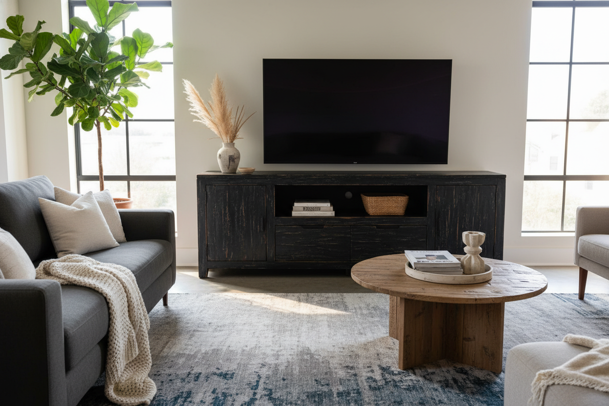
The easiest fix is a rug. You need something that doesn't have any warm wood tones in it. A cream jute rug or a faded Persian-style rug with blues and greens works wonders. By placing the unit entirely on a rug, you create a neutral island. The acorn wood now lives on the rug, not the floor, which kills the immediate color clash. I personally went with a low-pile wool rug in a charcoal shade, and it instantly grounded the piece.
Distracting the Eye with Visual Weight
Sometimes, you just need to go big. If you have a massive wall, a tiny acorn stand looks like an orange speck. But a substantial piece, like a 78 7 W 4 Drawer Tv Stand Media Console, has enough visual weight to define its own 'zone.' When the furniture is that large, the eye focuses on the grain and the hardware rather than the floor underneath it. I found that styling the top with matte black ceramics and some trailing ivy helped pull the focus upward and away from the floor-wood conflict.
When to Give Up and Buy Walnut Instead
Look, I love the retro vibe of acorn, but I’ve learned that sometimes you have to know when to fold 'em. If your floors are very light, very gray, or have a distinct 'pickled' look, acorn is an uphill battle. Walnut is almost always the better choice here. It’s cooler, deeper, and doesn't have those aggressive yellow undertones.
If you’re staring at your floor right now and it looks like the color of a rainy day in London, skip the acorn. Go for a dark walnut or even a painted navy or olive finish. You'll save yourself the headache of trying to 'fix' a room that was never meant to be orange. Furniture should make you feel relaxed, not like you're living inside a color wheel experiment gone wrong.
FAQ
Is acorn wood real wood?
Usually, no. 'Acorn' is a finish color, not a species of tree. Most 'acorn' furniture is made from solid rubberwood or eucalyptus that has been stained to mimic a vintage mid-century teak look.
What colors go best with an acorn tv stand?
Forest green, navy blue, and crisp white are your best friends. Avoid reds, oranges, or warm beiges, as they will just make the whole room feel like a giant sunset (and not in a good way).
How do I clean an acorn finish?
Since it’s usually a top-coat stain, avoid harsh chemicals. A damp microfiber cloth is usually all you need. If you use heavy wax or oils, you might actually change the tone of the stain over time, making it even more orange.

Leave a comment
This site is protected by hCaptcha and the hCaptcha Privacy Policy and Terms of Service apply.