


There is a pervasive myth in the interior design world that luxury requires an exorbitant budget. As a designer, I constantly challenge this notion. The hesitation many clients feel toward ikea home decor items usually stems from a fear of the "showroom look"—that distinct, recognizable flatness that comes from buying a room in a box. However, when curated with an educated eye, these accessible pieces can ground a room with surprising sophistication.
Key Principles for Curating IKEA Decor
- Material Authenticity: Prioritize natural materials like glass, metal, and ceramic over painted plastics to ensure longevity and visual weight.
- Silhouette Simplicity: Opt for clean lines that mimic mid-century or Scandinavian classics rather than overly ornate pieces that tend to look mass-produced.
- The Mix Ratio: Follow the 20/80 rule—mix 20% identifiable mass-market items with 80% vintage or high-end pieces to disguise the origin.
- Modification Potential: Assess if the item can be elevated with simple hardware swaps or paint treatments.
Elevating Interiors with Materiality
The secret to successfully integrating ikea house decor lies in material selection. In luxury design, we look for texture and light interaction. Avoid items with a flat, printed wood grain or high-gloss plastic finishes, as these immediately betray a lower price point. Instead, lean into their strengths: textiles, ceramics, and glassware.
Mastering Transparency with Glass
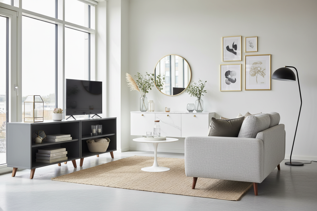
One of the strongest categories in their inventory is ikea glass decor. When styling a coffee table or a mantle, glass offers volume without visual clutter. The key is to look for mouth-blown options or heavy-bottomed vessels. A collection of the CYLINDER or BERÄKNA vases, for example, can look incredibly high-end if you cluster them in odd numbers (groups of three or five) and ensure they are impeccably clean. The way light refracts through these simple cylinders mimics much more expensive European crystal when placed near a natural light source.
The Art of Context and Grouping
An individual item rarely dictates the quality of a room; context does. A common mistake is scattering small decor items around a room, which creates visual noise. To achieve a curated aesthetic, group your items to create a focal point.
For instance, rather than placing a single ceramic pot on a shelf, group varied heights of similar tonal values. This creates a "collection" rather than just "clutter." When using ikea house decor, mix these items with coffee table books, organic elements like driftwood, or a piece of heirloom brass. The juxtaposition confuses the eye, making the affordable items appear as intentional design choices rather than budget constraints.
My Personal Take on IKEA Home Decor Items
I have used IKEA accessories in multi-million dollar projects, but I always apply a specific filter. Let's talk about the SINNERLIG pendant or the glass vase collections. I recently styled a living room using their clear glass vases, and here is the unpolished truth: while the glass clarity is surprisingly good, the seam lines from the molds can be visible and sometimes sharp.
In that project, I specifically positioned the vases so the vertical mold seams faced the wall, away from the main line of sight. Furthermore, I never display them empty. Empty, they look like inventory. Filled with substantial, structural branches or heavy river stones, the weight of the contents distracts from the lightweight feel of the glass. It’s a tactile trick—if it looks heavy and grounded, the brain perceives it as expensive. Also, a word of warning on their matte black ceramic finishes: they are absolute magnets for oil from your hands. I always handle them with a cloth during installation to avoid permanent smudges that are surprisingly hard to wipe off later.
Conclusion
Great design is not about the price tag attached to an object, but how that object interacts with the space around it. By being selective about materials and clever with placement, you can integrate accessible decor into a refined home. Trust your eye, prioritize natural textures, and remember that the most luxurious homes are those that feel curated, not cataloged.
Frequently Asked Questions
How do I make IKEA decor look less generic?
The best approach is customization. This can be as simple as spray-painting a metal tray in an antique brass finish or swapping out the shade on a lamp base for a custom linen drum. Removing the "factory finish" breaks the association with the mass market.
Is IKEA glass decor durable enough for high-traffic households?
Generally, yes. Their tempered glass options are robust. However, thinner mouth-blown pieces should be placed on higher shelves or mantles. For households with children or pets, look for their heavy-bottomed vases which have a lower center of gravity and are harder to tip over.
What is the biggest mistake people make with IKEA accessories?
Buying the "set." Avoid buying the matching vase, candle holder, and bowl from the same series. This creates a flat, coordinated look that lacks depth. Instead, mix a ceramic piece from one collection with a glass piece from another to build a layered, organic aesthetic.
Leave a comment
This site is protected by hCaptcha and the hCaptcha Privacy Policy and Terms of Service apply.