


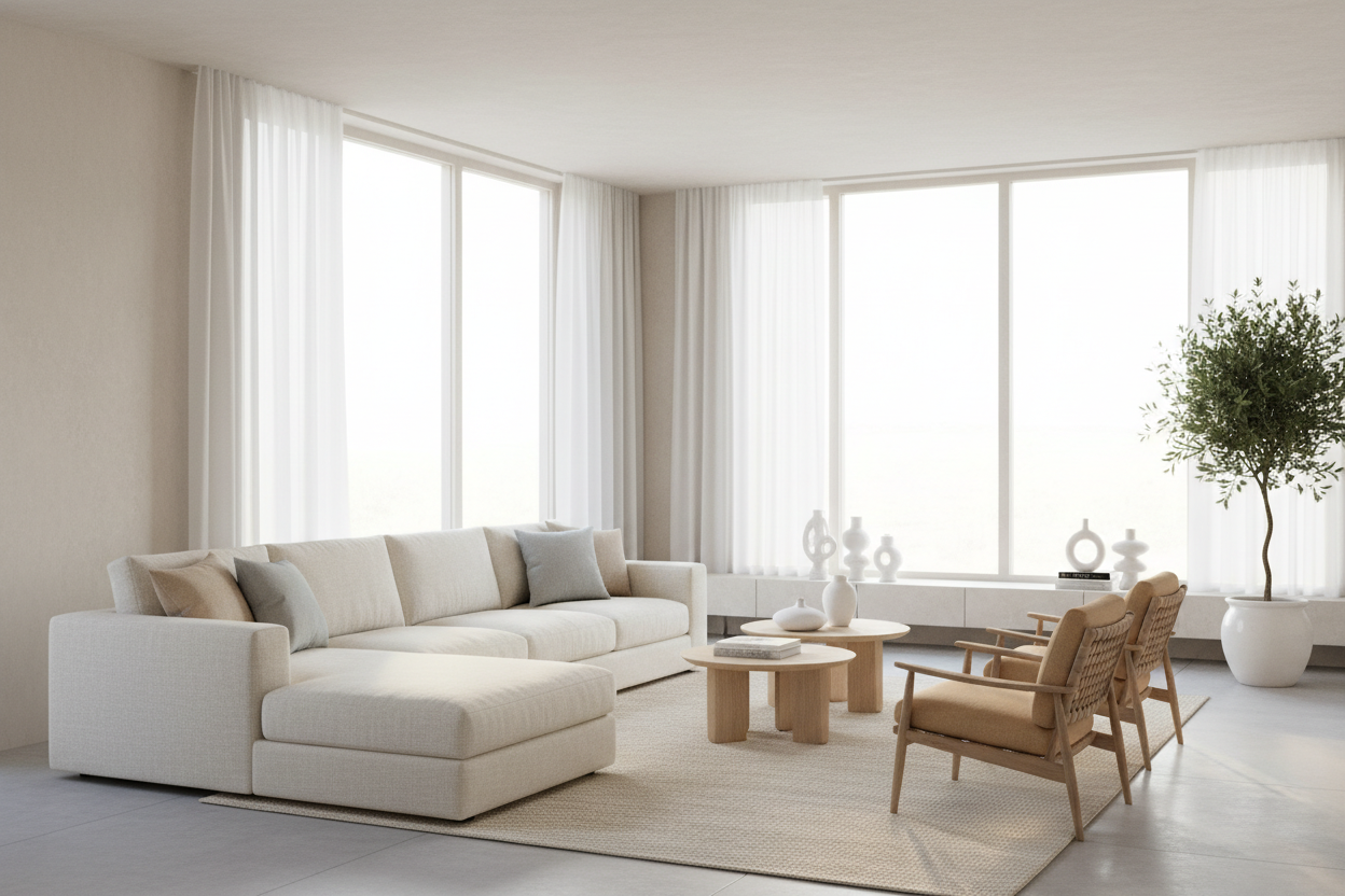
There is a specific hesitation I see in almost every client's eyes when I suggest a cream sofa or an oatmeal armchair. You love the aesthetic—the breathability, the sophistication, the way it reflects natural light—but you are terrified of the maintenance. The truth is, styling light color living room furniture is less about bravery and more about knowing your materials and spatial dynamics. It is not just about picking a color; it is about curating a tactile experience that prevents your space from feeling sterile or flat.
Key Features to Look For
- Performance Fabrics: Prioritize Crypton, solution-dyed acrylics, or high-performance velvets that resist staining and pilling.
- Texture Variety: Look for bouclé, heavy weaves, or linen blends to add depth to monochromatic palettes.
- Scale and Silhouette: Ensure the visual weight of light pieces balances with the room's dimensions to avoid a "floating" furniture effect.
- Undertone Matching: Identify whether the fabric has cool (blue/grey) or warm (yellow/pink) undertones to coordinate with your lighting.
Selecting the Right Material: Beyond the Color
When dealing with pale hues, the margin for error in material quality shrinks. A cheap polyester in navy blue might hide its texture, but in white or beige, it looks flat and lifeless. As a designer, I always steer clients toward materials with inherent tactile interest.
Performance is Non-Negotiable
Gone are the days when white furniture was reserved for "formal" rooms that no one entered. Modern luxury is livable. If you are investing in a high-traffic area, inspect the rub count (durability rating). For families or pet owners, removable slipcovers in heavy-weight linen or cotton canvas offer a practical safety net, allowing for professional laundering without compromising the silhouette.
The Art of Layering and Undertones
The most common mistake homeowners make is mismatching undertones. A "white" sofa is rarely pure white. If your walls are a cool grey, a cream sofa with yellow undertones will look dirty, not cozy. Conversely, placing a stark, blue-based white chair in a room with warm ambient lighting can make the furniture feel clinical.
To successfully integrate light colored furniture living room layouts, you must layer textures. If your sofa is a smooth weave, pair it with a nubby wool rug or a leather ottoman. This variation creates shadows and highlights, giving the eye somewhere to rest and preventing the "hospital waiting room" effect.
Grounding the Space
Light furniture has very little "visual weight." If you fill a room with pale pieces and pale walls, the room can feel unmoored, as if everything is floating. To counter this, you need to ground the furniture. This can be achieved through:
- Contrast Legs: sofas or chairs with dark wood or metal legs.
- Statement Rugs: A rug with a slightly deeper saturation to anchor the seating area.
- Architectural Elements: Positioning light furniture against a textured wall or beside a dark side table to define the edges of the piece.
My Personal Take on Light Color Living Room Furniture
I learned a hard lesson early in my career regarding "denim transfer." I designed a stunning, monochromatic living room for a client using a high-end, pure white cotton-linen blend sofa. It looked magazine-ready until about three weeks later.
The client called in a panic because the seat cushions were turning a distinct shade of blue. We hadn't accounted for the family's habit of wearing dark-wash raw denim jeans indoors. The dye transferred onto the white fabric simply from friction. Since then, I have a strict rule: if a client lives in jeans, we either choose a fabric with a slight oatmeal or grey heathering to mask potential transfer, or we go strictly with solution-dyed acrylics (like Sunbrella) that can literally be bleached. Light furniture is beautiful, but it demands an honest assessment of your lifestyle habits before the purchase order is signed.
Conclusion
Embracing a lighter palette opens up your home, making it feel expansive and serene. By prioritizing performance fabrics and paying close attention to textural depth, you can achieve that high-end aesthetic without sacrificing livability. Trust the materials, ground the layout, and your living room will remain timeless.
Frequently Asked Questions
How do I stop light furniture from looking boring?
Texture is the antidote to boredom. Mix materials like shearling, bleached wood, stone, and linen. The variation in surface reflection adds interest even when the color palette is monochromatic.
Does light furniture really make a room look bigger?
Yes, light reflects more light, blurring the boundaries between the furniture and the surrounding space. This reduces visual clutter, making the floor plan feel more open and airy compared to dark, heavy pieces that absorb light.
What is the best lighting for cream or white furniture?
Aim for warm white bulbs (2700K to 3000K). Very cool daylight bulbs (5000K+) can make light furniture look stark and blue-tinted. Warm light enhances the natural fibers and makes the room feel inviting rather than sterile.

Leave a comment
This site is protected by hCaptcha and the hCaptcha Privacy Policy and Terms of Service apply.