


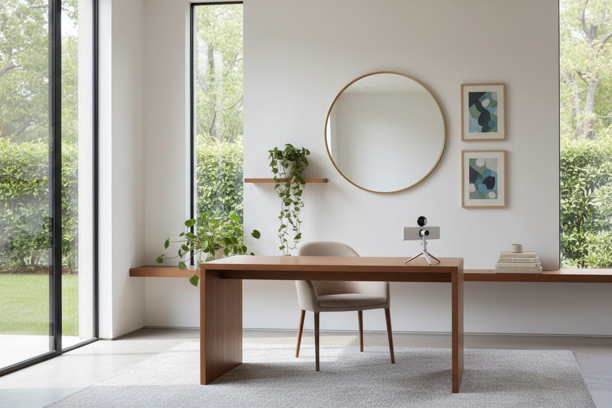
We have all seen it: a beautifully appointed workspace that falls flat the moment the camera turns on because the backdrop feels impersonal or cluttered. As remote work cements itself as a permanent fixture, the demand for a professional, branded backdrop has skyrocketed. Integrating a physical home office logo is no longer just for corporate lobbies; it is a crucial element of interior design for entrepreneurs and executives working from residential spaces. However, treating this as a simple sticker application is where most designs fail. It requires the same consideration of texture, scale, and lighting as any piece of statement furniture.
Key Features to Look For in Wall Branding
- Material Finish: Matte finishes are superior to gloss to prevent ring-light glare during video calls.
- Dimensionality: 3D lettering (raised) adds depth and shadow, creating a more premium look than flat decals.
- Scale & Proportion: The signage should occupy no more than 40-60% of the visible wall width behind you.
- Mounting Hardware: Look for invisible stand-offs or floating mounts to protect wall integrity.
Choosing the Right Material for Residential Spaces
When bringing branding into a home environment, the goal is to balance professional authority with residential warmth. Industrial materials like brushed steel or raw concrete often feel too cold for a room that might double as a guest bedroom.
Wood and Organic Textures
For a sophisticated, grounded aesthetic, consider laser-cut walnut or oak veneers. These materials introduce natural grain patterns that soften the corporate feel. They pair exceptionally well with darker wall colors, such as navy or charcoal, providing a rich contrast that reads beautifully on camera.
Acrylic and Metal Composites
If your design language is modern or minimalist, matte acrylics or powder-coated aluminum are excellent choices. The key here is color matching. A monochromatic look—where the logo is just a shade lighter or darker than the wall paint—creates a subtle, architectural relief effect that is elegant rather than shouting for attention.
Lighting: The Make or Break Factor
Even the most expensive bespoke signage looks cheap without proper illumination. In a home office, we rarely have the luxury of commercial track lighting. Instead, we must rely on ambient and accent lighting.
Avoid directing a spotlight straight at the logo, as this creates harsh shadows. Instead, consider backlighting (halo-lit letters) which provides a soft glow. This separates the signage from the wall, adding depth without causing glare on your webcam lens.
Contextualizing for the UK Market
In my work with British properties, space is often at a premium. A massive uk home office logo installation that works in a sprawling American study will likely overwhelm a converted box room or a Victorian terrace alcove. For smaller UK spaces, I recommend 'ghost' branding—using frosted acrylic on a white wall or etched glass. It establishes presence without visually shrinking the room.
Lessons from My Own Projects
I recently redesigned a workspace for a tech consultant who insisted on a high-gloss, gold-plated logo directly behind his desk. I advised against it, but he loved the 'luxury' look in the showroom. Two weeks after installation, he called me in frustration. Every time he turned on his key light for a Zoom meeting, the gold lettering acted like a mirror, blinding the camera lens and casting a distracting flare across his face.
We had to take it down. I replaced it with a brushed brass alternative with a satin finish and mounted it on half-inch stand-offs. The result? The light diffused across the surface beautifully, creating a soft, warm highlight rather than a harsh reflection. It’s a reminder that in interior design, practical function—especially regarding lighting physics—must always inform the aesthetic choice.
Conclusion
Integrating branding into your home workspace is about creating a focal point that commands respect without disrupting the harmony of your home. By focusing on matte textures, appropriate scaling, and soft lighting, you can create a backdrop that looks as professional as any corporate headquarters. Treat your logo like art, and your office will feel like a sanctuary.
Frequently Asked Questions
How high should I mount my home office logo?
Ideally, the center of the logo should sit at shoulder height or slightly above when you are seated. This ensures it remains visible within the camera frame during video calls without being cut off by your head or the top of the screen.
Can I install 3D signage in a rental property?
Yes, but avoid heavy metals. Opt for high-density foam or lightweight acrylic letters that can be mounted using command strips or architectural double-sided tape, which can be removed without damaging the plasterwork.
What is the best color for a logo on a white wall?
Avoid pure black, which can look too stark and harsh in a home setting. Charcoal grey, navy blue, or deep forest green provide excellent contrast while maintaining a softer, more designed aesthetic.
Leave a comment
This site is protected by hCaptcha and the hCaptcha Privacy Policy and Terms of Service apply.