


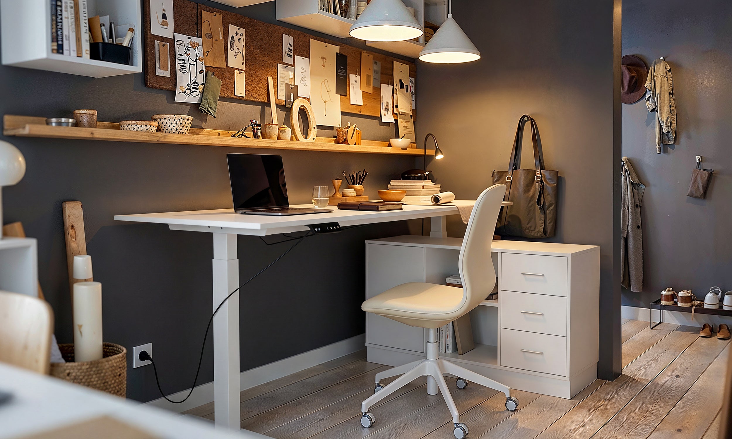
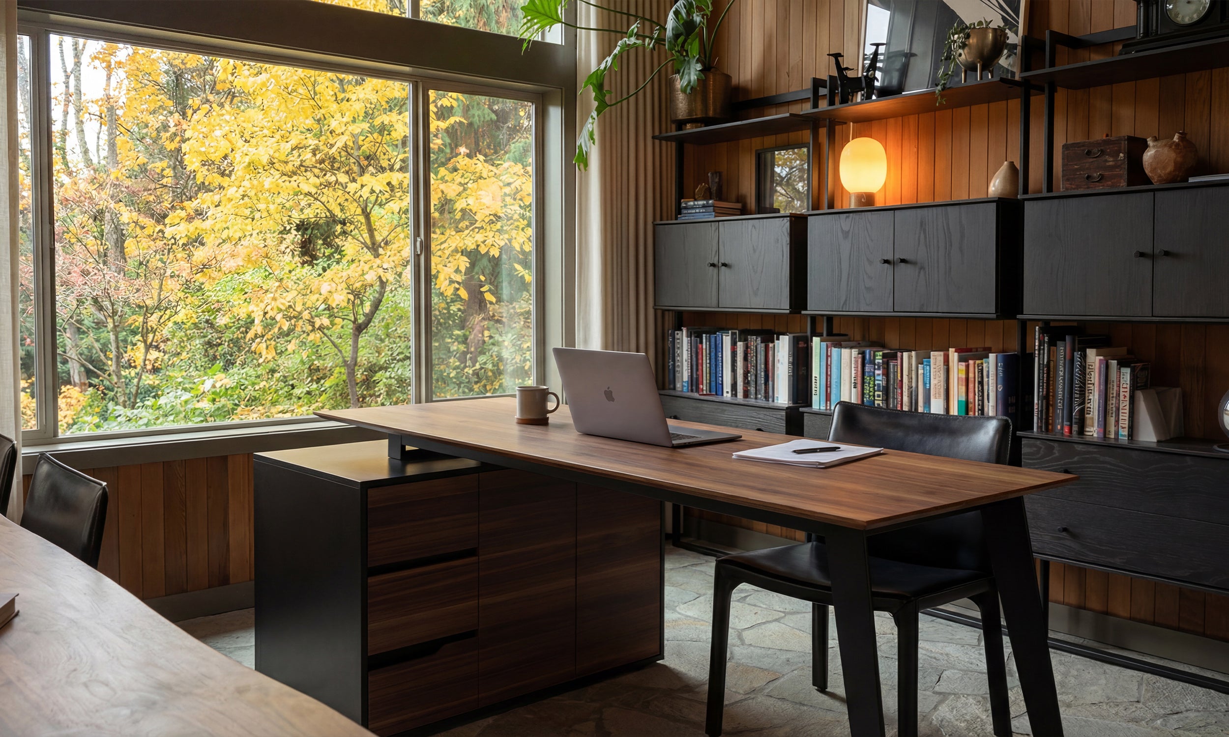


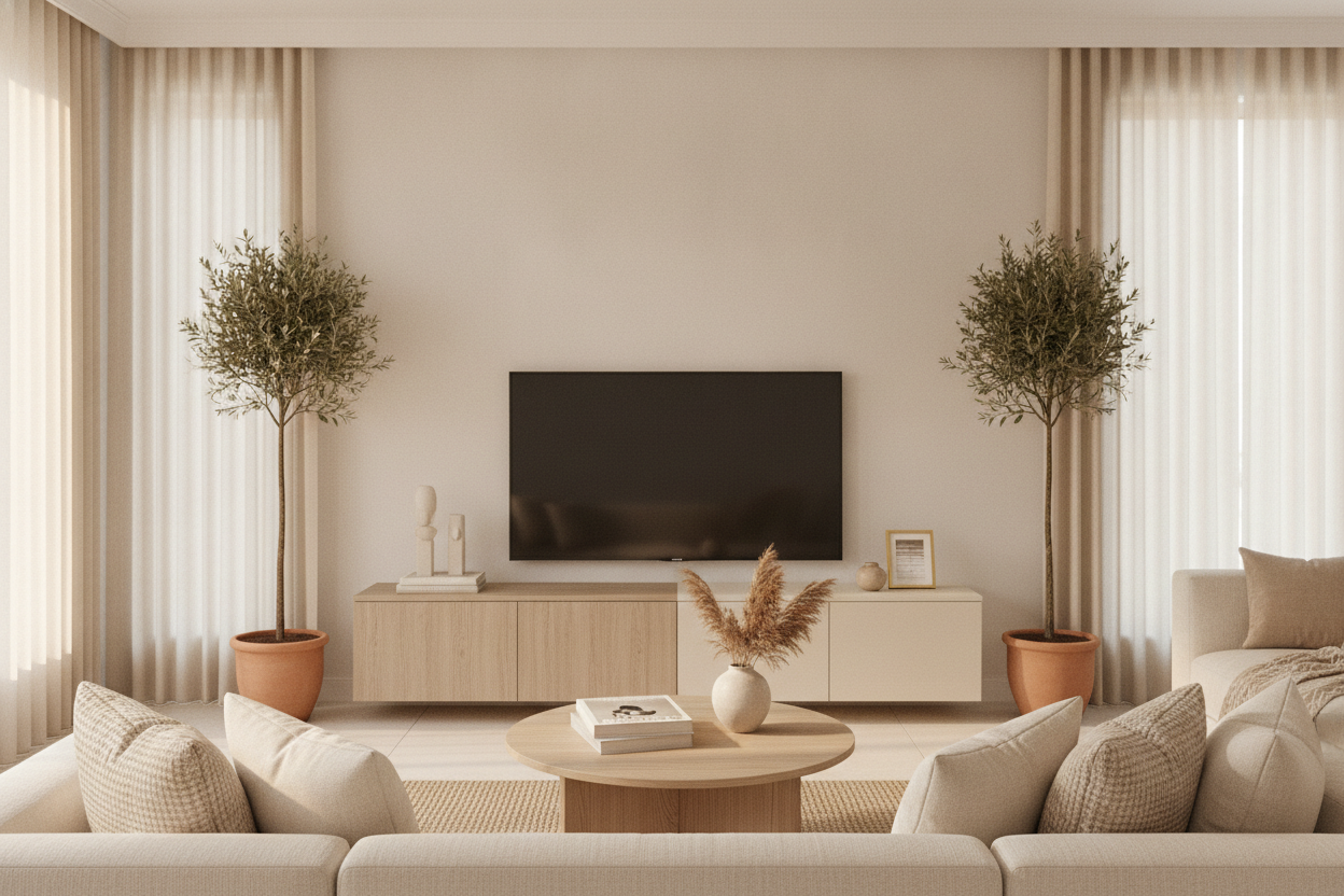
I spent three years staring at a living room that felt like a high-end dentist’s waiting room. I had the 'safe' white media unit, the grey rug, and the black leather sofa. It was clean, sure, but it had zero soul. It wasn't until I swapped that sterile white slab for a beige color tv stand that the room finally felt like a home. Sometimes, we get so caught up in 'modern' minimalism that we forget humans actually need warmth to feel comfortable.
Quick Takeaways
- Beige acts as a visual 'buffer' between dark screens and light walls.
- Cream and tan tones hide dust far better than high-gloss white or matte black.
- A beige media unit makes a room feel expensive without being pretentious.
- Undertones matter—always match your furniture to your floor’s temperature.
The Problem With 'Safe' White and Black Furniture
Most people default to stark white or heavy black when picking out beige tv stands or similar media furniture because they think it’s the path of least resistance. It isn't. A white unit often looks like hospital equipment or cheap melamine that yellows over time. On the flip side, a heavy black entertainment center creates a massive 'black hole' in the middle of your wall. It absorbs all the light and makes your 65-inch TV look like a gaping void.
I’ve seen dozens of living rooms where the black media console just sucks the energy out of the space. It’s too heavy for small apartments and too aggressive for cozy dens. If you’ve ever felt like your TV area is a separate, dark 'zone' that doesn't mesh with your decor, your furniture color is likely the culprit. You want something that grounds the room without dominating the conversation. Black furniture demands you look at it; beige furniture invites you to relax.
Why a Beige Color TV Stand is the Ultimate Decor Bridge
A beige color tv stand is the secret weapon for anyone who wants a 'grown-up' living room. It serves as a visual bridge. Most of our tech—the TV, the soundbar, the gaming consoles—is black or dark grey. Most of our walls are off-white or light grey. A cream colored entertainment center sits right in the middle of that spectrum, softening the harsh transition between the tech and the architecture. It makes the television look like a deliberate choice rather than an eyesore.
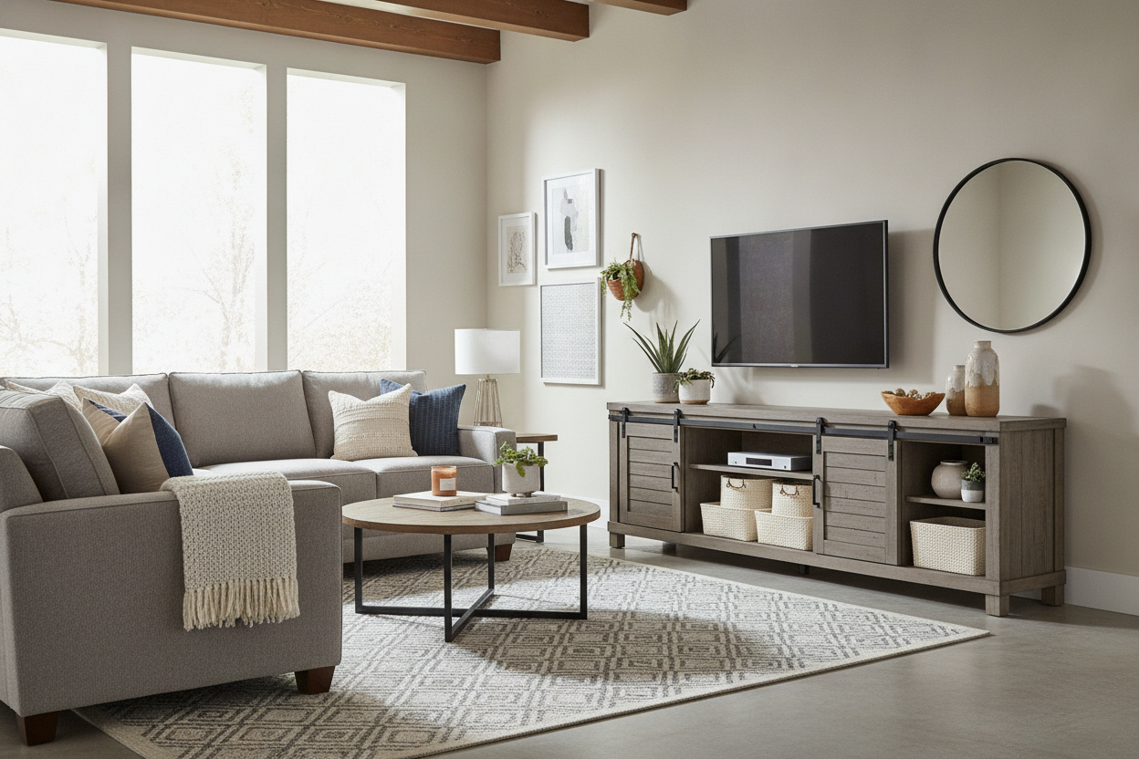
When you opt for a beige tv stand or a beige media console, you’re adding a layer of organic texture. If you choose a contemporary wooden tv stand with a beige-toned oak or maple finish, you get the added benefit of wood grain. This adds visual interest that flat, painted surfaces just can't touch. I’ve found that a cream entertainment center or a beige entertainment center works with almost any rug—from a colorful Persian to a chunky jute—making it way more versatile than a stark white tv console beige.
Navigating the 'Greige' and Cream Spectrum
Not all beige is created equal. I’ve made the mistake of ordering a tan tv console that looked sandy online but arrived looking like a block of 1970s cheddar cheese. You have to be careful with undertones. A light beige tv stand usually has cooler, grey-leaning undertones, which works beautifully with modern 'greige' walls. If your home has a lot of natural light and warm wood floors, a modern cream tv stand or a tan tv stand with yellow or pink undertones will feel much more harmonious.
Before you commit to a cream tv stand or a beige tv console, look at your flooring. If you have cool-toned grey floors, a warm, buttery cream tv console will look like a mistake. You want a beige unit that shares the same temperature as the largest surfaces in your room. A modern beige tv stand should feel like an extension of the space, not a random island of color. I always recommend getting a physical swatch or checking user-submitted photos to see how the cream color entertainment center looks in actual sunlight, not just studio flashes.
How to Style a Cream Media Console Without Looking Boring
The biggest fear people have with a beige entertainment unit is that it will look 'blah.' It’s a valid concern. If you put a cream media console against a beige wall and add nothing else, it’s going to look like a desert. The trick is contrast. I love swapping out standard silver hardware for matte black or antique brass knobs on a cream entertainment stand. It gives the piece some 'teeth' and connects it back to the black TV screen sitting on top.
Think of your beige media unit as a gallery shelf. I’ve styled my own by treating it like a display cabinet TV stand, layering in ceramic vases, stackable coffee table books, and a trailing Pothos plant. The greenery of a plant against a cream color tv stand is one of the most satisfying color pairings in interior design. Also, consider the texture of your decor. Matte ceramics and linen-bound books look much better on a beige tv stand 70 inch than shiny plastic or glass accessories. You want to lean into the softness of the cream tv stand 70 inch rather than fighting it.
Layout Hacks for Lighter Furniture
Lighter furniture is a massive cheat code for small spaces. A beige tv stand 75 inch has a significantly smaller visual footprint than a dark brown or black one of the same size. It doesn't 'stop' the eye as abruptly, which makes your walls feel further away. If you have a massive wall to fill, a cream white tv stand or a tan tv console can span 80 inches without making the room feel like a furniture showroom. It blends into the background, letting the rest of your decor shine.
For those with awkward living room shapes, consider a symmetric L shaped TV stand in a light wood or beige finish. This layout anchors the corner without making it feel heavy. I’ve found that a tv cabinet cream or a tv unit beige works best when it’s paired with a rug that is at least two shades darker or lighter than the stand itself. This creates enough separation so the furniture doesn't just disappear into the floor. Whether you’re looking at a cream television cabinets or a simple tv console cream, the goal is to create a layered, intentional look that feels warm, not washed out.
My Personal Experience: The 'Cheddar' Disaster
I once bought a 'tan' tv stand from a budget site that looked like a beautiful, muted oak in the photos. When it arrived, it was the color of a school bus. It was a nightmare to return, so I ended up sanding the whole thing down and refinishing it in a soft, sandy beige. The lesson? Always check the 'beige company' reviews and look for words like 'warm,' 'cool,' or 'neutral.' A tv stand beige wood should look like natural timber, not a paint-by-numbers kit. Now, I always lean toward cream colored tv stands that have a bit of visible grain; it’s much more forgiving and looks twice as expensive as a flat-painted beige entertainment center.
FAQ
Does a cream tv stand get dirty easily?
It’s a myth that beige shows more dirt. In fact, a tv stand cream is much better at hiding dust and fingerprints than a black or dark wood unit. Just avoid high-gloss finishes if you have kids or pets, as those can show smudges more easily.
Can I put a beige tv console against a white wall?
Absolutely. It creates a sophisticated, tonal look. The key is to make sure there is enough of a shade difference so it looks intentional. A light beige tv stand against a crisp white wall is a classic 'quiet luxury' move.
What color hardware looks best on a beige entertainment unit?
Matte black provides the best modern contrast, while champagne bronze or brass gives a warmer, more traditional feel. Avoid chrome, as it can make beige look a bit dated or 'office-like.'

Leave a comment
This site is protected by hCaptcha and the hCaptcha Privacy Policy and Terms of Service apply.