You have invested in a high-end ergonomic chair and a sleek monitor, yet the room still feels chaotic when you sit down to work. Often, the issue isn't the individual pieces of furniture, but rather the spatial relationship between them. Achieving an efficient office space layout is less about buying more organizers and more about understanding how you physically move through and inhabit a room. As a designer, I see many homeowners push a desk against the nearest wall and call it a day, but true productivity comes from intentional zoning and flow.
Key Features of a Functional Workspace
- The Command Position: Placing the desk so you face the entrance without being directly in line with the door.
- Traffic Flow: Ensuring a minimum 36-inch clearance behind your chair for unrestricted movement.
- Light Layering: Combining task lighting with ambient sources to reduce eye strain and glare.
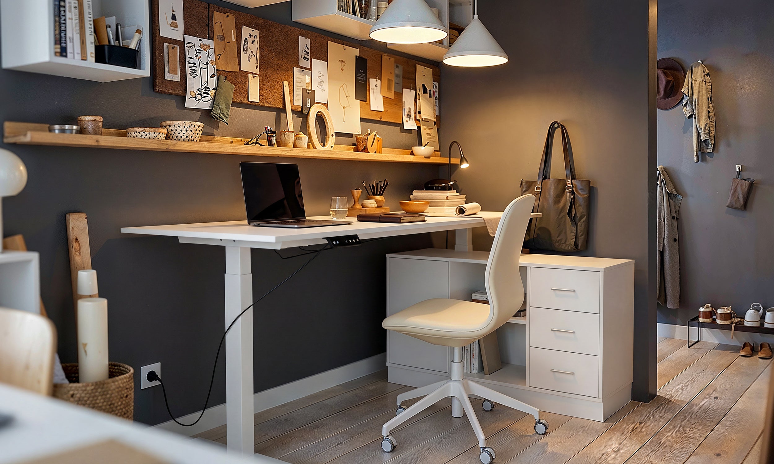
- Vertical Utilization: Using wall-mounted storage to keep the floor plan open and airy.
- Material Acoustics: Incorporating rugs or soft furnishings to dampen echo in minimalist spaces.
Mastering Spatial Planning and Zoning
When clients ask what is the layout of the office supposed to look like, I always start with zoning. A functional office layout divides the room into specific zones: a 'focus zone' for the desk, a 'reference zone' for storage, and potentially a 'break zone' with a lounge chair if space permits.
The most critical error is ignoring the 'Command Position.' Facing a wall might seem like it eliminates distractions, but subconsciously, it creates a sense of vulnerability. Positioning your desk so you have a view of the room—often floating it off the wall or perpendicular to a window—anchors the space and provides a sense of authority and calm.
Choosing Materiality and Scale
Visual Weight vs. Physical Size
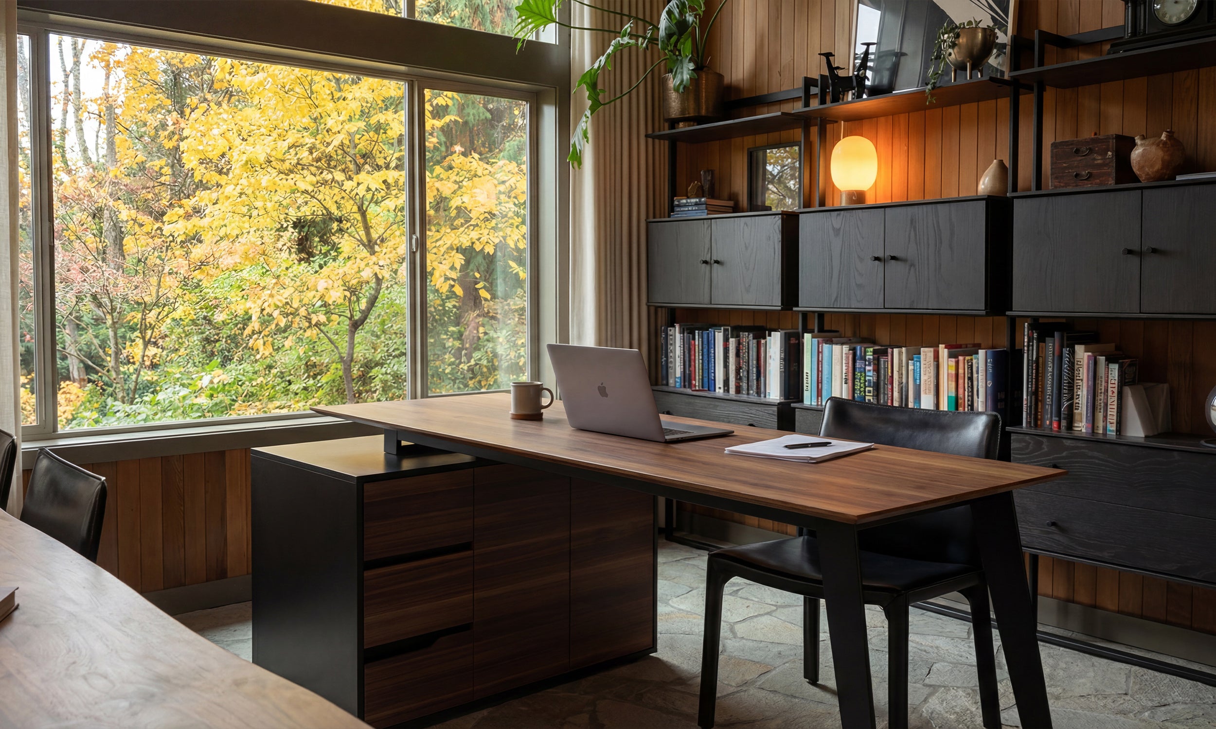
In best office layout design, scale is everything. A heavy, solid oak executive desk might look prestigious, but in a 10x10 room, it dominates the visual field and makes the space feel claustrophobic. For smaller footprints, I recommend materials that offer negative space, such as legs with open metalwork or glass tops. However, be mindful of material temperature; glass can feel cold and clinical to the touch, whereas walnut or oak veneers offer tactile warmth that makes long work hours more pleasant.
The Ergonomic Triangle
Just as a kitchen has a work triangle, an optimal office layout relies on the relationship between your chair, your digital workspace (monitor), and your analog workspace (files/reference materials). If you have to roll your chair more than a few feet to reach a file cabinet, the layout is broken. Keep high-use storage within arm's reach to maintain your flow state.
Lighting: The Invisible Design Element
Lighting dictates the mood. Overhead can lights often cast harsh shadows on your work surface. To counter this, position your desk so natural light hits from the side (preventing monitor glare). Supplement this with a task lamp that has a warm color temperature (2700K-3000K). This visual balance prevents the fatigue associated with harsh fluorescent environments.
Lessons from My Own Projects: The "Floating Desk" Trap
I want to share a specific lesson from a project I worked on in a converted loft. We decided to float a beautiful mid-century modern desk in the center of the room to capitalize on the view. It looked incredible in the renderings.
However, once installed, we realized a practical nightmare: cable management. Because the desk wasn't against a wall, we had a waterfall of black power cords cascading down the side, ruining the aesthetic entirely. I had to retroactively install a floor outlet and use a specific adhesive cable spine that ran down the desk leg to hide the mess. The lesson? If you plan to float your furniture for a better layout, you must plan your electrical grid first. A beautiful layout fails immediately if it's cluttered with trip hazards.
Conclusion
Creating a workspace that works for you is a balance of aesthetics and rigid practicality. By respecting traffic flow, choosing the right scale for your furniture, and prioritizing light, you elevate a simple room into a productivity powerhouse. Don't settle for a setup that fights you; design one that supports you.
Frequently Asked Questions
What is the best office layout for a small room?
For tight spaces, an L-shaped layout in a corner is often best. It utilizes dead corner space and doubles your surface area without encroaching on the center of the room, keeping the traffic flow open.
How much space do I need behind my desk?
Ergonomically, you need at least 30 to 36 inches of clearance between the edge of your desk and the wall (or bookshelf behind you). This allows you to slide your chair back and stand up without banging into furniture.
Is it better to face the window or the wall?
Ideally, neither. Facing a wall is uninspiring, and facing a window directly can cause eye strain due to the contrast in brightness. The optimal position is perpendicular to the window, allowing light to wash across your desk from the side.



Leave a comment
This site is protected by hCaptcha and the hCaptcha Privacy Policy and Terms of Service apply.