


We have all experienced the specific fatigue that sets in halfway through the marketplace section. You are surrounded by bins of tea lights and shelves of mass-produced ceramics, wondering if any of it will actually elevate your living room or just add clutter. The design dilemma is real: how do you incorporate budget-friendly items without your home looking like a catalog showroom? The secret lies not in what you buy, but in how you curate and contextualize these pieces. When selected with a discerning eye, ikea home accents can seamlessly blend with vintage finds and investment furniture to create a sophisticated, layered narrative.
Key Features to Look For
- Material Authenticity: Prioritize natural materials like glass, metal, stone, or bamboo over shiny, rigid plastics.
- Scale and Proportion: Avoid undersized décor. One substantial vase has more visual impact than five small trinkets.
- Finish Quality: Check for seams on ceramics and the quality of glazing. Matte finishes often look more expensive than high-gloss.
- Timelessness: Opt for simple, geometric shapes (Scandi-minimalism) rather than trend-heavy patterns that date quickly.
Elevating the Ordinary: Material Selection
As a designer, the first thing I check when holding a potential accessory is the tactile quality. Visual weight matters. When browsing ikea home accessories, bypass the painted plastics and head straight for the mouth-blown glass or stoneware. For instance, clear glass catches the light and adds an airy quality to a heavy bookshelf, while stoneware introduces necessary texture.
The Metal Finish Test
Be cautious with gold or brass finishes at lower price points. They can often lean too yellow or orange, which instantly signals a lower cost. Instead, look for powder-coated black steel or brushed stainless steel items. These finishes tend to be more consistent and durable, grounding a space without clashing with the hardware on your existing furniture.
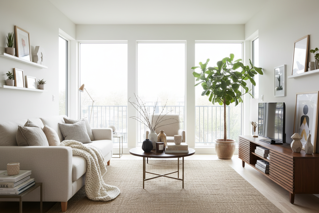
The Art of the Vignette
Buying the item is the easy part; placement is where the design work happens. A common mistake is scattering accents individually across surfaces. This creates visual noise. Instead, employ the 'Rule of Three'. Group items of varying heights and textures together to create a focal point.
Mixing High and Low
The most successful interiors rely on the tension between high and low. Place a streamlined IKEA table lamp next to a stack of heavy, hardcover art books or a vintage ceramic bowl. The proximity to higher-end items elevates the perception of the budget-friendly piece. The eye perceives the collective aesthetic of the vignette rather than isolating the price tag of the lamp.
Textiles and Soft Furnishings
Soft accents are the quickest way to change the mood of a room. However, insert pads are where many homeowners compromise comfort for cost. If you purchase cushion covers from the marketplace, I strongly recommend discarding the standard polyester inserts. Replace them with feather or down-alternative fills that are 2-4 inches larger than the cover. This ensures a plump, luxurious 'karate chop' look that holds its shape, rather than the flat, lifeless appearance of standard poly-fill.
My Personal Take on IKEA Home Accents
I want to be transparent about the longevity and reality of these products based on a project I completed last year for a client in a rental loft. We used the SINNERLIG pendant lamp—a cult favorite—as a central accent. While it photographs beautifully, here is the unpolished truth: the cork fixture is incredibly delicate. During installation, we chipped a small piece off the rim just by bumping it against the ladder. Furthermore, the bamboo weave, while stunning, is a dust magnet.
Six months later, the client mentioned that cleaning it required a very soft bristle vacuum attachment because a standard duster just snagged on the fibers. It looks like a $500 fixture, but it requires delicate handling that solid wood or metal doesn't. When I specify these items now, I always warn clients: they provide the aesthetic value of high-end design, but you must treat them with more care than their price tag suggests.
Conclusion
Creating a luxury feel isn't about the budget; it is about the edit. By focusing on material integrity, proper scale, and thoughtful groupings, you can utilize mass-market décor to anchor a room with style and confidence. Trust your eye, mix your eras, and let your home tell a story that is uniquely yours.
Frequently Asked Questions
How can I make my IKEA accessories look more expensive?
The easiest hack is to paint them. Using a textured spray paint (like a stone or terracotta effect) on basic ceramic or glass vases can add depth and remove the mass-produced sheen. Also, removing tags and stickers immediately prevents residue buildup.
Are the metal finishes on IKEA accents durable?
They are generally durable against rust if kept dry, but the finish is often a thin coating. Avoid using abrasive sponges or harsh chemical cleaners, as these can strip the gold or black coating, revealing the base metal underneath.
What is the best way to style open shelving with these items?
Leave negative space. Do not fill every inch of the shelf. Alternate between stacks of books (horizontal lines) and standing accessories like vases or sculptures (vertical lines) to keep the eye moving comfortably across the display.
Leave a comment
This site is protected by hCaptcha and the hCaptcha Privacy Policy and Terms of Service apply.