


We have all seen them while scrolling through feeds or flipping through glossy pages: workspaces that feel less like cubicles and more like sanctuaries. The difference between a generic workspace and a true arch digest office rarely comes down to budget alone; it is about intention, layering, and the interplay of form and function. As designers, we often see clients buy expensive furniture that feels flat in the room because the layout lacks a narrative. This guide will help you transition from a utility-focused setup to a space that commands attention while remaining deeply conducive to work.
Key Elements of a High-End Workspace
- Sculptural Silhouettes: Move away from boxy furniture; look for desks with curves, interesting legs, or floating tops.
- Layered Lighting: A mix of ambient, task, and accent lighting (like picture lights) is non-negotiable.
- Material Integrity: Prioritize natural materials like solid walnut, travertine, or unlacquered brass over synthetic veneers.
- Hidden Tech: The hallmark of an architectural digest office design is the invisibility of cords and monitors when not in use.
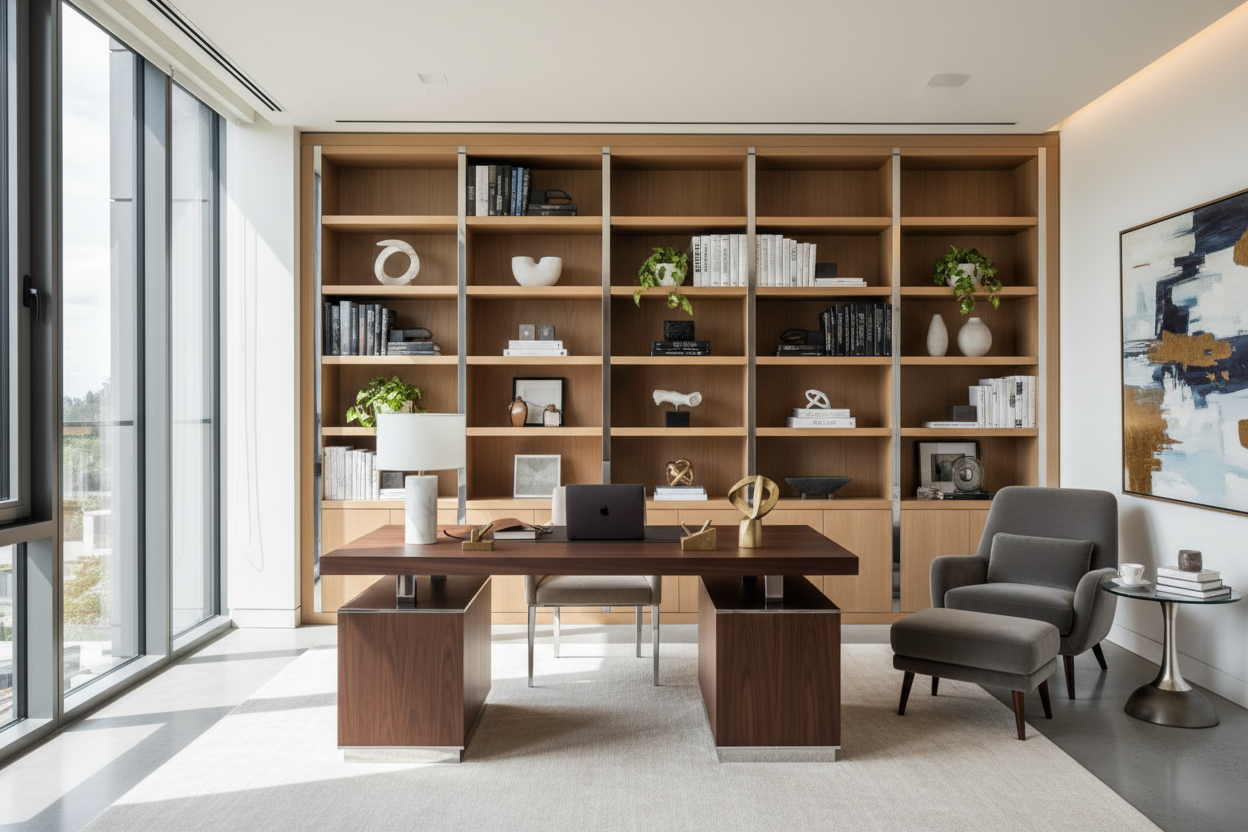
Anchoring the Room: The Desk as Sculpture
In any home office architectural digest would feature, the desk is never just a surface; it is the protagonist of the room. When sourcing an architectural digest desk, I advise clients to look at the piece from all angles. Unlike a standard office where a desk is pushed against a wall, a luxury layout often floats the desk in the center of the room or perpendicular to a window.
Material Matters: Solid Wood vs. Veneer
While veneers have their place, a desk meant to last decades requires solid wood or high-grade stone. Solid wood develops a patina—small scratches and sun-fading become part of the story rather than defects. If you choose a stone top, such as marble or travertine, ensure it is honed rather than polished to avoid the glare of your task lighting reflecting into your eyes.
Layout and Flow: The "Power Position"
Architectural digest office design leans heavily on the concept of the "power position." This means positioning your chair so you have a view of the door, with a solid wall behind you. This not only looks authoritative but psychologically creates a sense of security.
However, visual balance is equally critical. If your desk is heavy and blocky, pair it with a chair that has a lighter, open frame. If your desk is glass or thin metal, ground the space with a substantial, textured rug to prevent the furniture from feeling like it is "floating" aimlessly.
Styling the Shelves: The curated Look
To achieve that lived-in, collected aesthetic common in an architectural digest office, your shelving needs to breathe. A common mistake is packing shelves with books spine-out. Instead, mix vertical stacks with horizontal piles topped with sculptural objects. Use negative space as a design element; the eye needs a place to rest. Incorporate art that leans against the back of the shelf to add depth and break the grid.
My Personal Take on arch digest office
I learned a hard lesson about "photogenic" furniture versus "livable" furniture during a project for a client in a downtown loft. We selected a stunning, high-gloss black lacquer desk that looked incredible in the mood boards—pure drama, very editorial.
However, two weeks after installation, I visited the site and realized my mistake. The lacquer was a magnet for dust and fingerprints. Every time the client rested their wrists to type, it left a smudge. It looked beautiful in photos but was high-maintenance for daily use. Since then, I always steer clients toward matte finishes, leathers, or textured woods for high-touch surfaces. Real luxury is not just about the look; it is about how the piece ages with you. A desk that requires constant polishing will eventually become a source of annoyance rather than inspiration.
Conclusion
Creating a workspace worthy of a magazine spread does not require a complete renovation. It requires a shift in perspective. By treating your office furniture with the same reverence as your living room décor—prioritizing texture, lighting, and layout—you can build a space that fosters creativity. Start with the desk, manage your lighting, and let the design evolve.
Frequently Asked Questions
How do I hide monitors in an architectural digest office?
Designers often use the "Frame TV" concept for monitors, displaying art when the screen is idle. Alternatively, we position the desk so the monitors face away from the room's main entry point, or we use low-profile screens that sit below the eye line of the desk décor.
Can I achieve this look in a small space?
Absolutely. For smaller footprints, focus on verticality. Use floor-to-ceiling drapery to add height and drama. Choose a desk with slender legs to keep the floor visible, which makes the room feel larger, and invest in one oversized piece of art rather than a cluttered gallery wall.
What is the best lighting temperature for a home office?
To mimic the warm, inviting glow seen in editorial features while maintaining focus, aim for 3000K LED bulbs. Anything cooler (4000K+) feels like a clinical hospital, while anything warmer (2700K) can be too sleepy for focused work.
Dejar un comentario
Este sitio está protegido por hCaptcha y se aplican la Política de privacidad de hCaptcha y los Términos del servicio.