


We have all walked into a room that feels technically correct but emotionally flat. The furniture fits, the layout works, but the soul is missing. Often, the solution isn't a complete renovation, but a disruption in the palette. Enter the orange table ikea options—a bold design choice that frightens amateurs but excites professionals. Whether you are eyeing a vintage IKEA classic or hacking a modern piece, introducing this high-energy hue requires a nuanced understanding of color theory and spatial balance to avoid looking like a fast-food interior.
Quick Decision Guide: Is Bold Right for You?
- Light Interaction: Orange is highly reflective. Ensure your room has warm lighting (2700K-3000K); cool daylight bulbs can make the surface look harsh or industrial.
- Material Matters: High-gloss finishes reflect light and feel modern, while matte finishes (common in IKEA's powder-coated steel) absorb light, offering a more grounded, sophisticated look.
- The 60-30-10 Rule: Use the orange table as your 10% accent. If it becomes the dominant 60%, the room will feel anxious rather than energetic.
- Durability Check: If choosing a particleboard option (like the LACK series), be aware these are lightweight 'honeycomb' structures. For heavy daily use, look for steel or solid pine options.
Mastering the Material and Aesthetic
When selecting a statement piece from a mass-market retailer, the finish is everything. In my years styling showrooms, I have found that the difference between "cheap" and "chic" often comes down to texture.
The High-Gloss vs. Matte Debate
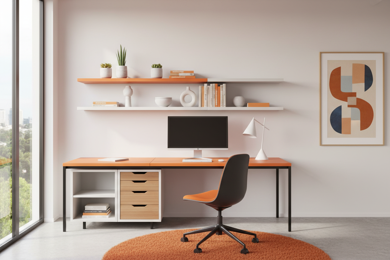
IKEA frequently alternates between high-gloss finishes and matte powder coats. If you are sourcing an ikea orange desk for a creative workspace, I almost always recommend a matte finish. High-gloss surfaces are magnets for fingerprints and dust, which can ruin the clean lines of a modern office. Furthermore, a matte orange creates a "terracotta" or "burnt sienna" vibe that pairs beautifully with natural woods and indoor plants, grounding the space rather than overstimulating it.
Visual Weight and Silhouette
Because orange is a visually heavy color—it advances toward the eye—the silhouette of the table must remain light. A chunky, solid orange block can overwhelm a small apartment. Instead, look for designs with slender legs or open frames (like the TROTTEN or customized LINNMON systems). This allows light to pass through and under the furniture, maintaining a sense of airiness despite the aggressive color choice.
Strategic Color Coordination
The biggest fear clients express regarding bold furniture is clashing. To make an orange table feel intentional, you must curate the surrounding palette.
The Teal and Navy Counterbalance
On the color wheel, blue is the direct complement to orange. Placing an orange side table against a deep navy accent wall or on top of a teal rug creates a vibration that feels luxurious and curated. The cool tones of the blue neutralize the heat of the orange, creating a dynamic equilibrium.
The Monochromatic Approach
For a more avant-garde look, tone-on-tone styling works wonders. Pairing a bright orange table with softer peach or rust-colored textiles creates a warm, enveloping atmosphere. This technique is particularly effective in north-facing rooms that lack natural sunlight, as it artificially warms the ambient light.
My Personal Take on Orange Table IKEA Pieces
I want to be transparent about a project I worked on last year involving a creative studio in Brooklyn. The client insisted on a vibrant, energetic workspace on a budget, so we sourced a vintage IKEA orange glass table (from the early 2000s collection) and paired it with a modern ikea orange desk setup using trestle legs.
Here is the unpolished truth: The color was fantastic, but the color cast was a nightmare initially. We painted the walls a crisp white, but when the afternoon sun hit that large orange surface, it bounced a sickly peach glow onto the client's face during Zoom calls. It looked like a bad spray tan.
We fixed it not by changing the table, but by changing the floor. I placed a large, dark charcoal wool rug underneath. The dark fabric absorbed the excess light bounce rather than reflecting it back up. Additionally, I noticed that on the cheaper laminate IKEA tops, the edge banding is the first thing to show wear. If you use this daily, keep a matching orange marker or a small pot of model paint handy. The "white line" that appears when the laminate chips is the quickest way to kill the luxury illusion.
Conclusion
Integrating an orange table into your home is not just a purchase; it is a commitment to a specific energy. When styled with the right lighting and complementary textures, even a budget-friendly IKEA piece can anchor a room with the confidence of high-end Italian design. Trust your eye, control the lighting, and do not be afraid of the bold choice.
Frequently Asked Questions
Can I paint an existing IKEA table orange myself?
Yes, but preparation is key. Most IKEA furniture is laminate or melamine. You must use a shellac-based primer (like BIN) to ensure adhesion before applying your orange paint. Without this primer, the paint will scratch off with a fingernail within a week.
Does an orange desk affect productivity?
Color psychology suggests orange stimulates creativity and social interaction. It is excellent for brainstorming areas or lively dining rooms but might be too stimulating for a bedroom or a space intended for deep, focused reading.
What chairs pair best with an orange dining table?
Avoid matching orange chairs. Instead, opt for transparency (acrylic/Ghost chairs) to let the table shine, or choose natural materials like light oak or rattan to soften the industrial feel of the color.

Dejar un comentario
Este sitio está protegido por hCaptcha y se aplican la Política de privacidad de hCaptcha y los Términos del servicio.