


We have all fallen down the rabbit hole of scrolling through endless feeds of perfectly curated workspaces, only to look up at our own blank, uninspiring walls. The disconnect between a digital mood board and reality is often stark. The challenge isn't finding inspiration; it is executing pinterest office wall decor in a way that feels authentic to your workflow rather than a chaotic collage of trends. This guide bridges the gap between clicking 'save' and creating a cohesive, high-end environment.
Key Elements of a Pinterest-Worthy Office
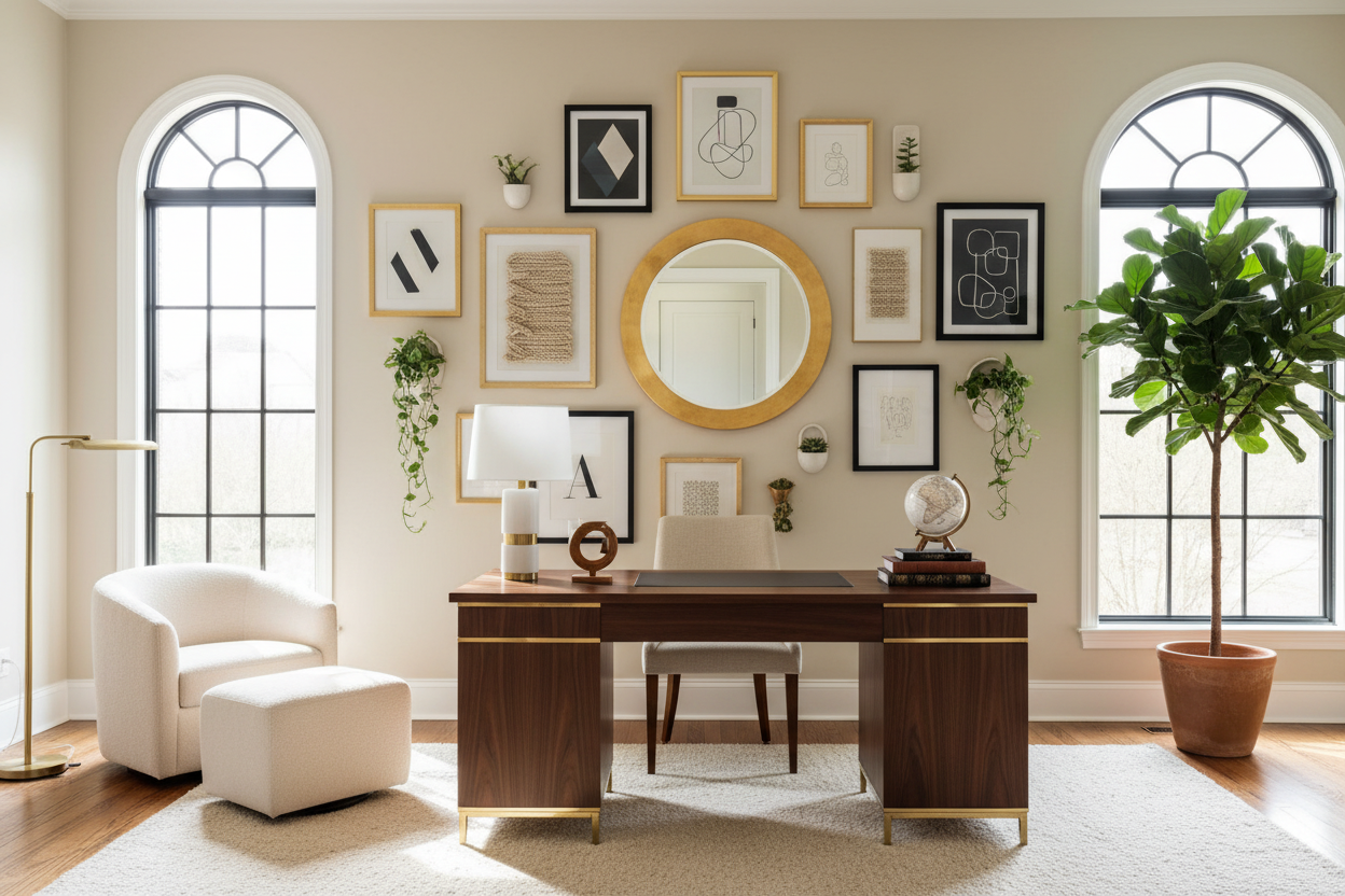
- Scale and Proportion: Ensure artwork covers 60-75% of the available wall space to avoid the "floating stamp" look.
- Material Integrity: Prioritize tactile materials like canvas, wood, or metal over flat paper prints to add depth.
- Color Cohesion: Select a 60-30-10 color rule (dominant, secondary, accent) to maintain visual calm.
- Functional Acoustics: Incorporate soft textures (tapestries or felt panels) to dampen echo in video calls.
Translating Digital Trends to Physical Reality
When you browse office wall art pinterest boards, you are often looking at staged photography with controlled lighting. To replicate this in a real home office, you must look past the image and analyze the material quality. A common pitfall is purchasing budget-friendly prints that look excellent on a Retina display but flat and reflective on a wall.
The Importance of Texture and Finish
For a luxury aesthetic, avoid standard glossy posters which can look collegiate. Instead, opt for matte finishes, giclée prints on heavy cotton paper, or textured canvas. If you are framing prints, the glazing matters. Standard glass creates glare that can be distracting during deep work. I always recommend non-glare or museum glass; it disappears, allowing the art to breathe and reducing visual fatigue.
Mastering Layout and Visual Balance
The difference between a cluttered wall and a curated gallery lies in the spacing. A popular trend in office wall decor pinterest searches is the eclectic gallery wall. However, the secret to making this work is strict geometry.
The Grid vs. The Organic Layout
For a corporate or highly focused environment, a symmetrical grid of matching frames provides structure and predictability, which can be psychologically grounding. For a creative studio, an organic layout works, but it requires a unifying element—such as keeping all frames black or ensuring all art shares a similar saturation level. Always maintain consistent spacing (2 to 3 inches) between frames to create a singular "silhouette" rather than scattered noise.
Ergonomics of the Eye
Design isn't just about what looks good; it is about how it affects your posture and focus. Your primary focal point—usually the art directly behind your monitor—should not compete with your screen. High-contrast patterns behind a monitor can cause eye strain. Save the bold, complex pieces for the side walls or the background visible during your Zoom calls to establish authority without hindering your productivity.
My Personal Take on Pinterest Office Wall Decor
I learned a hard lesson about "Pinterest vs. Reality" during a project for a tech executive in Seattle. We replicated a stunning, high-gloss gallery wall she loved online. It looked incredible during the install. However, two days later, she called me complaining of headaches.
The issue wasn't the art; it was the reflection. The high-gloss frames and standard glass were reflecting the movement of her dual monitors and the window behind her, creating a constant flickering motion in her peripheral vision that the Pinterest photo didn't show. I had to swap everything for matte frames and canvas wraps that absorbed light rather than bounced it. It was a tedious fix, but it taught me that in a workspace, light control is just as important as the aesthetic. Now, I always test a material sample against the client's monitor glare before committing to the full install.
Conclusion
Curating your workspace is about filtering the noise. By focusing on texture, proper scale, and light management, you can transcend the screen and build a room that supports your career and your style. Don't just pin it—plan it, measure it, and invest in quality materials that stand the test of time.
Frequently Asked Questions
How high should I hang my office wall art?
The center of the artwork should be at eye level, which is typically 57 to 60 inches from the floor. However, in an office where you are seated, you may want to lower this slightly so the art feels connected to your seated line of sight, especially if it hangs above a low credenza.
Can I mix different frame styles?
Yes, but proceed with caution. To maintain a cohesive look, keep one element consistent. If you mix frame styles (e.g., vintage gold and modern black), ensure the artwork inside shares a similar color palette or theme. Too much variety creates visual chaos.
What is the best wall decor for a small office?
In compact spaces, one large "statement" piece is often better than many small ones. A single large canvas expands the room visually, whereas a cluster of small frames can make a small wall feel cluttered and the room more confined.
Dejar un comentario
Este sitio está protegido por hCaptcha y se aplican la Política de privacidad de hCaptcha y los Términos del servicio.