




I spent three weeks staring at a 65-inch OLED sitting on a cardboard box in my 1924 bungalow. Every 'traditional' console I looked at felt like a cheap movie set prop—something trying too hard to look old while housing a piece of tech that clearly isn't. That's when I realized that contemporary entertainment centers aren't the enemy; they're the only way to handle 21st-century tech without lying to your architecture.
- Contrast is your friend: Clean lines highlight historic details rather than muddying them.
- Texture over 'Fake Age': Choose real wood or matte metals instead of faux-distressed finishes.
- Scale matters: High ceilings in older homes can swallow small, spindly TV stands.
- Cord management is king: Modern units solve the 'no outlets' problem of 100-year-old rooms.
The 'Time-Travel Collision' Problem in Older Living Rooms
The visual friction is real. You've got original white oak floors and plaster walls that have survived a century, and then you drop a massive, glowing black rectangle in the middle of it all. It often looks like a time-travel accident. The mistake most people make is trying to 'hide' the TV inside a clunky, faux-antique armoire that takes up half the room and makes the space feel claustrophobic.
When you place a stark, modern piece against 100-year-old crown molding, you create a dialogue between the eras. It says, 'I live here now, but I respect what was here before.' The trick is to avoid the ultra-minimalist 'spaceship' look. You want something that feels grounded. If the furniture is too flimsy, the history of the room will crush it. If it's too heavy, it competes with the architecture. It's a balancing act that requires a bit of nerve.
Why I Still Prefer Sleek Lines Over Faux-Antique Consoles
I absolutely loathe faux-distressed furniture. You know the stuff—MDF covered in a 'weathered' plastic veneer that claims to be farmhouse chic. It’s a lie, and your 1920s trim work knows it's a lie. When I was shopping for an entertainment center, I realized that trying to mimic the age of the house with new, cheap furniture just highlights the difference in quality. A modern entertainment unit design works because it doesn't try to compete with the history; it provides a clean, intentional contrast.
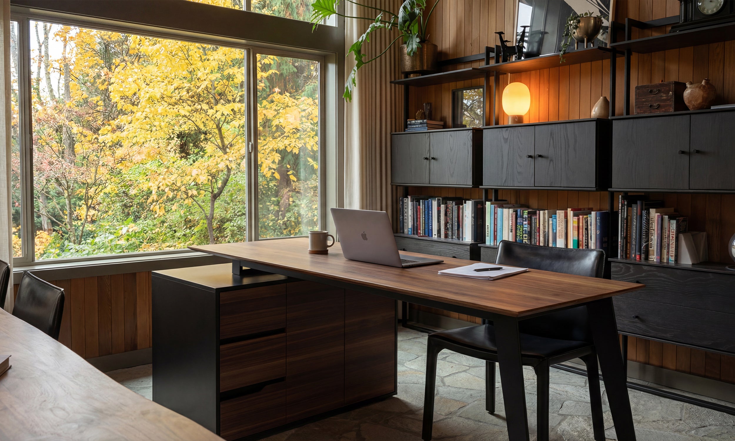
The beauty of sleek lines is that they don't demand all the attention. A low-profile, walnut-veneer console with simple metal legs allows your original fireplace or those gorgeous leaded-glass windows to remain the stars of the show. Ornate, 'traditional' new furniture is often too bulky, featuring weird scrolls and plastic-feeling hardware that looks tacky next to real, hand-carved historic details. I'd rather have a piece that does its job quietly than a fake antique that screams for attention.
3 Rules for Blending Eras Without It Looking Accidental
Rule number one: Match the wood undertone, not the wood species. If your floors are a cool-toned, 80-year-old oak, don't buy a warm, orange-toned cherry unit. They will fight until the end of time. Find a contemporary piece with a similar 'temperature.' This creates a sense of cohesion even if the styles are decades apart.
Rule number two: Avoid high-gloss finishes. A 'wet look' white lacquer unit belongs in a glass-walled condo, not a Victorian or a Craftsman. Matte finishes, powder-coated metals, and natural wood grains bridge the gap between old and new much more effectively. You want textures that feel like they could have existed in some form a century ago, even if the shape is entirely modern.
Rule number three: Use the furniture to frame the tech. A modern entertainment center wall unit can actually serve as a transitional bridge. By surrounding the TV with books, art, or even just clean shelving, you integrate the screen into the room's architecture. It stops being a 'TV on a stand' and starts being a functional part of the wall, which is much more sympathetic to traditional layout logic.
Dealing with Plaster Walls and Weird Layouts
Old houses are functionally weird. My living room has exactly two outlets, both on the wrong wall, and the plaster is about three inches thick with lath that eats drill bits for breakfast. This is where entertainment unit modern design actually saves your sanity. Modern pieces are built with the assumption that you have a dozen cables to hide, whereas 'antique' styles often leave you with a rat's nest of wires visible from the side.
I needed serious help managing those tangled cords that were snaking across my baseboards. A well-designed modern unit has internal channels that let you run power strips and HDMI cables internally. Also, walls in 100-year-old homes are never actually straight. I've seen floors slope two inches from one side of a room to the other. Using an adjustable width minimalist TV stand saved me from having to shim a static unit against a crooked wall, allowing me to customize the fit to the specific, quirky dimensions of my alcove.
Is a modern TV stand too 'cold' for a traditional house?
Only if you go for glass and chrome. If you stick to wood grains, matte blacks, or earthy tones, it actually feels warmer than a chunky, dark-stained traditional unit that sucks all the light out of the room.
How do I stop the TV from looking like a giant black hole?
Surround it with life. Use the shelves of a contemporary unit for actual books, plants, and ceramics. The mix of organic shapes and modern lines softens the 'tech' feel.
Should I wall-mount the TV or use a stand?
In older homes, I almost always vote for a stand. Plaster walls are notoriously difficult to mount to safely, and a modern console gives you a dedicated place to hide the cable box and gaming consoles without cutting holes in your historic walls.


Leave a comment
This site is protected by hCaptcha and the hCaptcha Privacy Policy and Terms of Service apply.