


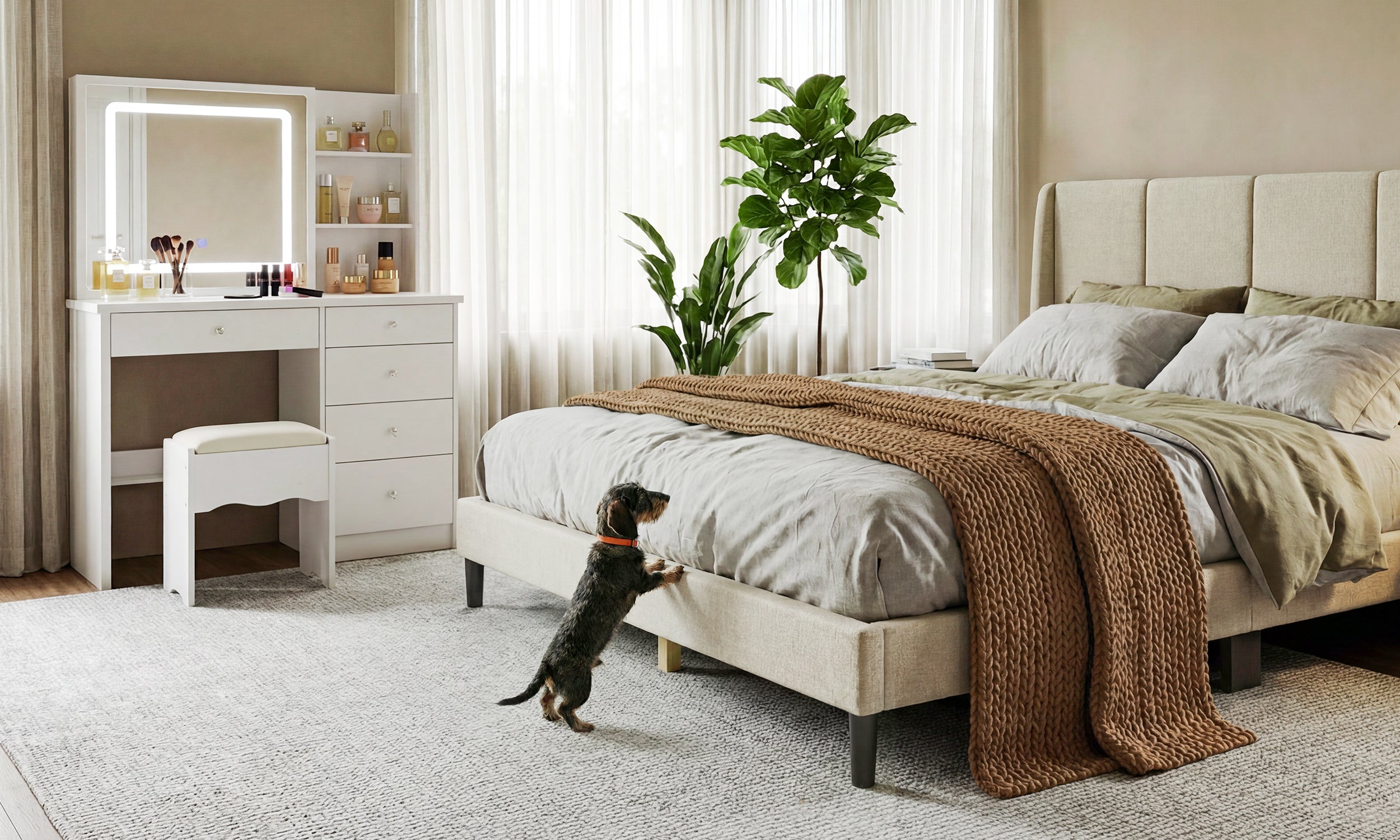
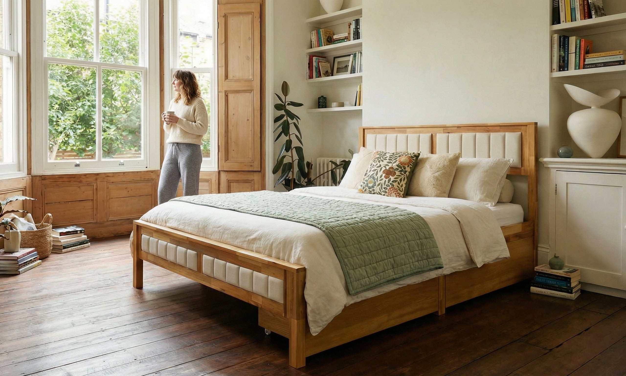
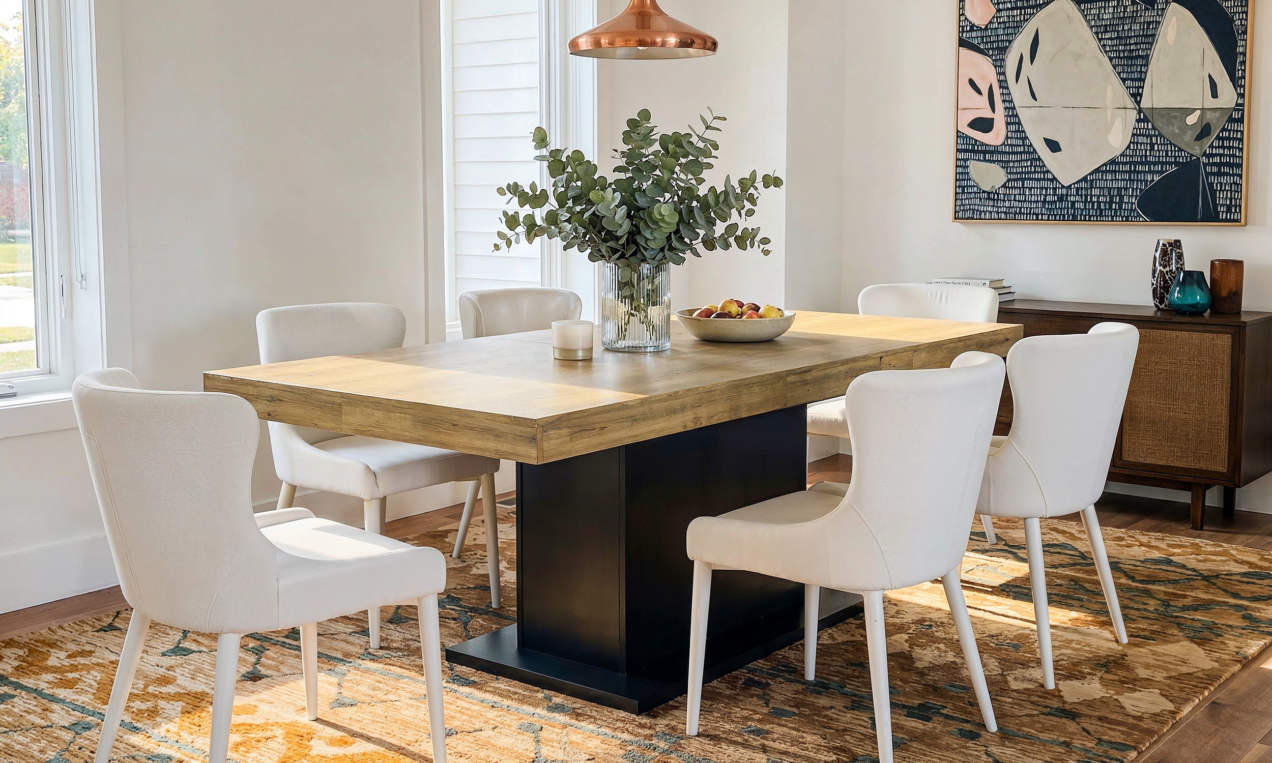
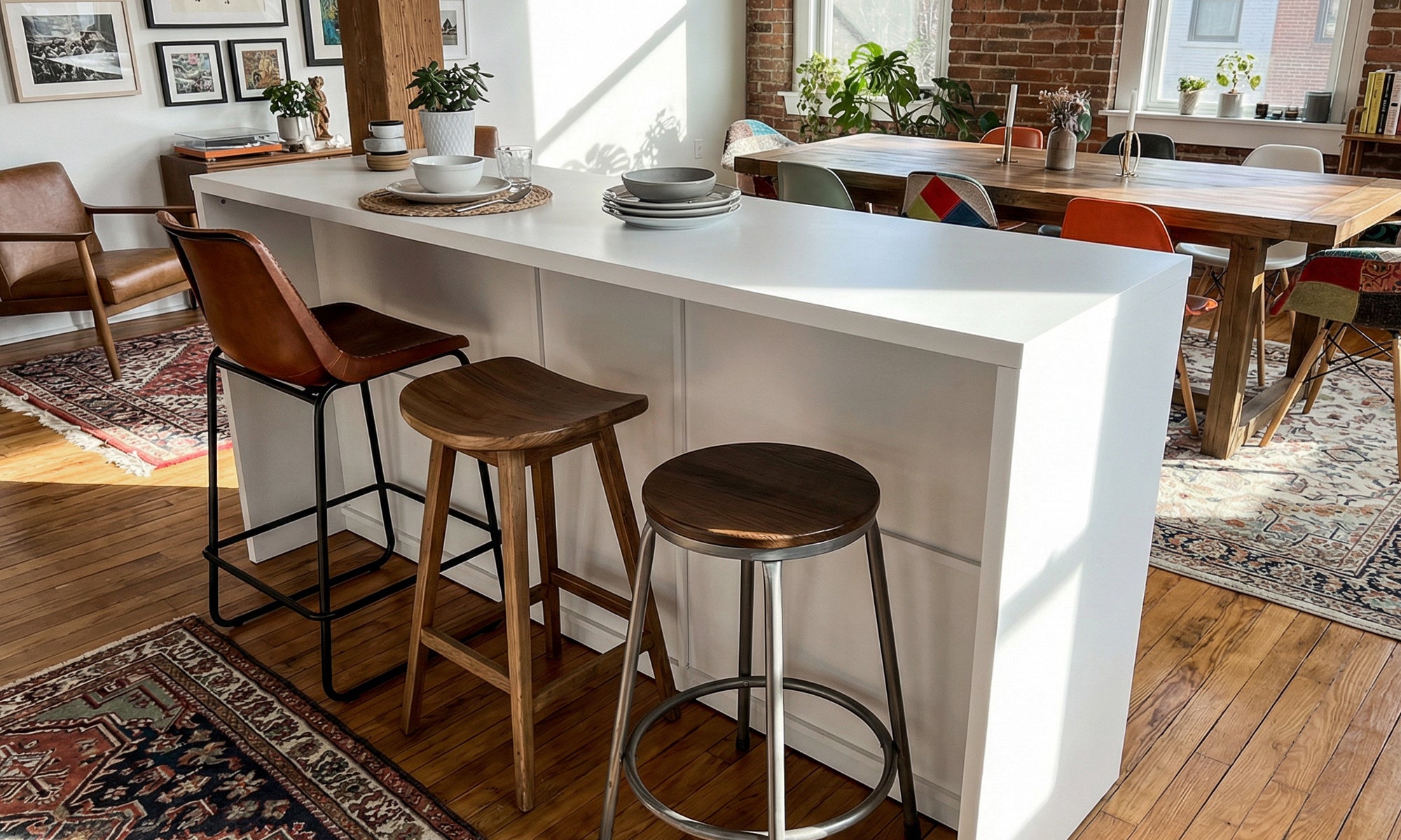
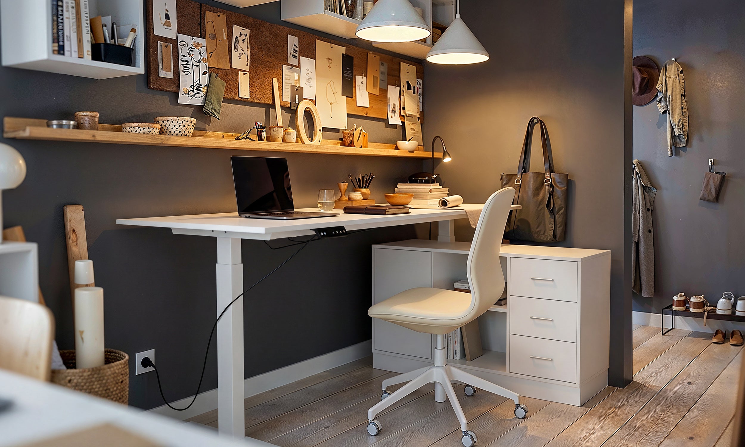
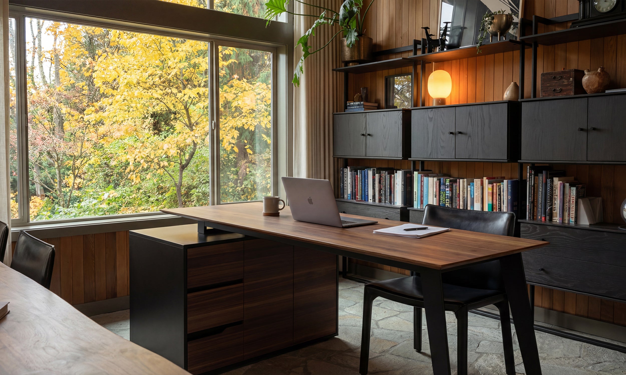


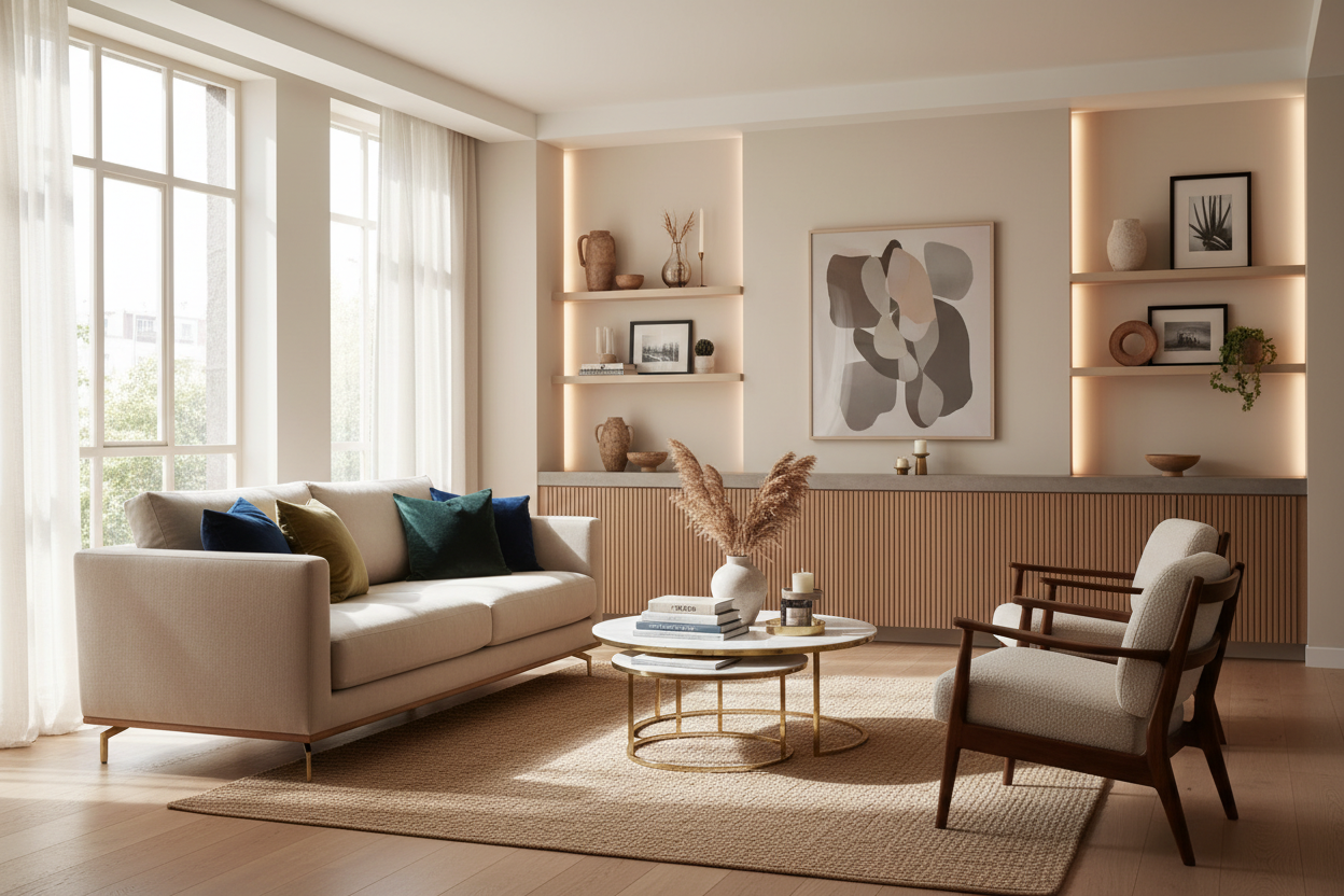
We have all experienced the specific allure of Scandinavian design catalogs. You find yourself scrolling through ikea furniture images, captivated by the pristine lighting, the perfectly draped throws, and the sense of airy minimalism. Yet, when the flat-packs arrive and the assembly is complete, the result often feels flatter than the photo. As a designer, my job is to bridge that gap between the curated editorial image and the reality of a lived-in home. It is not just about buying the item; it is about understanding the styling cues that make those mass-produced pieces look bespoke.
Quick Decision Guide: Translating Photos to Reality
Before you commit to a purchase based on a digital rendering or studio shot, consider these fundamental design elements to ensure the piece works in your actual space:
- Scale and Proportion: Catalog photos often use wide-angle lenses, making furniture appear smaller or rooms larger. Always tape out dimensions on your floor.
- Material Authenticity: Zoom in to determine if the finish is a textured veneer or a flat paper foil. This dictates how light reflects off the surface.
- Lighting Context: Studio images use multi-directional lighting. In a dimly lit living room, dark finishes may read as heavy black holes rather than sleek charcoal accents.
- Hardware Potential: Assess if legs and knobs are standard sizes; swapping these is the fastest route to a custom look.
Decoding the Visual Language of IKEA Furniture Photos
When we look at professional ikea furniture photos, we are rarely looking at the furniture in isolation. We are looking at a composition. The design team at IKEA are masters of "grouping." To achieve a sophisticated aesthetic, you must look past the product and analyze the periphery.
Notice the negative space. In the images, a sideboard is rarely cluttered; it is styled with perhaps three distinct objects of varying heights. To replicate the look, you must commit to the same level of curation. If you load a Bestå unit with wires, papers, and generic decor, the sleek silhouette captured in the image vanishes.
Materiality: What Pictures Don't Tell You
High-resolution ikea furniture pictures can be deceiving regarding texture. In a photograph, a white melamine desk and a white lacquered desk may look identical. In person, the tactile experience is vastly different.
Veneer vs. Foil Finishes
For main living areas, I always advise clients to lean toward collections that use real wood veneer (like the Stockholm or Lisabo series) rather than paper foil. While the foil finishes photograph beautifully, they lack the depth and warmth required for a "luxury" feel in a physical room. Veneer catches the light unevenly—in a good way—creating a sense of organic movement that flat finishes cannot mimic.
Leveraging Packages for Cohesion
One underutilized strategy is analyzing ikea furniture packages or room sets. While I rarely advocate for buying a matching suite (which can look sterile), these pre-styled sets offer a blueprint for scale. If you see a sectional paired with a specific rug size in the image, take note of that ratio. The most common mistake homeowners make is buying a rug that is too small for the sofa, disrupting the visual balance. Use the package images as a guide for proportions, even if you intend to swap out the coffee table for a vintage piece to add character.
My Personal Take on ikea furniture images
I want to share a specific lesson from a project I worked on last year involving the popular PAX wardrobe system. Looking at the promotional images, the units appeared to sit flush against the wall, looking like custom built-ins. However, the photos conveniently cropped out the baseboards.
When we installed them, the existing baseboards in the client's pre-war apartment forced the units two inches off the wall, creating an awkward shadow gap that looked cheap—nothing like the seamless image we fell in love with. We ended up having to hire a carpenter to remove the room's baseboards and build a custom plinth to elevate the wardrobes, re-applying the trim across the front. The lesson? The images sell a fantasy of geometry. Real homes have uneven floors and protruding trim. Always look at the "feet" in the photo; if you can't see how it meets the floor, expect a modification challenge.
Conclusion
Achieving the aesthetic promised by catalog imagery is less about the budget and more about the execution. By understanding scale, upgrading hardware, and being honest about your home's lighting, you can transform standard flat-pack items into pieces that anchor a room. Don't just buy the furniture; buy into the discipline of the design.
Frequently Asked Questions
How can I tell if the color in ikea furniture images is accurate?
Screens vary significantly. I recommend looking for "customer photos" or tagged images on social media rather than relying solely on the studio stock photos. Studio lighting is often cool-toned (4000K), while most residential homes use warm lighting (2700K), which will make white furniture look cream and grey furniture look taupe.
Do ikea furniture packages actually save money?
Sometimes, but the real value is in the design shortcut. Buying a package ensures the wood tones and ergonomic heights match. However, from a designer's perspective, I suggest breaking up the package by swapping out at least one item (usually the lighting or soft furnishings) to avoid a "showroom" appearance.
Why do my photos of the furniture look cluttered compared to the catalog?
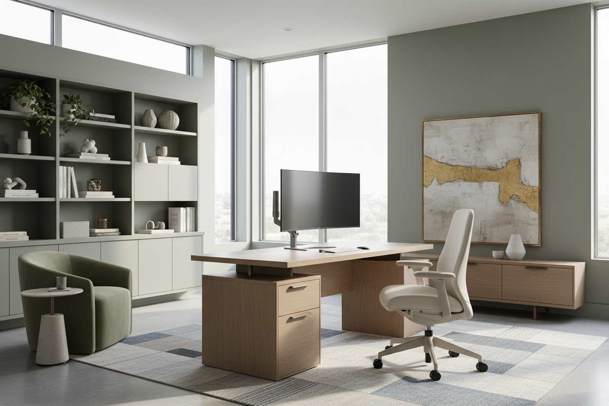
The catalog stylists use the "rule of thirds" and rigorous editing. They remove all functional clutter (remote controls, cables, mail). To mimic the image, you need to invest in hidden storage solutions to keep surfaces strictly for decorative styling objects.


Leave a comment
This site is protected by hCaptcha and the hCaptcha Privacy Policy and Terms of Service apply.