


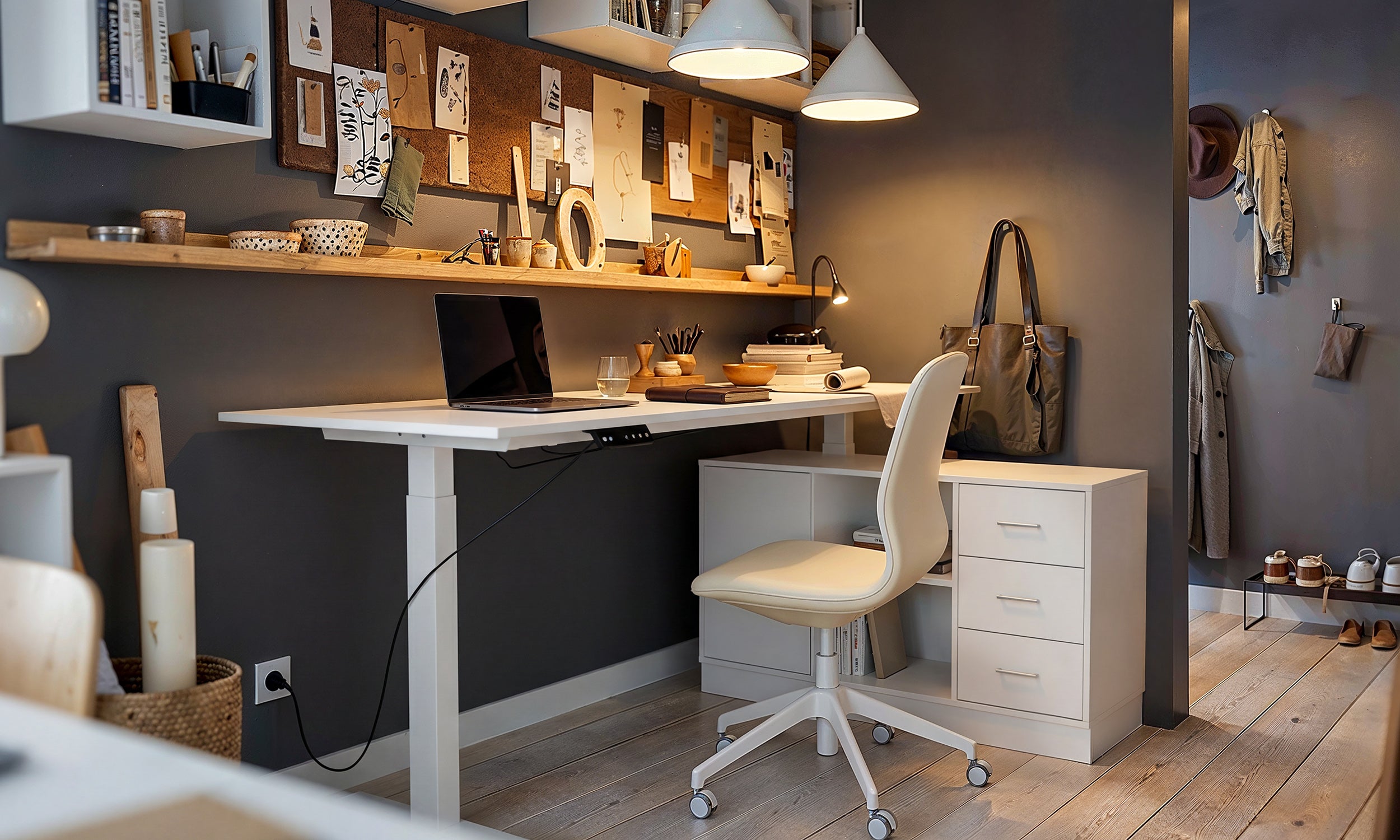
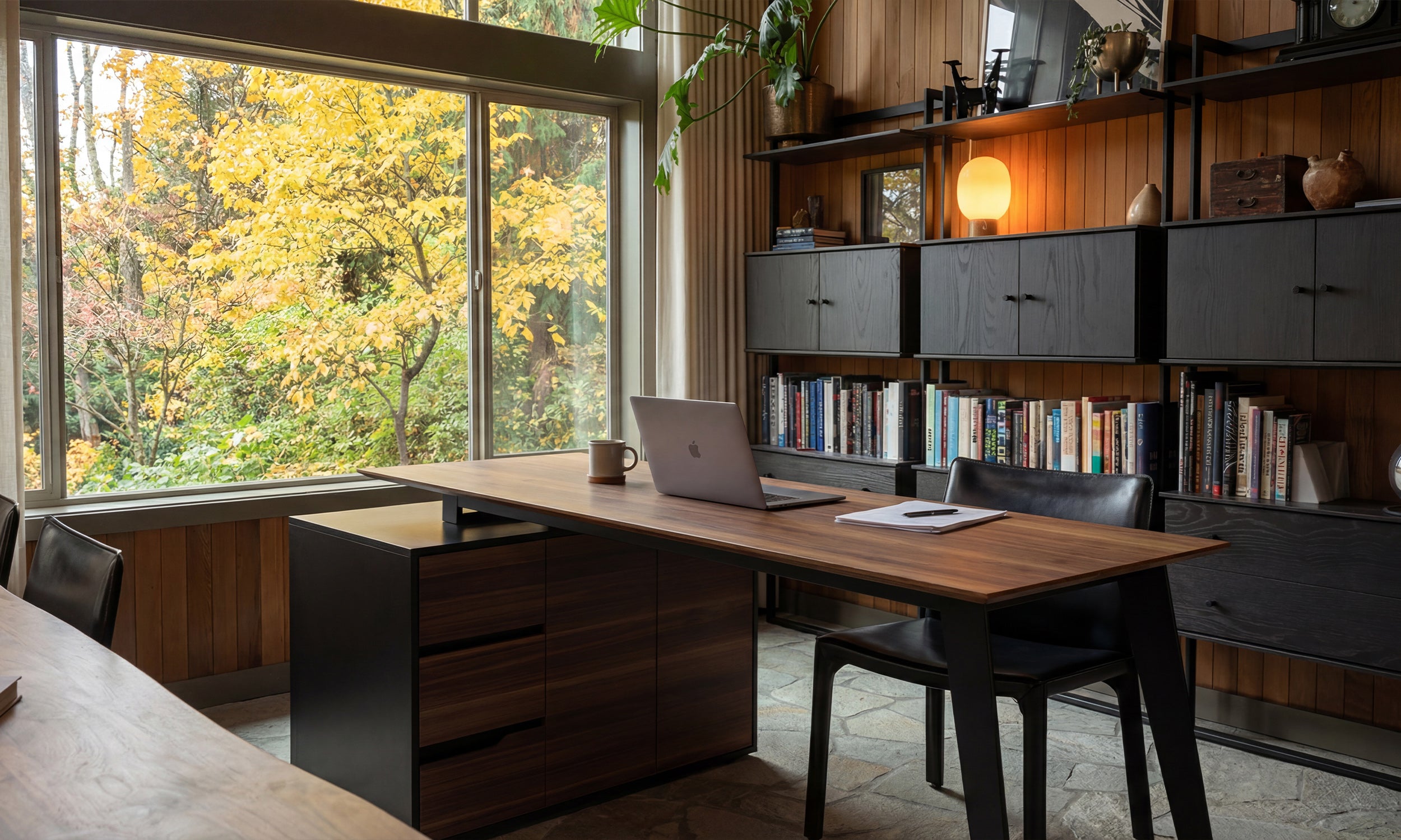


Working from home often means fighting a daily battle against visual clutter. When your desk is covered in monitors, paperwork, and tangled cords, the last thing you need is a chaotic color palette fighting for your attention. This is why a monochromatic home office is incredibly effective. By restricting your color palette to a single hue, you instantly lower visual fatigue and create a workspace built for deep focus.
But there is a fine line between a sophisticated, single-color room and a space that feels like a sterile, flat box. When you strip away contrasting colors, you have to rely on other design principles to make the room feel inviting. Here is exactly how to execute this look successfully without losing the warmth and character of a lived-in home.
Quick Decision Guide
- Vary your textures: When color is restricted, texture must do the heavy lifting. Pair matte walls with a high-gloss lamp, a ribbed wood desk, or a bouclé chair.
- Match your undertones: Ensure your shades share the same temperature (warm vs. cool) to prevent the room from feeling disjointed or accidental.
- Use the 60-30-10 rule: Apply your main color to 60% of the room (walls), a lighter or darker shade to 30% (furniture), and the deepest accent tone to 10% (decor and hardware).
- Layer your lighting: A single overhead light flattens a one-color room. Use task lighting and floor lamps to cast shadows and carve out depth.
Mastering Style and Coordination
Nailing the Undertones
The secret to a successful monochromatic office design lies in the undertones. If you decide on a blue office, you cannot simply grab any blue item from the store. A navy desk with green undertones will clash awkwardly against a slate blue wall with purple undertones. Stick to a strict temperature family. If you choose a warm, earthy green, ensure your upholstery, rugs, and paint all share that same yellow-green base so the space feels intentional.
The Power of Texture
Without contrasting colors to guide the eye, your brain needs tactile differences to process the space. If your walls are flat paint, your desk is smooth laminate, and your chair is sleek leather, the room will feel heavy and lifeless. Introduce visual friction. Think a heavy linen drapery panel, a plush wool rug, or a leather chair with heavy stitching. These varied surfaces catch the light differently, giving your single hue incredible depth.
Space Planning and Visual Weight
Anchoring the Desk
In North American homes, office spaces are often carved out of spare bedrooms or open-concept dens. When working with one color, the silhouette of your furniture dictates the room's flow. A chunky, solid desk in the exact same color as the wall can look like a giant block floating in the room. To fix this, look for desks with negative space—like thin metal legs or open shelving. This allows the room to breathe while maintaining the cohesive color story. Leave at least 36 inches of clearance behind the desk so you can roll your chair back comfortably without scraping the baseboards.
Designer's Honest Take
A few years ago, I designed a moody, charcoal-gray workspace for a client in Toronto. We painted the walls, trim, and ceiling in a deep charcoal, and brought in a matching matte gray desk. In photos, it was stunning. In reality? I learned a hard lesson about matte finishes in dark, monochromatic spaces.
Every single smudge from a coffee mug, fingerprint, and speck of dust became a glaring focal point on that matte desk. We ended up having to swap the surface for a lightly grained, stained ash wood in a similar tone just to hide the daily wear and tear. If you go dark with your palette, mix your sheen levels. Use a satin or semi-gloss finish on high-touch surfaces, and embrace wood grains to hide the inevitable smudges of daily life.
Frequently Asked Questions
Does a monochromatic room have to be black or white?
Not at all. While all-black or all-white spaces are popular, monochromatic simply means using variations of one color. Sage green, dusty blue, and warm terracotta are excellent choices that feel soothing and highly professional.
How do I add warmth to a monochromatic office design?
Bring in natural materials. Even in an all-gray or all-blue room, incorporating a natural walnut chair frame, woven rattan baskets, or a jute rug adds necessary warmth without breaking the single-color rule. Metallic hardware in unlacquered brass also works wonders.
What is the best color for a home office?
It depends entirely on your workflow. Blues and greens are universally recommended for high-focus, analytical work because they tend to lower heart rates and reduce stress. Warmer tones like muted yellows or soft terracottas are better suited for creative roles that require high energy and stimulation.


Leave a comment
This site is protected by hCaptcha and the hCaptcha Privacy Policy and Terms of Service apply.