


You have roughly three seconds to convince a passerby that what you have to offer is worth their time. Whether you are arranging a retail store entrance, setting up a booth at a trade show, or styling the entryway of a boutique hotel, the front table is your primary hook. It acts as the physical handshake between your space and the visitor. If this surface is cluttered, confusing, or barren, you lose the interaction before it even begins.
A successful front table does not just hold items; it tells a story. It establishes the price point, the vibe, and the quality of everything else inside. The goal is to create a "speed bump"—a visual interruption that causes someone to pause physically and mentally shifting them from walking mode to browsing mode. This requires a specific blend of height, color psychology, and strategic negative space.
My $500 Mistake at the Market
I learned the hard way that volume does not equal value. A few years ago, I helped a friend run a booth at a high-traffic maker's market. We were terrified of looking understocked, so we crammed every square inch of our six-foot table with product. We had candles, ceramics, and prints all fighting for attention on a flat plane. The result? People walked right past. It looked like a rummage sale, not a curated shop.
Around noon, out of frustration, we pulled 40% of the stock off the floor. We used empty crates under the tablecloth to create elevation tiers. We placed a single, large ceramic vase dead center and grouped the candles in threes. The difference was immediate. By creating breathing room, we increased the perceived value of the items. We stopped trying to sell everything at once and focused on selling the idea of the product. Sales tripled in the second half of the day. That experience taught me that the front table is a stage, not a storage unit.
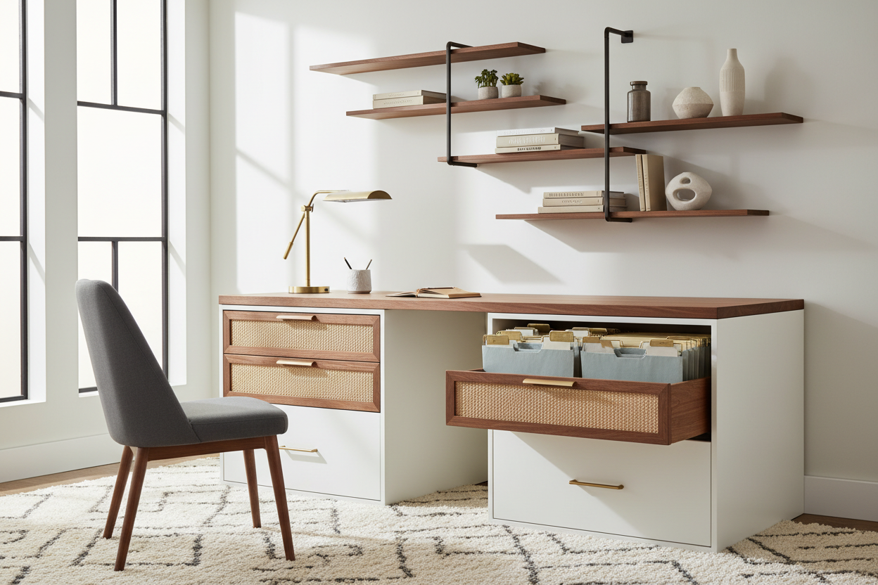
The Pyramid Principle of Display
Flat displays are visually boring. The human eye naturally scans landscapes, looking for peaks and valleys. When you are styling your front table, you need to build vertically. This is often called the Pyramid Principle. You want your tallest item in the center (or slightly off-center) with medium and smaller items cascading down from it. This guides the eye in a triangular motion, keeping the viewer's gaze trapped within your display rather than sliding off the edge.
If you are in a retail setting, use risers, acrylic blocks, or even stacked books to vary the height. If you are setting up a reception or event desk, a tall floral arrangement or signage usually serves as the peak. This verticality ensures that your table is visible from a distance, effectively extending your reach beyond the immediate footprint of the furniture.
Don't Waste the Table Front
While most people focus on the horizontal surface, the vertical space facing the customer—the table front—is arguably just as valuable. This is prime real estate for branding and messaging. If you leave this area bare or cover it with a wrinkled, ill-fitting cloth, you are missing a massive opportunity to communicate who you are.
For trade shows and pop-ups, the table front is where your logo belongs. It should be large enough to be read from ten feet away. However, avoid putting critical information like QR codes or website URLs at the very bottom near the floor; nobody is going to crouch down to read them. Keep the critical visual elements in the top third of the skirting or draping.
In a brick-and-mortar retail context, the front of the table can be used for cross-merchandising. Baskets placed on the floor directly in front of the table legs can hold lower-price-point impulse buys. This adds depth to the display and captures the attention of customers who might be looking down at their phones as they walk in.
Lighting and the "Moth Effect"
Even the most beautifully arranged collection will fail if it sits in the shadows. Humans are phototropic; we naturally move toward light. Your front table needs to be the brightest point in the immediate vicinity. If you rely solely on overhead fluorescent lighting, your display will look flat and unappealing.
Use accent lighting to create drama. A simple clip-on spotlight or a portable battery-operated lamp can create highlights and shadows that give your products texture. If you are selling jewelry or glass, lighting is non-negotiable to make the items sparkle. The light source should be directed at the product, not the customer's eyes. This focused illumination acts as a subconscious signal that the items on this table are special and deserve attention.
The Rule of Three and Asymmetry
Symmetry is safe, but asymmetry is interesting. When objects are lined up perfectly straight, the brain processes the image quickly and moves on. Asymmetry creates a slight visual tension that forces the brain to linger longer to process the scene. This extra second of cognitive processing is often enough to stop a customer in their tracks.
Group items in odd numbers. The "Rule of Three" suggests that arrangements of three items are more visually pleasing than even-numbered groupings. For a front table, try grouping a tall item, a medium item, and a low item together. This creates a self-contained vignette. You can repeat this cluster strategy across the length of the table to create rhythm without making it look chaotic.
Rotation is Key
A static front table eventually becomes invisible. If you have regular foot traffic or repeat customers, seeing the same display twice signals that nothing new is happening inside. You should refresh this focal point frequently. This doesn't always mean swapping out every single product. Sometimes, simply changing the color of the tablecloth or moving the "peak" of your pyramid from the center to the left side is enough to re-engage the brain of a returning visitor.
Treat this space as a living entity. It is the most valuable square footage you control. By respecting the geometry of the display and utilizing the table front for branding, you transform a piece of furniture into a silent salesperson that works for you every time someone walks by.
Frequently Asked Questions
How high should the focal point be on a standard front table?
Ideally, your tallest element should sit at or slightly below eye level (around 5 feet from the ground). If the item is too high, it blocks the view into the rest of the space; if it is too low, it fails to attract attention from a distance.
What is the best way to cover the table front if I don't have a branded tablecloth?
A solid color runner or a neatly pinned fabric drape works well. You can pin a printed foam board sign to the fabric or use a runner that hangs over the front edge with your logo, which is often cheaper and more versatile than a fully printed fitted sheet.
How much merchandise should be on the front table?
Less is usually more. Aim to cover about 60% of the surface area, leaving 40% as negative space. This prevents the "garage sale" look and allows customers to pick up items and set them down without fear of knocking something over.
Leave a comment
This site is protected by hCaptcha and the hCaptcha Privacy Policy and Terms of Service apply.