


I was sitting on my pebble-grey linen sofa, staring at my greige walls and my oatmeal-colored rug, when I realized I was living in a sensory deprivation tank. Everything I owned was 'timeless' and 'sophisticated,' which is just code for boring. I had spent years curating a space that felt like a high-end dentist’s waiting room, and I was officially over it. I didn't need another neutral throw pillow; I needed a pink tv stand.
- Pink works as a 'new neutral' when you choose muted blush or dusty rose tones.
- A bold media console is a lower commitment than painting an entire accent wall.
- Closed storage is mandatory to keep the look 'adult' rather than 'dorm room.'
- Mixing pink with metals like brass or black steel prevents the space from looking too saccharine.
The Breaking Point of My All-Neutral Era
The breaking point happened on a rainy Tuesday. I looked around my perfectly curated, monochromatic living room and felt absolutely nothing. No joy, no spark, just a vague sense of architectural competence. We’ve been told for a decade that neutrals are the only safe bet for resale value and 'clean' aesthetics, but my house didn't feel like a home—it felt like a staging unit for a real estate listing. I realized that my fear of making a 'design mistake' was actually just preventing me from having a personality.
I started small, looking for a way to inject a shot of adrenaline into the room. I didn't want to commit to a fuchsia velvet sofa (I’m not that brave yet), but the media center was the obvious candidate for a glow-up. It’s the focal point of the room, the thing everyone stares at for three hours a night while binge-watching. Swapping my safe, mid-century walnut unit for something unapologetically pink felt like a rebellion against the 'sad beige' lifestyle that had taken over my Pinterest boards.
Why I Chose a Pink Media Console Over Painted Walls
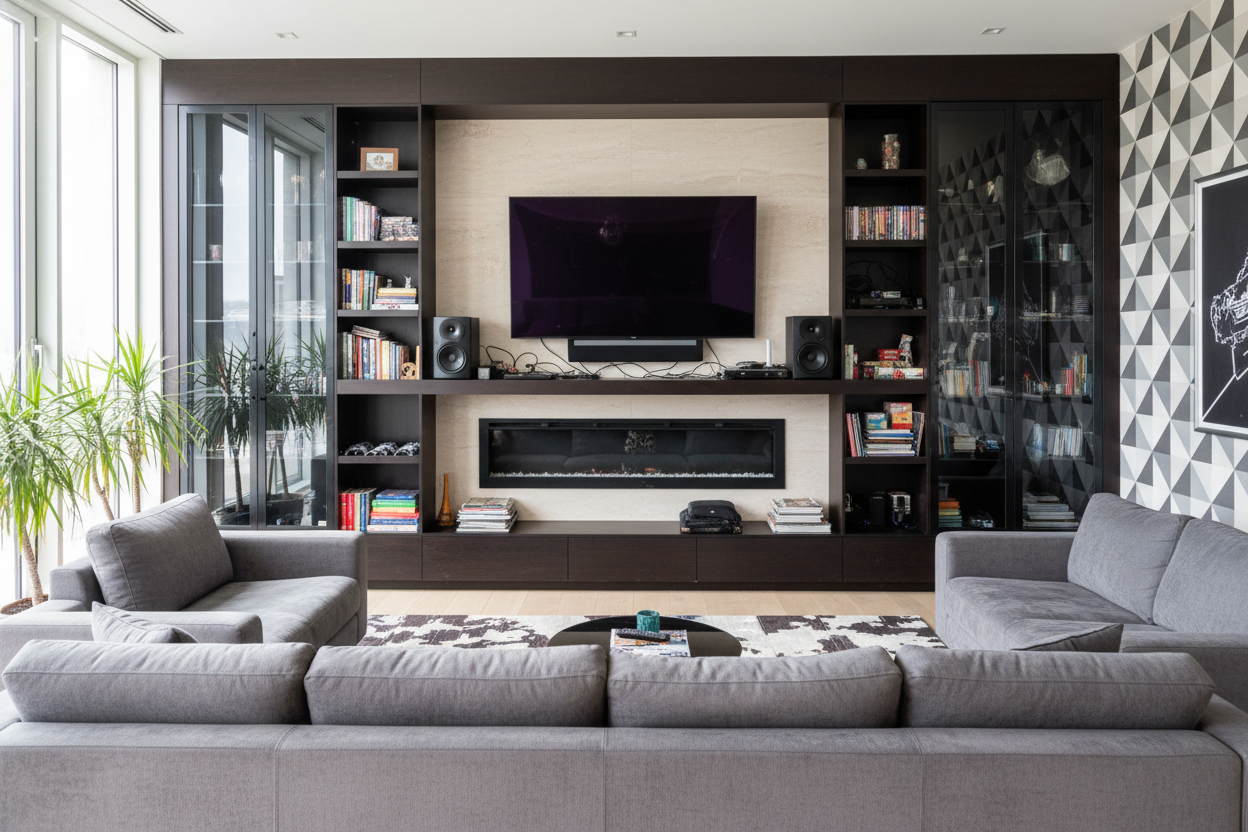
Painting a room is a massive production. You have to move the furniture, tape the baseboards, deal with the fumes, and then inevitably realize the 'soft petal' color you picked looks like a bottle of Pepto-Bismol in the afternoon light. A furniture piece is different. It’s a contained burst of color. When I started my search, scrolling through endless pages of standard Tv Stands felt like a chore. It was a sea of weathered oak, matte black, and industrial metal. Everything looked like it belonged in a converted loft in 2014.
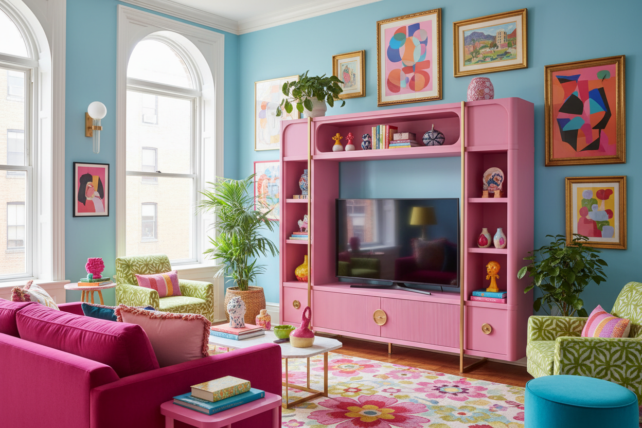
Then I saw it: a 60-inch media console in a deep, dusty pink with reeded door fronts. It wasn't just a place to put the TV; it was a piece of art. Choosing a pink tv console allowed me to keep my neutral walls and expensive sofa while completely shifting the energy of the room. It’s the difference between wearing a grey suit with a white shirt or wearing that same suit with a pair of neon socks. It’s a calculated risk that pays off every time you walk through the front door.
Finding Your Shade: From Soft Blush to Hot Pink
Not all pinks are created equal. If you’re worried about your living room looking like a five-year-old’s birthday party, the shade is everything. A blush pink tv stand or a light pink tv stand is surprisingly versatile. These tones have a lot of grey and brown undertones, making them behave more like a warm taupe or a sophisticated nude. They play well with olive greens, navy blues, and even mustard yellows. It’s the 'grown-up' way to do color without screaming for attention.
On the flip side, if you’re leaning into maximalism, a hot pink tv stand is the way to go. This isn't for the faint of heart. A vibrant, high-saturation pink works best in rooms that already have some visual weight—think dark charcoal walls or heavy velvet curtains. It acts as a grounding element because it’s so intentional. When you go bold, you have to go all the way. A pastel tv stand in a dark, moody room might look like an accident; a hot pink one looks like a manifesto.
Pastel vs. Punchy: Matching Your Vibe
If your style leans more toward 'Parisian chic,' go for a pastel or blush unit with brass hardware. The metallic accents pull the pink out of the nursery and into the salon. I personally paired my unit with a set of heavy marble bookends and a matte black lamp to keep it grounded. If you’re more into the 'eclectic maximalist' vibe, don't be afraid of a pink tv cabinet with a glossy finish. Just make sure the rest of your decor has enough 'heft' to balance it out. You want the pink to look like a choice, not a compromise.
How to Style It (Without Looking Like a Barbie Dreamhouse)
The secret to making a pink entertainment center look sophisticated is all in the styling—and the cable management. Nothing kills a 'cool' furniture vibe faster than a tangle of black power strips and HDMI cords hanging out the back. I learned this the hard way. My first attempt looked messy because I had open shelving that showed off my dusty PlayStation and a mountain of tangled wires. I eventually realized that Why I Swapped My Minimalist Console for a Display Cabinet TV Stand was the right move; having doors to hide the tech allowed the color of the stand to be the star.
To keep the look adult, avoid pairing your pink stand with too many other 'girly' tropes. Skip the floral prints and the heart-shaped pillows. Instead, lean into hard textures. Think concrete planters, smoked glass vases, and oversized coffee table books with bold, graphic covers. You want to create contrast. The softness of the pink needs the hardness of industrial or modern materials to feel balanced. I also recommend keeping the top of the console relatively clear—maybe one lamp and a single tray—so the color of the unit itself can breathe.
The Unexpected Charm of a Pink Fireplace Unit
If you really want to go for the 'cozy but cool' vibe, you might even look into a pink fireplace tv stand. It sounds wild, but there is something incredibly charming about the glow of an electric fire against a soft pink frame. It turns the TV area into a legitimate hearth. For those who aren't quite ready for a solid block of color, a pink and white tv stand offers a nice compromise. The white framing breaks up the pink, making it feel lighter and less dominant in a small room.
If you're still feeling a bit nervous about the commitment, you could always look at something like a 30 Inch Electronic Fireplace With White Tv Stand And Adjustable Light as a baseline and then customize it with pink accessories or a pink runner. But honestly? Just buy the pink stand. My biggest mistake was waiting two years to do it because I was worried what people would think. Now, everyone who comes over asks where I got it. It’s the only piece of furniture I own that actually starts a conversation.
FAQ
Will a pink TV stand make my room look like a nursery?
Only if you surround it with stuffed animals and ruffles. If you style it with clean lines, metallic accents, and sophisticated art, it looks like a high-end designer choice. Stick to matte finishes rather than high-gloss if you're worried about it looking too 'toy-like.'
What colors go best with a pink media console?
Forest green is the magic pairing—it's the direct opposite on the color wheel and makes the pink pop without looking childish. Navy blue, charcoal grey, and even deep burgundy also work beautifully to ground the brightness.
Is pink furniture just a passing trend?
People have been using 'Millennial Pink' for a decade now, and it hasn't gone away; it has just evolved. A muted blush is basically a permanent part of the modern color palette at this point. It's as timeless as navy or sage green.

Dejar un comentario
Este sitio está protegido por hCaptcha y se aplican la Política de privacidad de hCaptcha y los Términos del servicio.