


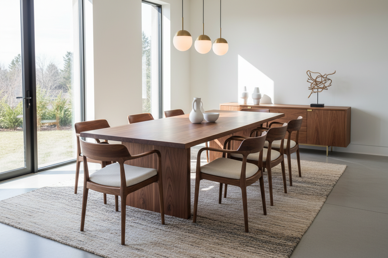
There is a distinct difference between a cozy workspace and a cramped closet. The deciding factor is rarely the square footage itself, but rather how intelligently that space is utilized. When clients approach me with limited room, they often assume they must sacrifice style for utility. However, the correct **floor plan for small office** design proves that constraint often breeds the most sophisticated creativity. By prioritizing flow, light, and scale, we can turn a compact footprint into a powerhouse of efficiency.
Key Considerations for Compact Layouts
- Traffic Flow: Ensure a minimum of 30-36 inches of clearance behind desks for chair movement.
- Vertical Utilization: Prioritize floor-to-ceiling joinery to reduce the furniture footprint on the floor.
- Light Source Orientation: Position screens perpendicular to windows to mitigate glare while maximizing ambient light.
- Scale & Proportion: Select furniture with exposed legs (visual permeability) rather than solid bases to make the room feel larger.
- Power Access: Map electrical outlets before finalizing the layout to avoid hazardous cord clutter.
Zoning and Spatial Dynamics
Creating a simple small office floor plan begins with zoning. In interior design, we refer to the "work triangle" in kitchens, but offices have a "focus axis." This is the direct line of sight from your chair. If your desk faces a blank wall, visual fatigue sets in quickly. If it faces the door, you gain a sense of command, but in a small room, this might block the entry.
For a small office plan layout with dimensions that work, I recommend the "anchored floating" position. Instead of pushing the desk flush against a wall, pull it out 12 inches if space permits, or anchor one short end to the wall (peninsula style). This allows the room to breathe and creates distinct zones for work and circulation.
Materiality and Visual Weight
When reviewing a small office blueprint, the physical size of furniture is only half the battle; visual weight is the other. A solid mahogany executive desk will visually suffocate a 10x10 room. Instead, look for materials that offer durability without bulk.
Glass and Metal
Tempered glass or acrylic surfaces allow light to pass through the furniture, tricking the eye into seeing more floor space. Pair this with slender steel frames for a modern, industrial look that maintains structural integrity without the heaviness of wood.
Wood Veneers vs. Solid Timber
If you prefer the warmth of wood, opt for high-quality veneers on engineered wood substrates. These provide the tactile luxury of timber but often allow for thinner profiles than solid wood construction, which requires bulk for stability. This is crucial when trying to fit a small office plan 3d visualization into reality.
Ergonomics in Tight Quarters
Simple office floor plans often fail because they ignore the human element. A chair is not static. You need to account for the "push-back" zone. When drafting your layout, draw a circle with a 42-inch diameter around the center of your desk chair. If this circle intersects with a bookshelf or a door swing, the layout will feel claustrophobic regardless of the aesthetic.
My Personal Take on floor plan for small office
I learned a hard lesson about small office layouts during a project for a client in a historic brownstone. We were working with a narrow, high-ceilinged room. On paper (and even in the small office plan 3d render), the layout looked impeccable. We placed a beautiful mid-century credenza behind the desk.
However, I hadn't accounted for the specific mechanism of the client's preferred ergonomic chair. It had a deep recline function. The first time he leaned back to take a call, the headrest slammed into the credenza with a heart-stopping thud. It wasn't just about the dimensions on the floor; it was about the dynamic volume of the furniture in use. We had to swap the credenza for shallow floating shelves. Now, I always perform a "recline test" measurement—adding an extra 8 inches to the standard chair clearance zone to ensure the client can relax without fear of collision. It’s these unpolished, practical details that define a truly livable space.
Conclusion
Designing a small office is an exercise in editing. It requires you to be ruthless with clutter and intentional with every inch. By selecting the right materials and adhering to strict dimension guidelines, you can create a workspace that feels expansive, professional, and deeply personal. It is not about how much space you have, but how you command it.
Frequently Asked Questions
What is the minimum size for a functional home office?
While you can squeeze a workspace into a closet, a standalone functional office typically requires a minimum of 7x10 feet (70 sq ft). This allows for a standard 48-inch desk, a chair with proper clearance, and a small storage unit without impeding the door swing.
Should my desk face the window in a small office?
Ideally, no. Facing a window directly can cause eye strain due to the contrast between the bright outdoors and your screen. Placing the desk perpendicular to the window is the best approach for simple small office floor plans, offering natural light without the glare.
How do I make a small office look bigger?
Use the vertical plane. Floor-to-ceiling shelving draws the eye upward, emphasizing ceiling height rather than limited floor area. Additionally, using a large area rug that tucks under all furniture legs can unify the space, whereas small rugs chop up the floor visually.
Leave a comment
This site is protected by hCaptcha and the hCaptcha Privacy Policy and Terms of Service apply.