


We have all walked into a workspace that feels sterile, cold, and utterly uninspiring. The walls are bare, or worse, adorned with generic, mass-produced prints that look like placeholders. As a designer, I see this constantly: clients invest heavily in ergonomic chairs and mahogany desks but treat wall art as an afterthought. The truth is, the right visual elements define the atmosphere of a room. Selecting the perfect office decor pictures is not merely about covering a blank space; it is about curating an environment that fosters focus, creativity, and professional confidence.
Key Features to Look For
- Scale and Proportion: The artwork must command the wall without overwhelming the furniture below it.
- Glazing Quality: In office environments with overhead lighting, anti-reflective or museum glass is crucial to prevent glare.
- Color Psychology: Select hues that align with the room's function (e.g., blues for focus, abstract vibrant tones for creativity).
- Frame Material: Ensure the frame finish complements your existing millwork or metal accents (e.g., walnut frames for traditional desks, matte black for modern setups).
Mastering Scale and Composition
The most frequent error I encounter in DIY office design is incorrect sizing. A postage-stamp-sized print floating above a six-foot sofa creates a sense of visual imbalance that feels unsettling, even if you can't articulate why. To achieve a high-end look, you must respect the rule of visual weight.
The Two-Thirds Rule
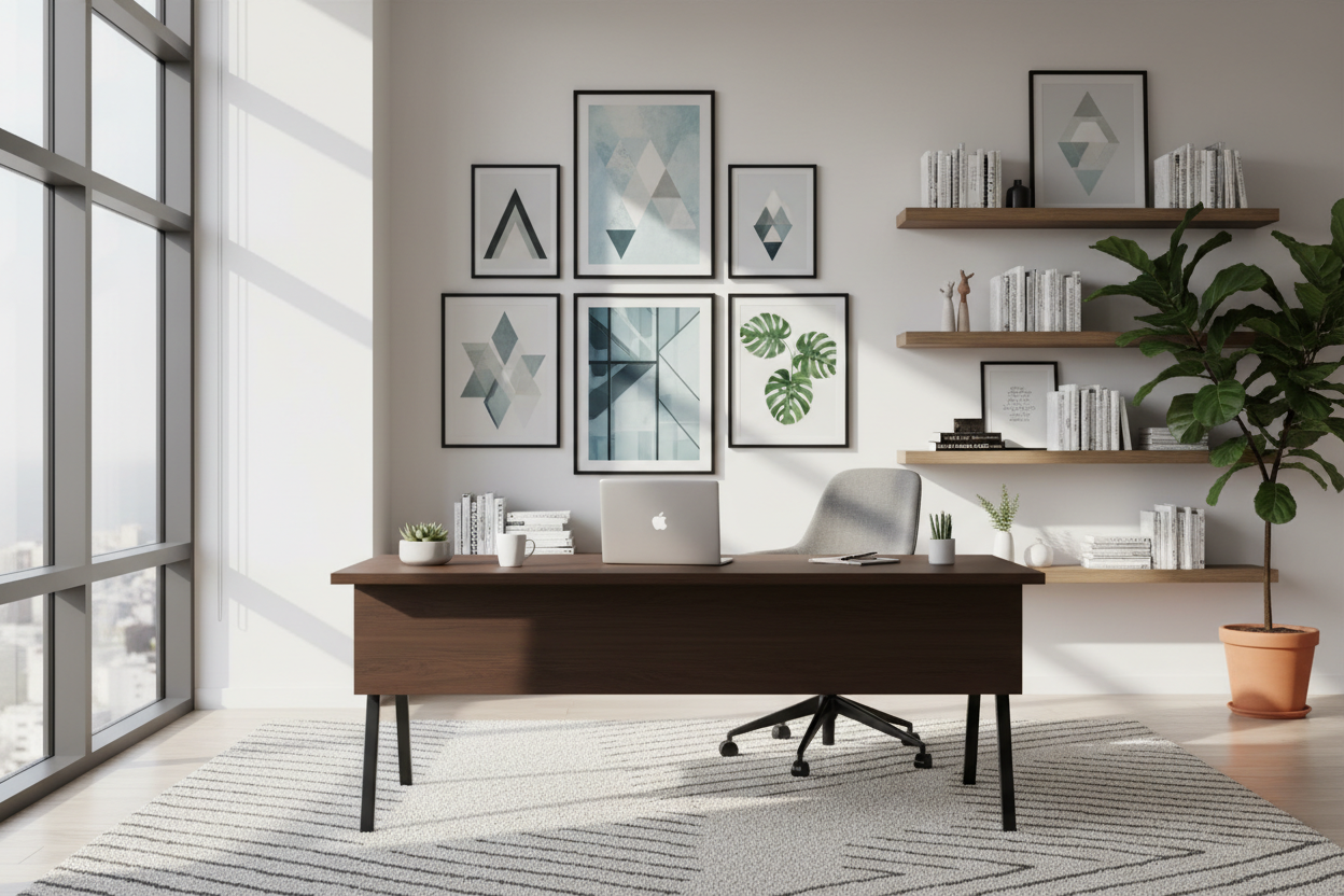
When hanging art above a desk or credenza, the piece (or the collective width of a gallery set) should span approximately two-thirds to three-quarters of the furniture's width. This anchors the art to the furniture, creating a cohesive vignette rather than two floating objects.
Gallery Wall vs. Statement Piece
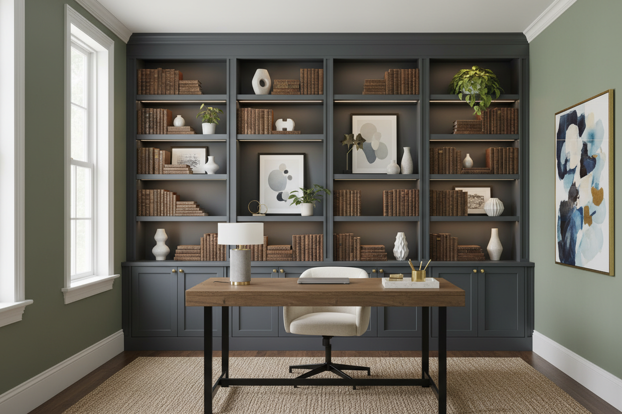
Deciding between a collection of pictures for office decoration or a singular statement piece depends on the room's energy. A single, large-scale abstract work creates a focal point that feels calm and authoritative—ideal for executive suites. Conversely, a grid of smaller, framed architectural prints suggests precision and order, which works beautifully in legal or financial home offices.
Materiality and Glazing Considerations
In a showroom, lighting is controlled. In your office, it likely isn't. When choosing between canvas, metal prints, or framed paper, you must consider light sources.
Canvas offers a softer, more textual aesthetic that absorbs light, making it excellent for rooms with aggressive fluorescent lighting or large windows. However, if you prefer the sharp elegance of a framed print, pay close attention to the glazing. Standard glass reflects everything. I always advise clients to upgrade to non-glare acrylic or museum glass. It ensures that your carefully selected art remains visible from every angle, rather than becoming a mirror for your computer screen.
Color Coordination and Mood
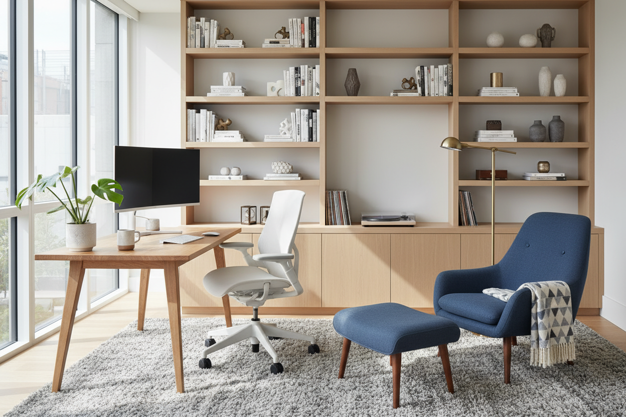
Art is the bridge between your neutral furniture and your wall color. It shouldn't match perfectly; it should coordinate. If your office features heavy leather and dark woods, look for artwork with lighter, cooler tones to break up the visual density. If your space is a modern "white box," introduce warmth through sepia-toned photography or textured fiber art.
My Personal Take on Office Decor Pictures
I learned a hard lesson early in my career regarding the "unpolished" reality of office art. I once specified a stunning, oversized photography print encased in high-gloss acrylic for a client's south-facing office. It looked incredible during the installation at 8:00 AM. However, by noon, the sun hit that wall, and the reflection was so blinding it actually triggered a migraine for the client sitting opposite it.
Since then, I have been obsessive about "light mapping" a room before buying art. Another detail people forget: acoustic impact. I recently worked on a minimalist office with concrete floors that echoed terribly. We swapped out glass-framed pictures for large-scale, gallery-wrapped canvas with acoustic foam backing. It dampened the sound significantly while maintaining the aesthetic. It’s these functional nuances—glare and acoustics—that separate a pretty room from a livable workspace.
Conclusion
Your workspace is where you build your legacy, and it deserves more than generic decor. By paying attention to scale, managing light reflection, and choosing art that resonates with your professional ethos, you create a space that supports your workflow. Treat your walls as a canvas for motivation, not just a backdrop for video calls.
Frequently Asked Questions
How high should I hang my office pictures?
The center of the artwork should be at eye level, which is generally 57 to 60 inches from the floor. However, if you are hanging art specifically to be viewed while sitting at a desk, you may want to lower this slightly so the center aligns with your seated line of sight.
What is the best subject matter for a professional office?
Abstract art, landscapes, and architectural photography are safe, sophisticated bets. They provide visual interest without being distracting. Avoid chaotic imagery or overly personal photos in the direct background of your webcam view to maintain professionalism.
Can I mix frame styles in a single office?
Yes, but with caution. To maintain a cohesive look, keep one element consistent. You can mix frame colors (like black and wood) if the matting is the same, or mix frame thicknesses if the material (e.g., all gold metal) remains consistent. Total randomness tends to look cluttered rather than curated.
Leave a comment
This site is protected by hCaptcha and the hCaptcha Privacy Policy and Terms of Service apply.