


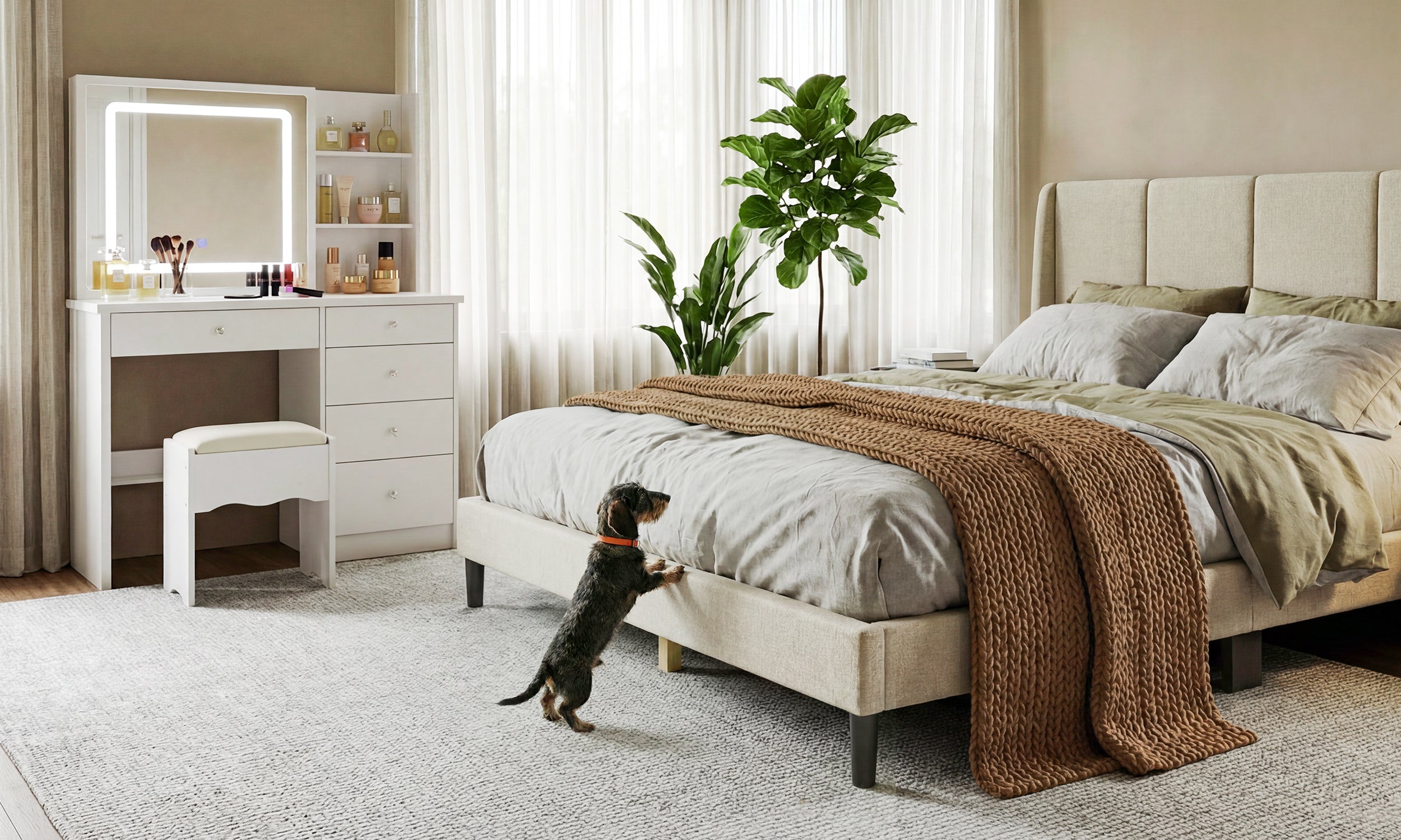
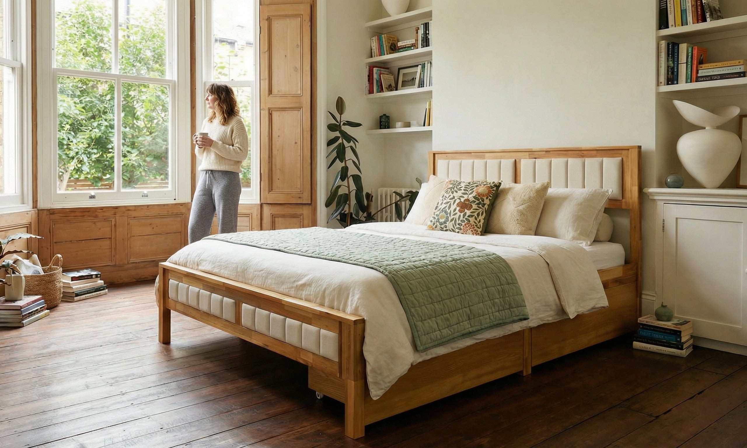
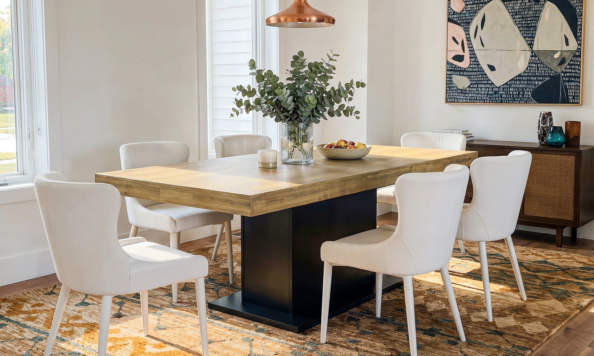
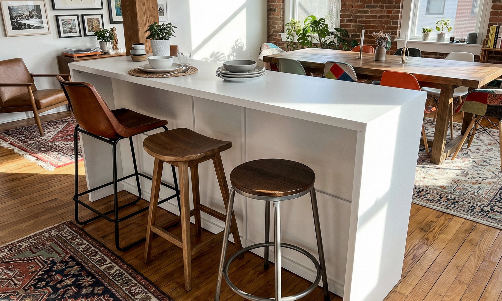


We have all walked into a space that feels disjointed—where the sofa feels like an intruder rather than an anchor. The problem usually isn't the quality of the piece, but the hue. Selecting the right color living room furniture is less about picking your favorite shade and more about understanding light, volume, and visual weight. As an interior designer, I see homeowners paralyzed by the fear of choosing the wrong fabric, often defaulting to 'safe' greige that leaves the room feeling flat. This guide will help you navigate the nuances of palette selection to curate a space that feels intentional and sophisticated.
Quick Decision Guide: Key Selection Factors
If you are rushing to make a purchase, review these critical factors first to ensure your investment stands the test of time.
- Light Exposure: North-facing rooms require warmer furniture tones to counteract blue light; south-facing rooms can handle cool, moody hues.
- Fabric Texture: Velvet absorbs light, making colors appear deeper; linen and cotton reflect light, making the same color appear softer.
- Traffic Levels: Dark colors hide stains but highlight dust and pet hair; mid-tones with a weave pattern are the most forgiving.
- Undertones: Always match the undertone of your furniture (warm vs. cool) with your existing flooring and wall paint.
The Psychology of Palette and Space Planning
When selecting colors for living room furniture, you are essentially manipulating the perceived size and mood of the room. Darker, heavier colors like charcoal, navy, or forest green add 'visual weight.' These work beautifully as focal points in large rooms but can make a small apartment feel claustrophobic if not balanced with negative space.
Balancing the 60-30-10 Rule
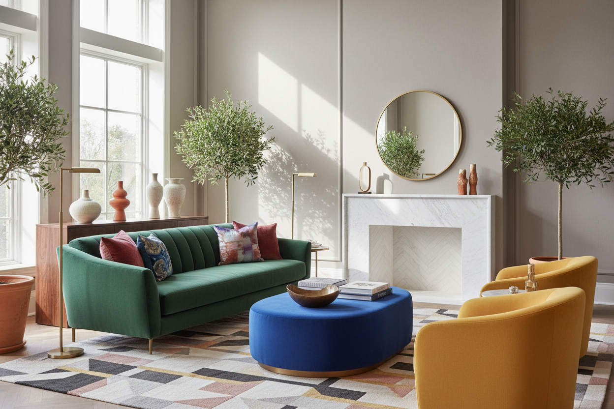
In professional design, we often reference the 60-30-10 rule. Your walls and flooring make up the 60%. Your main upholstery—usually the sofa—represents the 30%. This is where your choice of living room furniture colours becomes pivotal. If your shell is neutral, a terracotta or olive sofa acts as the grounding element. The final 10% comes from accent chairs or ottomans, where you can afford to be bold with patterns or high-saturation hues.
Material Matters: Texture Modifies Color
You cannot separate color from material. I often see clients confused when the 'emerald green' they saw online arrives looking like a dull moss. This is usually a texture issue. When looking at different color living room furniture, remember that shiny fabrics (like mercerized cotton or performance velvet) will bounce light and appear lighter on the curves. Matte fabrics (like wool or boucle) will hold the shadow, making the color read truer and flatter.
Breaking Up the "Set" Mentality
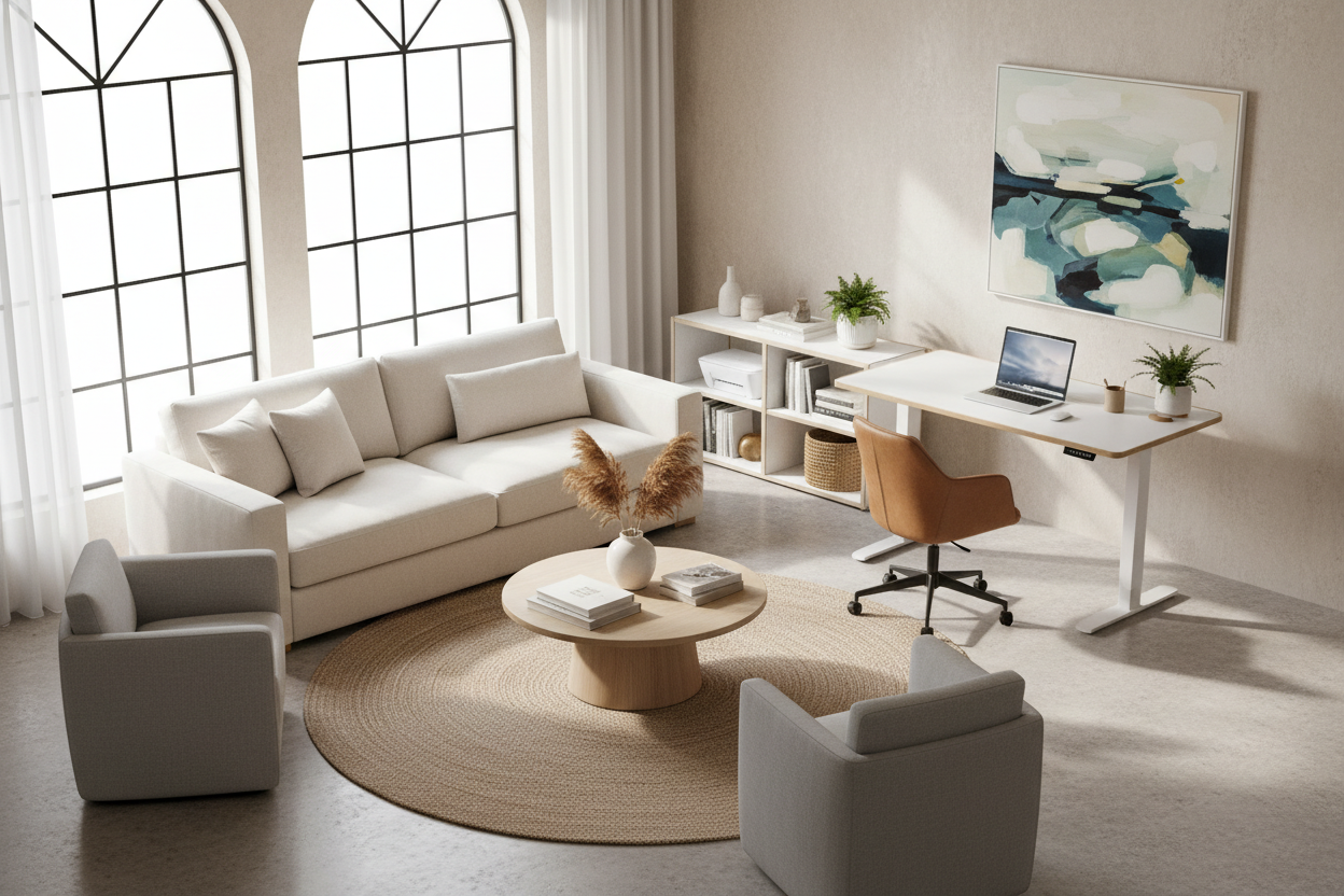
One of the most common mistakes is purchasing matching living room set colors. While convenient, a sofa and two armchairs in the exact same fabric can make a room look like a furniture showroom rather than a curated home. To achieve a high-end look, vary the tones. If your main sofa is a deep cognac leather, consider pairing it with armchairs in a textured cream or a subtle plaid. This layering creates depth and prevents the eye from getting bored.
Lessons from My Own Projects: The "Chameleon" Gray
I want to share a specific experience that changed how I advise clients on neutrals. I once specified a high-end, light gray sectional for a client with a stunning window-heavy living room. In the showroom, under 3000K LED lighting, it was a perfect, crisp dove gray.
However, once we installed it in the client's home, surrounded by the lush greenery of their garden outside, the gray fabric reflected the green cast from the windows. For most of the day, that expensive 'gray' sofa looked undeniably mint green. It was a disaster. We had to install sheer curtains to filter the light and change the rug to a warm rust tone just to neutralize the green cast.
The lesson? Always test a large swatch in your actual room for at least 24 hours. Watch how the color shifts from morning sunlight to evening artificial light. Also, a practical note on dark furniture: I have found that while navy or black velvet looks luxurious, it is a nightmare for lint. I once spent 20 minutes before a photoshoot just lint-rolling a dark blue armchair because it attracted dust like a magnet. If you have pets, mid-tone weaves are your only true friend.
Conclusion
Choosing the right furniture color is a balance of bravery and practicality. Don't be afraid to step away from the safety of beige, but do so with an understanding of your room's lighting and your lifestyle realities. A well-chosen color can elevate your furniture from simple seating to a piece of art that defines your home.
Frequently Asked Questions
What are the most forgiving colors for living room furniture with kids and pets?
Mid-tone grays, taupes, and navy blues are generally the most forgiving. However, the secret isn't just the color, but the variation. Fabrics with a 'heathered' look or a tweed weave hide stains and pet hair much better than solid, flat colors.
Should my accent chairs match my sofa color?
Ideally, no. To create a designer look, your accent chairs should coordinate but not match. If your sofa is a solid color, try a patterned fabric or a different texture (like leather vs. fabric) for the chairs in a complementary hue.
How do I mix wood tones with colored upholstery?
Focus on the undertones. Warm upholstery colors (reds, oranges, creams) generally pair well with warm woods like walnut or oak. Cool upholstery tones (blues, grays, teals) often look sharpest against ash, black stain, or very dark espresso woods.

Leave a comment
This site is protected by hCaptcha and the hCaptcha Privacy Policy and Terms of Service apply.