


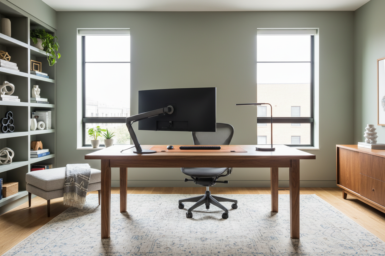
We have all fallen down the rabbit hole of scrolling through endless home office design images late at night. You see a setup that looks effortlessly chic—a mahogany desk bathed in natural light, a sculptural chair, and zero clutter. Yet, when you try to replicate this in your own spare room or corner nook, the result often feels disjointed or cramped. As an interior designer, I tell my clients that the problem usually isn't the furniture you bought; it is the invisible architecture you missed in the photo.
Translating a two-dimensional image into a three-dimensional, functional workspace requires looking past the styling and understanding the structure. This guide will help you decode professional design photography so you can build a workspace that works as hard as you do.
Key Features to Analyze in Design Photos
Before buying a single piece of furniture based on a picture, use this checklist to analyze the feasibility of the design in your specific space:
- Light Source Direction: Note where the natural light hits the monitor. Is it causing glare, or is it side-lit for optimal viewing?
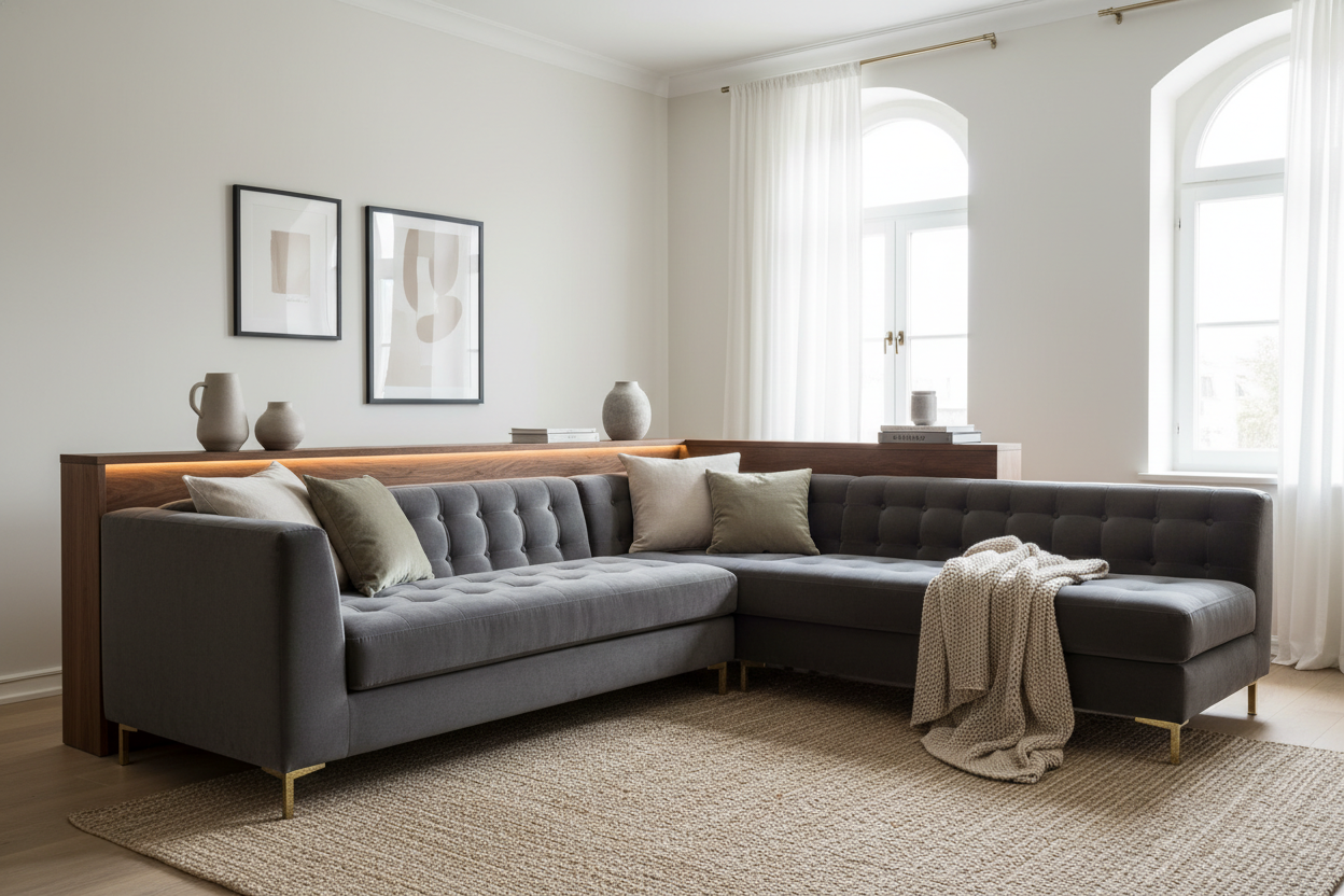
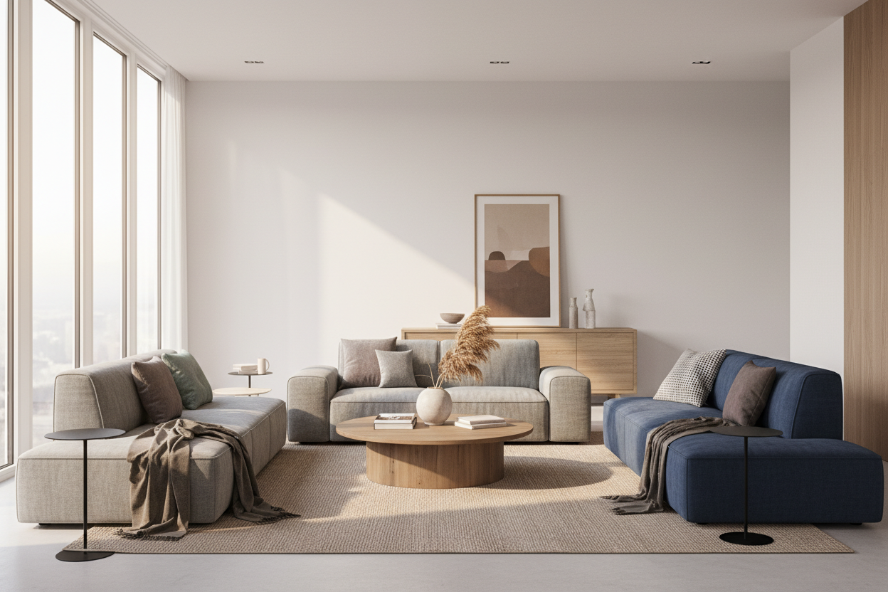
- Visual Weight: Look at the legs of the furniture. Are they chunky (grounding) or slender (airy)? This dictates how spacious the room feels.
- The "Triangle" Layout: Identify the distance between the chair, the storage, and the door. Good images usually hint at an unobstructed flow.
- Texture Layering: Observe the mix of materials (e.g., wood, metal, textiles) which prevents the room from looking flat or sterile.
Decoding the Layout: Beyond the Frame
When you look at high-end home office design pics, you are often seeing a cropped reality. To achieve that level of sophistication, you must understand space planning.
The Focal Point and Flow
In most editorial images, the desk is the hero piece, often floating in the center of the room. While this looks commanding, it requires perimeter floor outlets to avoid tripping hazards. If your room dictates a wall-facing desk, you need to create depth differently. Use open shelving above the desk or a textured wall covering to prevent the "cubicle effect." The goal is to ensure your line of sight has somewhere to rest that isn't a blank wall.
Materiality: The Tactile Experience
Photos cannot convey touch, but as a specialist, I assure you that texture is paramount for long-term satisfaction. A glass desk might look pristine in a photo, but it is cold on the forearms and amplifies the sound of typing.
For a luxury aesthetic that offers durability, look for matte-finished walnut or white oak. These materials absorb light rather than reflecting it, reducing eye strain during long work sessions. If you love the look of stone or marble seen in design portfolios, ensure it is a honed finish rather than polished to mitigate glare.
Ergonomics vs. Aesthetics
This is where the tension lies. That mid-century modern bucket chair looks sculptural and stunning in a photograph, but it likely lacks lumbar support and height adjustability.
When sourcing furniture based on images, always cross-reference the visual style with ergonomic data. If you are committed to a non-adjustable aesthetic chair, ensure your desk height is custom-tailored to your torso length. Otherwise, invest in a high-quality task chair and use the "aesthetic" chair as a side accent for reading or guest seating. Design is useless if it causes physical fatigue.
My Personal Take on Home Office Design Images
I want to share a lesson from a project that looked perfect on paper but had a hidden flaw. I once designed a home office for a client who was obsessed with home office design images featuring "floating" minimal desks with absolutely no visible hardware or storage. We achieved the look perfectly using a custom wall-mounted slab.
However, the photos she admired were staged. In reality, she had a printer, a backup drive, and a docking station. Within a week, she called me in frustration because the floor beneath the desk was a tangled nest of cables that ruined the minimalist vibe. The lesson? Photos often Photoshop out the cords. Now, whenever I see those clean, cord-free images, I immediately look for the hidden cable management solutions—grommets, hollow legs, or false wall panels. Real life requires wires; great design just hides them better.
Conclusion
Your home office should be a marriage of the inspiration you see online and the reality of how you work. By analyzing lighting, prioritizing tactile comfort, and planning for the unglamorous necessities like cable management, you can create a space that rivals any magazine spread. Don't just copy the image; engineer the environment.
Frequently Asked Questions
How can I match wood tones from different brands?
Don't try to match them perfectly; it often looks forced. Instead, aim for a cohesive undertone (warm, cool, or neutral) and vary the grain patterns. Mixing a dark walnut desk with lighter oak shelving can create a sophisticated, curated look.
What is the biggest lie in home office design pics?
Lighting. Most professional photos rely on powerful strobe lights to brighten the room. In reality, you need a three-point lighting plan: ambient overhead light, specific task lighting for your desk, and accent lighting to warm up the corners.
How do I make a small office look like the spacious images?
Focus on "leggy" furniture. Desks and chairs with slender legs reveal more floor space, tricking the eye into thinking the room is larger. Avoid solid, boxy desks that block sightlines.
Dejar un comentario
Este sitio está protegido por hCaptcha y se aplican la Política de privacidad de hCaptcha y los Términos del servicio.