


I remember staring at my living room wall, clutching a level and a stud finder, wondering if I had made a massive mistake. I had just ordered a grey floating tv shelf because it looked 'sophisticated' on my Pinterest board, but once it was mounted, the room felt about as cozy as a high-security server room. It was flat, chilly, and honestly, a bit depressing.
We have all seen the 'flipper grey' houses where everything from the floors to the ceiling is the color of a rainy Tuesday. It can feel soulless if you do not know how to fight back. But after three years of staring at mine, I have realized that a well-styled unit is actually the ultimate neutral anchor for a room that feels intentional rather than institutional.
Quick Takeaways
- Mix your woods: Pair cool grey with warm walnut or oak to kill the 'office' vibe.
- Warm metals only: Brass and bronze hardware make charcoal finishes look expensive.
- The 2700K Rule: Use warm-toned LED strips to eliminate harsh shadows underneath.
- Texture over tech: Offset the plastic look of consoles with woven baskets and organic shapes.
The 'Millennial Grey' Problem (And Why I Still Chose It)
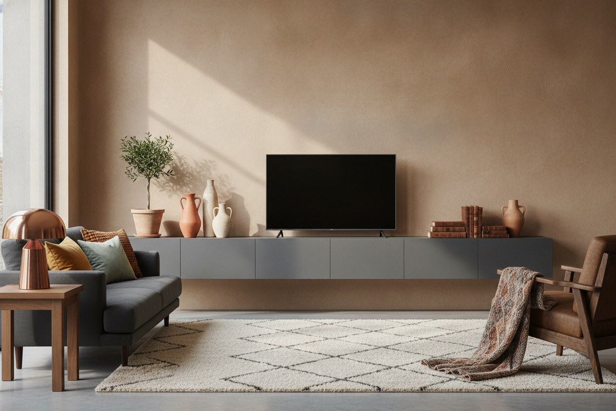
Grey gets a bad rap for looking like a cheap house flip, and sometimes, that criticism is earned. If you buy a low-quality gray floating tv shelf with a plastic-looking laminate finish, it is going to look like it belongs in a dorm room. However, I still chose a grey unit because a shelf floating on the wall actually saves space in my narrow 12-foot wide living room, and a neutral tone prevents the wall from feeling too heavy.
The secret is choosing a 'greige' or a deep charcoal rather than a mid-tone ash. A dark grey acts like a shadow, making the unit recede into the wall, whereas a light grey can sometimes look like unfinished primer. When you treat the shelf as a foundation rather than the main event, the 'cold' factor disappears.
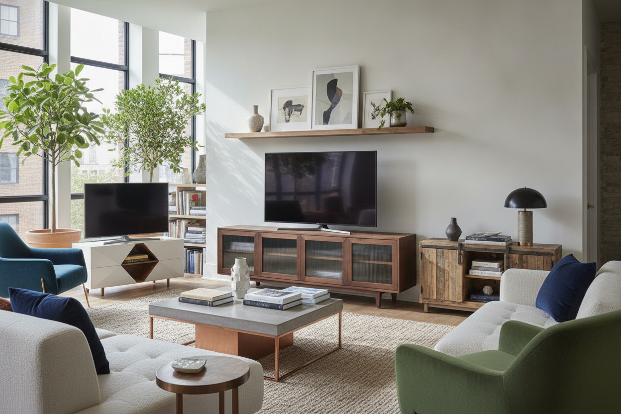
Wood Tones Are Your Best Friend Here
If your grey floating tv shelves look icy, you need to introduce wood immediately. I am not talking about more grey-washed wood—I mean the real, warm stuff. I placed a pair of walnut-cased speakers on my unit, and the rich orange-brown tones of the wood instantly neutralized the blue undertones in the grey paint.
If your unit has open cubbies, do not leave them bare. I use adjustable shelf storage inserts made of woven seagrass or light oak to break up the monotonous grey surface. The goal is to create a 'sandwich' of textures: the sleek, cool shelf layered with the rough, warm texture of a basket or a wood box. It makes the whole setup feel like a piece of furniture rather than a utility rack.
What Goes On Top? (Please, Not Just Speakers)
The biggest mistake people make with a gray wall mounted tv stand is treating the top surface like a tech dumping ground. If it is just a soundbar and a gaming console, it will always look sterile. I use a simple formula: something living, something old, and something shiny.
A trailing pothos or a 'string of pearls' plant is non-negotiable. The organic, messy shape of a plant softens the sharp, hard edges of the shelf. Next to that, I stack three or four vintage hardcover books—look for linen covers in cream or terracotta. Finally, I add a small ceramic bowl for remotes. This mix of materials makes the floating tv shelf grey finish feel like a deliberate design choice.
The Brass and Charcoal Rule
If your shelf has handles, throw the stock chrome ones in the trash. Chrome on grey is the fastest way to make your house look like a dentist's office. I swapped my hardware for unlacquered brass pulls, and the difference was night and day. Warm metals like antique bronze or brushed gold pop beautifully against a darker grey, giving it a bespoke, high-end look that hides the fact that you might have bought it on sale.
Lighting the Void Beneath
The space under a grey floating tv shelf can often look like a dark, dusty abyss, which adds to that heavy 'storm cloud' feeling. To fix this, I installed a simple LED bias light strip along the bottom edge of my wall mounted media console entertainment center.
Set the lights to a warm white (around 2700K)—never the 'cool blue' setting. This creates a soft glow that makes the unit look like it is weightlessly hovering. It also provides enough ambient light for movie nights so you aren't sitting in pitch-blackness, which actually makes the grey tones of the furniture feel softer and more inviting at night.
FAQ
Will a grey shelf show more dust than wood?
Honestly, yes. Dark charcoal shows every speck of dust and every fingerprint. If you are not a fan of dusting once a week, go for a lighter 'driftwood' grey with a bit of grain texture to hide the debris.
Does grey work with beige walls?
It can, but you have to be careful. If your walls are a very warm 'yellow' beige, a cool grey shelf might look like a mistake. Stick to a charcoal or a very dark slate to create enough contrast so the colors don't clash.
Should the shelf match the floor?
Never. If you have grey floors and a grey shelf, your room will look like a black-and-white movie. You want contrast. If your floors are grey, go for a very dark or very light unit to create some visual separation.
Dejar un comentario
Este sitio está protegido por hCaptcha y se aplican la Política de privacidad de hCaptcha y los Términos del servicio.