


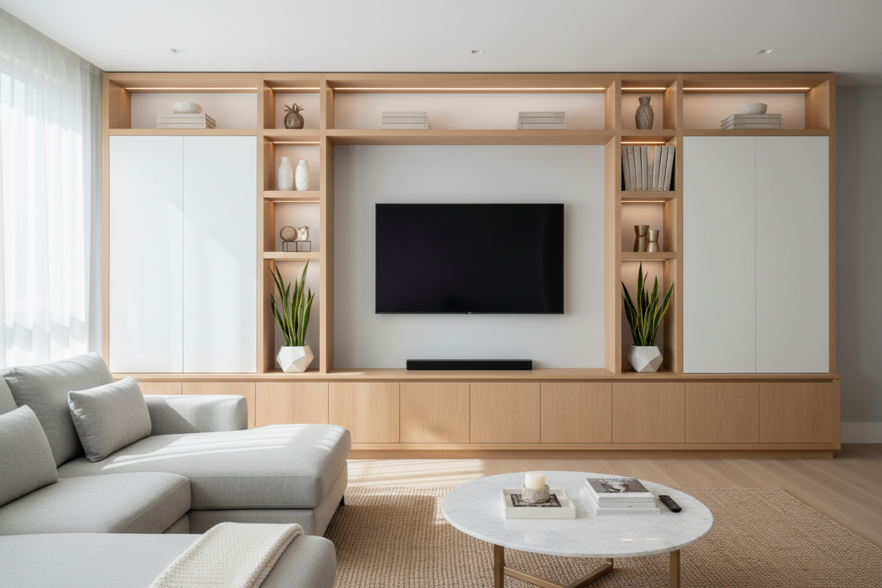
I remember staring at my living room wall for three weeks, debating whether a massive storage system would make my house look like a sophisticated library or a high-end storage locker. It is that specific moment of panic when the delivery truck pulls up and you realize you have basically bought a new wall. A large living spaces wall unit is a commitment, and if you do not handle the styling correctly, it can feel like a heavy, dark cloud hanging over your sofa.
- Stick to the 30% rule: Leave nearly a third of your shelf space empty to prevent visual claustrophobia.
- Incorporate reflective materials like glass and polished metal to bounce light back into the room.
- Weight your items: Heavy books and bins go at the bottom; light, airy pieces go at the top.
- Step back and squint every ten minutes to check the visual balance of the entire room.
The Fear of the 'Furniture Monolith'
We have all seen it: the massive, dark wood structure that looked incredible in a 20,000-square-foot showroom but looks like a hulking beast in a standard 12x14 living room. This is what I call the 'Furniture Monolith' effect. It happens when a piece of furniture is so large and so filled with stuff that it ceases to be a design choice and starts feeling like an architectural intrusion. You want your storage to feel intentional, not like you are trying to hide a structural flaw in the drywall.
The trick is to view the unit as a framework for light rather than just a box for your things. When styled with a light touch, a modern entertainment center wall unit should feel like the missing puzzle piece that finally makes the room make sense. It provides a focal point that anchors the space, but only if you allow the room to breathe around it. If you treat it like a closet with no doors, the room will shrink by five feet the moment you finish assembly.
Rule 1: Leave 30% of Your Shelves Empty
The biggest mistake I see people make—and one I made myself with a massive walnut unit back in 2018—is the 'nature abhors a vacuum' approach. If there is a shelf, we feel a primal urge to put a book, a candle, or a framed photo on it. Stop doing that. Negative space is your best friend when dealing with large-scale furniture. If every square inch is occupied, your eye has nowhere to rest, which creates a subconscious feeling of clutter and anxiety.
I aim for about 30% empty space on every single shelf. This does not mean leaving one end completely bare; it means grouping items together and leaving gaps between those groups. Think of it like a gallery wall. You would not overlap the frames, right? By leaving breathing room, you are signaling to the brain that the room is spacious enough to 'waste' some storage area. It is a psychological trick that makes the unit feel lighter than its actual physical weight.
Try alternating your groupings. Put a stack of books on the left side of one shelf, then a single sculptural object on the right side of the shelf below it. This zigzag pattern keeps the eye moving and prevents the unit from looking like a solid block of material. When you leave space, the wall color behind the unit (if it is open-backed) or the back panel of the unit itself becomes part of the decor.
Rule 2: Use Glass and Metal to Bounce Light
Most wall units are made of solid wood or matte-finished MDF, which are notorious for absorbing light. To keep the unit from feeling like a black hole, you need to introduce materials that fight back. I always suggest mixing in glass, mirrors, or polished metals. These materials act as little light-reflectors, pulling brightness from windows or lamps and throwing it back into the center of the room.
If your unit has solid doors, consider placing a display cabinet with glass doors nearby to continue the theme of transparency. Inside the unit itself, use glass vases, metallic bookends, or even a small mirror leaned against the back of a shelf. These small touches break up the monotony of the wood and create a sense of depth. It is the difference between looking at a flat wall and looking into a layered display.
I personally love using brass or chrome accents. Even a simple brass tray or a set of silver candlesticks can provide enough 'shimmer' to counteract the heavy visual weight of a dark-stained shelf. If the unit has built-in LED lighting, use it. But even without integrated lights, a few well-placed reflective objects will do the heavy lifting for you.
Rule 3: Ground the Bottom, Float the Top
Visual weight is a real thing. If you put your heaviest, darkest items on the top shelves, the unit will feel like it is toppling over on you. It makes the ceiling feel lower and the room feel cramped. Instead, follow the 'Ground and Float' strategy. Use the bottom third of the unit for your 'heavy' items: large art books, storage baskets made of thick wicker, or heavy electronics. This creates a solid base that feels stable and grounded.
As you move up the shelves, the items should get progressively lighter and more delicate. On the top tiers, I like to use trailing plants (like a Pothos or String of Pearls), thin ceramics, or small, minimalist art pieces. This draws the eye upward and makes the unit feel like it is tapering off into the room, rather than looming over it. It is a similar logic to how you would style a solid wood modern sideboard, where you keep the bulk inside the cabinets and only a few choice items on the surface.
Don't be afraid to mix textures here, too. A rough-hewn basket at the bottom provides a nice contrast to a smooth porcelain bowl at eye level. By keeping the 'visual noise' at the bottom, you maintain a clear line of sight across the top half of the room, which is essential for keeping a space feeling open and airy.
The 'Step-Back' Test for Your Living Room
Once you think you are finished styling, it is time for the professional stager's secret weapon: the step-back and squint. Walk to the furthest corner of the room, turn around, and squint your eyes until the details of the decor blur. You are looking for 'clumps' of darkness or areas that look too busy. If one side of the unit looks significantly darker or heavier than the other, you need to shift things around.
Your goal is a balanced distribution of color and weight across the entire wall. This exercise ensures that the unit is anchoring your living room setup rather than distracting from it. If your eyes immediately dart to one overstuffed shelf, that is your sign to edit. A wall unit should be a backdrop for your life, not the main character that refuses to stop talking.
Is a wall unit too big for a small apartment?
Not necessarily. If you choose a unit with an open back or a light wood finish (like oak or birch), it can actually make a small room feel taller by drawing the eye upward. Just avoid dark, chunky pieces that lack 'leg' room at the bottom.
How do I hide ugly wires in a wall unit?
Use decorative boxes with the backs cut out or cable management clips that run along the inside corners of the unit. Never just let them dangle; nothing kills a high-end look faster than a 'spaghetti' pile of black power cords.
Should I color-coordinate my books?
It is a polarizing choice, but for a large wall unit, it can help reduce visual chaos. If you do not want to go full rainbow, try grouping books by neutral tones or turning the spines inward for a monochromatic look, though that makes finding a specific book a nightmare.

Dejar un comentario
Este sitio está protegido por hCaptcha y se aplican la Política de privacidad de hCaptcha y los Términos del servicio.