


We have all been there: staring at a screen during a high-stakes video conference, distracted not by the agenda, but by the cluttered bookshelf or the stark, interrogation-style lighting behind the speaker. In the era of remote work, your office wall background is no longer just a decorative choice; it is your digital handshake. It establishes authority, signals professionalism, and affects how clients perceive your attention to detail.
Many homeowners treat the wall behind their desk as an afterthought, slapping on a coat of paint and calling it a day. However, true design sophistication lies in curating a backdrop that offers visual depth without dominating the conversation. Let’s refine your workspace to ensure your environment works as hard as you do.
Key Features to Look For
If you are planning a renovation or a quick refresh, prioritize these elements to ensure your backdrop is camera-ready and aesthetically pleasing:
- Matte Finishes: Essential for preventing glare from ring lights or natural windows.
- Acoustic Properties: Materials like wood slats, cork, or upholstered panels reduce echo.
- Visual Depth: Open shelving or textured millwork prevents the "floating head" look of flat walls.
- Color Temperature: Neutral or muted tones prevent color casting on your face during calls.
- Scale and Proportion: Artwork and shelves must be sized relative to the camera frame, not just the room.
Mastering Background Office Wall Design
When curating a background office wall design, the goal is balance. You want to create a focal point that adds interest without causing visual fatigue. This often comes down to the interplay between texture and lighting.
Material Matters: Solid Wood vs. Veneer vs. Paint
While paint is the budget-friendly option, it often falls flat on camera. To elevate the space, we look at texture. Solid wood millwork (like shiplap or vertical slats) offers unbeatable richness and durability. It catches light in a way that creates natural shadows, adding dimension to your video feed.
However, high-quality wood veneers are often a smarter choice for home offices. They are lighter, easier to install, and less prone to warping with humidity changes. Avoid cheap laminates; under bright office lighting, they can look plastic and artificial.
Visual Ergonomics and Lighting
We rarely think of "ergonomics" regarding walls, but visual ergonomics is real. A highly patterned wallpaper behind you can cause the camera's autofocus to hunt, creating a shimmering effect that strains the viewer's eyes. Stick to organic textures or solid colors with a low sheen.
Furthermore, consider how your lighting interacts with the wall. If you use a dark office background wall (like charcoal or navy), you will need significantly more frontal lighting to separate your silhouette from the background. Conversely, a pure white wall can blow out the exposure, making you look washed out.
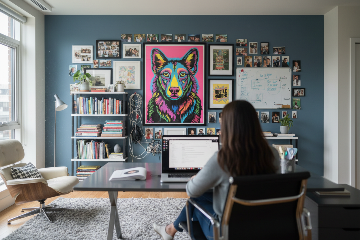
Designing for Function: Storage as Decor
Integrating storage into your background is a classic move, but it requires discipline. Open shelving allows you to display credentials, books, and art, adding personality to the space. However, styling is critical. Use the "two-thirds rule": fill only two-thirds of the shelf space to allow for negative space. This prevents the background from looking chaotic and keeps the focus on you.
My Personal Take on Office Wall Backgrounds
I learned a hard lesson about finishes during a project for a tech executive a few years ago. We designed a stunning, high-gloss lacquered navy wall behind his desk. In person, it was breathtaking—it looked like liquid glass. It screamed luxury.
However, the first time he turned on his 1080p webcam and his ring light, it was a disaster. The high-gloss finish acted like a mirror, reflecting the ring light directly into the camera lens and creating a distracting halo effect behind his head. We had to scramble to install a matte film over the lacquer to diffuse the light. It was a humble reminder that in modern design, how a room looks through a lens is just as important as how it looks to the naked eye. Always test your material samples under your specific video lighting before committing.
Conclusion
Your office wall background is a tool for communication. By selecting the right textures, managing lighting reflection, and curating your display, you transform a simple wall into an asset that enhances your professional brand. Don't settle for a blank slate—design a backdrop that speaks volumes before you even say a word.
Frequently Asked Questions
What is the best color for an office background wall?
Soft blues, sage greens, and warm grays are ideal. They are universally flattering on camera and evoke a sense of calm and focus. Avoid bright reds or neon colors, which can bleed onto your skin tone during video calls.
How do I stop my background from echoing?
Hard surfaces bounce sound. To dampen audio, incorporate soft materials into your office background wall. Acoustic felt panels disguised as art, heavy velvet curtains, or even a bookshelf filled with books will absorb sound waves and improve your audio clarity.
Should I use a virtual background instead of designing a wall?
While convenient, virtual backgrounds often glitch and can appear unprofessional if the edge detection fails. A physical, well-designed background conveys permanence, stability, and authenticity that a digital image simply cannot match.

Leave a comment
This site is protected by hCaptcha and the hCaptcha Privacy Policy and Terms of Service apply.