


You know that feeling when you walk into a dining room and a piece of furniture just sings? It's not just a storage unit; it's a statement. That's the power of a well-executed two tone painted china cabinet. I've helped over 200 homeowners navigate this exact choice, and I've seen the good, the bad, and the 'let's repaint that tomorrow.' The most common hiccup? Choosing colors that fight the room instead of flattering it. This isn't about fleeting trends; it's about creating a focal point with intention.
Quick Takeaways
- Two-tone design creates depth and can visually alter the perceived size of your cabinet.
- Your dominant color should cover about 70% of the cabinet, with the accent on 30%.
- Always test paint samples in the room's actual light—morning, noon, and night.
- Hardware is part of the color story; don't treat it as an afterthought.
- Maintenance is key: use a quality primer and keep touch-up paint for nicks.
Why Two Tone Works: The Psychology Behind the Paint
Why does a two-tone finish feel so dynamic? It breaks up a large, monolithic form. A standard china hutch is often a big box—think 60 inches wide by 84 inches tall. Painting it one color emphasizes that solid mass. But split it? You guide the eye. A darker color on the lower base grounds it, while a lighter hue on the upper glass doors makes it feel airy. This is especially useful in North American open-concept spaces, where your dining area needs to hold its own visually without creating a wall of furniture. The principle works across your home, much like the strategic use of color discussed in our guide on Why The Two Tone Look Is The Ultimate Entryway Upgrade.
Choosing Your Color Combo: A Designer's Formula
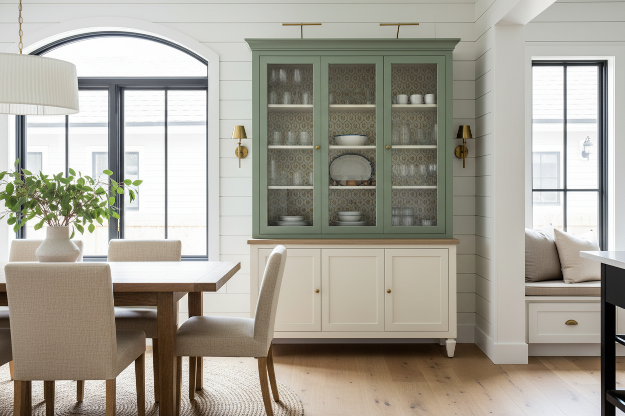
Forget 'what's in style.' Start with what's in your room. What's the wall color? What's the undertone of your flooring? If you have warm oak floors, a cabinet with cool gray and stark white might feel disconnected. I always pull three elements from the room: a primary color (like your wall paint), a secondary color (from a rug or large artwork), and a neutral. Your two tones should relate to two of these. For a fail-safe combo, try a deep, moody green on the base (like Sherwin-Williams 'Evergreen Fog') with a creamy off-white on the top (like 'Alabaster'). This creates contrast without clashing. Remember, color psychology is consistent; the calming effect of a blue-and-white combo works just as well on a china cabinet as it does on a Two Tone Makeup Vanities That Elevate Your Beauty Space.
The 70/30 Rule: Getting Proportions Right
This is the golden rule. The dominant color gets about 70% of the visual real estate. Typically, this is the base cabinet—the solid, lower portion. The accent color (30%) is for the upper section, the frame around the glass doors, or the interior back panel. On a standard hutch with a 36-inch tall base and a 48-inch tall top, the base naturally takes up that 70% share. If you reverse it—painting the large top a bold color—it can feel top-heavy and overwhelming. The goal is balance, not a 50/50 split, which often looks indecisive.
From Traditional to Modern: Styling Your Two Tone Hutch
How you style it completes the look. For a traditional feel in a two-tone cabinet with a dark base and light top, style the base with solid-color dinnerware stacks and the glass upper with heirloom china or crystal. Leave 3-4 inches of space between objects. For a modern look, treat the entire piece as a curated display. Use the base for large art books or a single sculptural vase, and the top for a minimalist collection of three matching pitchers. Don't forget the power of mixed materials: woven baskets in the base can soften a painted finish. For taller units, like a 74 2 H China Cabinet, use the verticality by placing taller items at the back of the shelves. Incorporating glass, as seen in our Black Cabinet With Glass Doors collection, keeps the look light and allows your displays to shine.
Common Mistakes (And How to Avoid Them)
I've seen these three mistakes most often. First, not enough contrast. A beige top on a cream base just looks like a mistake. You need a clear value difference—light vs. dark. Second, ignoring artificial light. That perfect sage green can look drab under warm evening downlights. Paint large swatches on poster board and live with them for 48 hours. Third, clashing hardware. If you have a warm white and navy cabinet, cool chrome knobs will fight it. Try unlacquered brass or oil-rubbed bronze for cohesion.
Maintenance and Longevity: Keeping Your Painted Finish Fresh
A durable finish starts with prep. Sand thoroughly, use a stain-blocking primer (I prefer shellac-based for knots or old stains), and apply at least two coats of a quality enamel paint. For daily care, dust with a microfiber cloth. For smudges around handles, a damp cloth with a drop of dish soap works. Keep a small jar of your touch-up paint. Cabinets in active dining rooms get bumped—it's normal. A quick dab with a small artist's brush hides most nicks. The wear patterns differ from a high-use Kitchen Cabinet Set With Two Parts, so you won't need to clean grease, but you will need to guard against humidity if it's near a kitchen.
Personal Experience: The Client Who Wanted All Black
A client once insisted on a fully black china cabinet for a small, north-facing dining nook. I warned her it would feel like a black hole. We compromised on a two-tone: Black ('Tricorn Black') on the lower third of the base only, and a soft, reflective gray ('Repose Gray') everywhere else. The result? The bold black anchor she wanted, but the room stayed bright and open. The downside? Two-tone requires more precise taping and painting time. It's not a quicker project than a single color—it's often slower.
FAQ
Can I do two-tone on an existing stained wood cabinet?
Absolutely. The prep is just more critical. You must sand thoroughly to dull the finish and use a high-adhesion primer designed for slick surfaces.
What sheen should I use?
Semi-gloss or satin. Flat paint shows every fingerprint. High-gloss can look too industrial. Semi-gloss is durable and wipeable, which is ideal for furniture.
Should the interior be painted an accent color?
It's a great detail, but not mandatory. Painting the back panel of the upper section in your accent color adds wonderful depth when the doors are closed. It's a commitment, though, as it's hard to change later.
Is two-tone dated?
Not when done with considered color. Avoiding extreme trends (like neon accents) and focusing on timeless combinations (navy & white, green & cream, charcoal & light gray) keeps it feeling fresh for years.

Leave a comment
This site is protected by hCaptcha and the hCaptcha Privacy Policy and Terms of Service apply.