


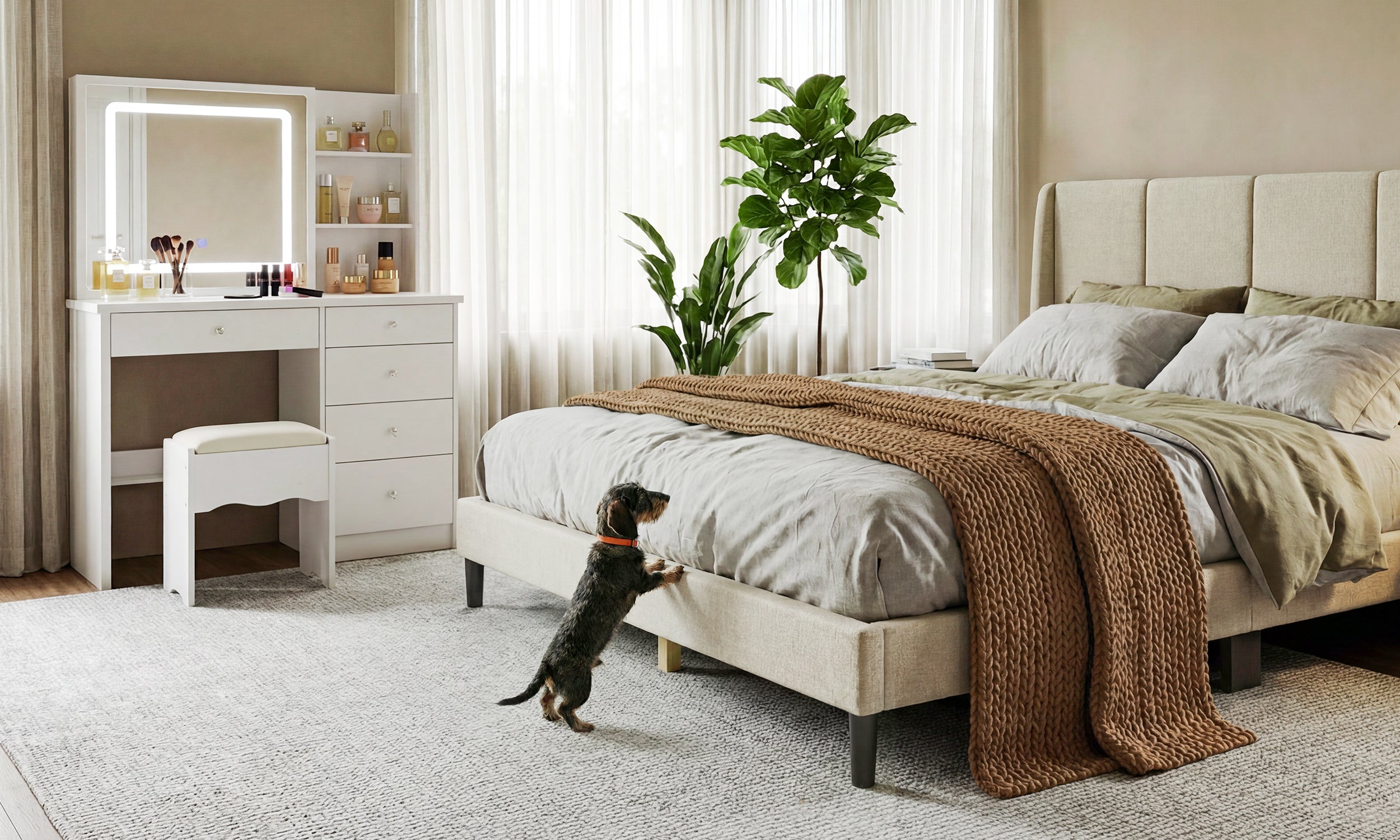
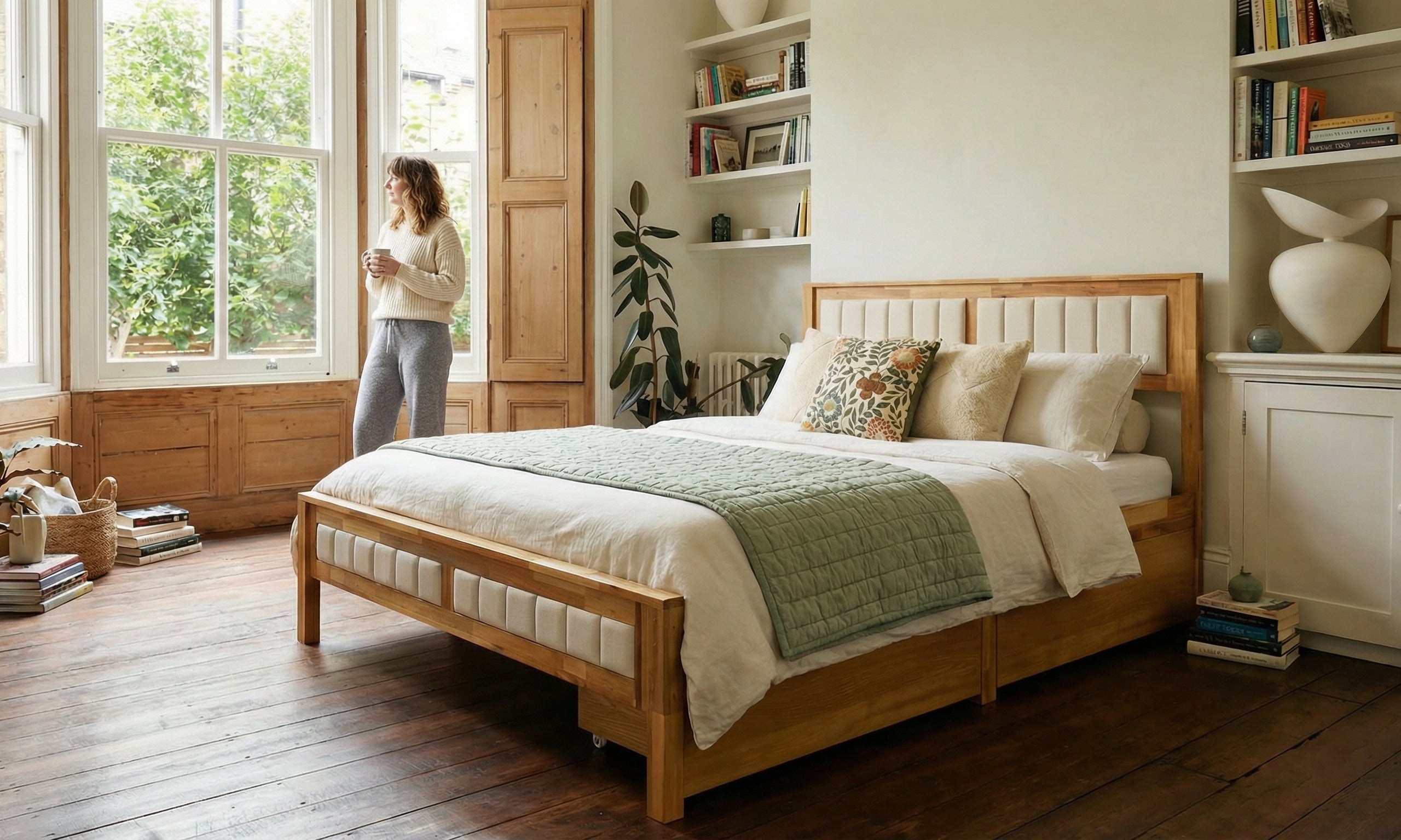
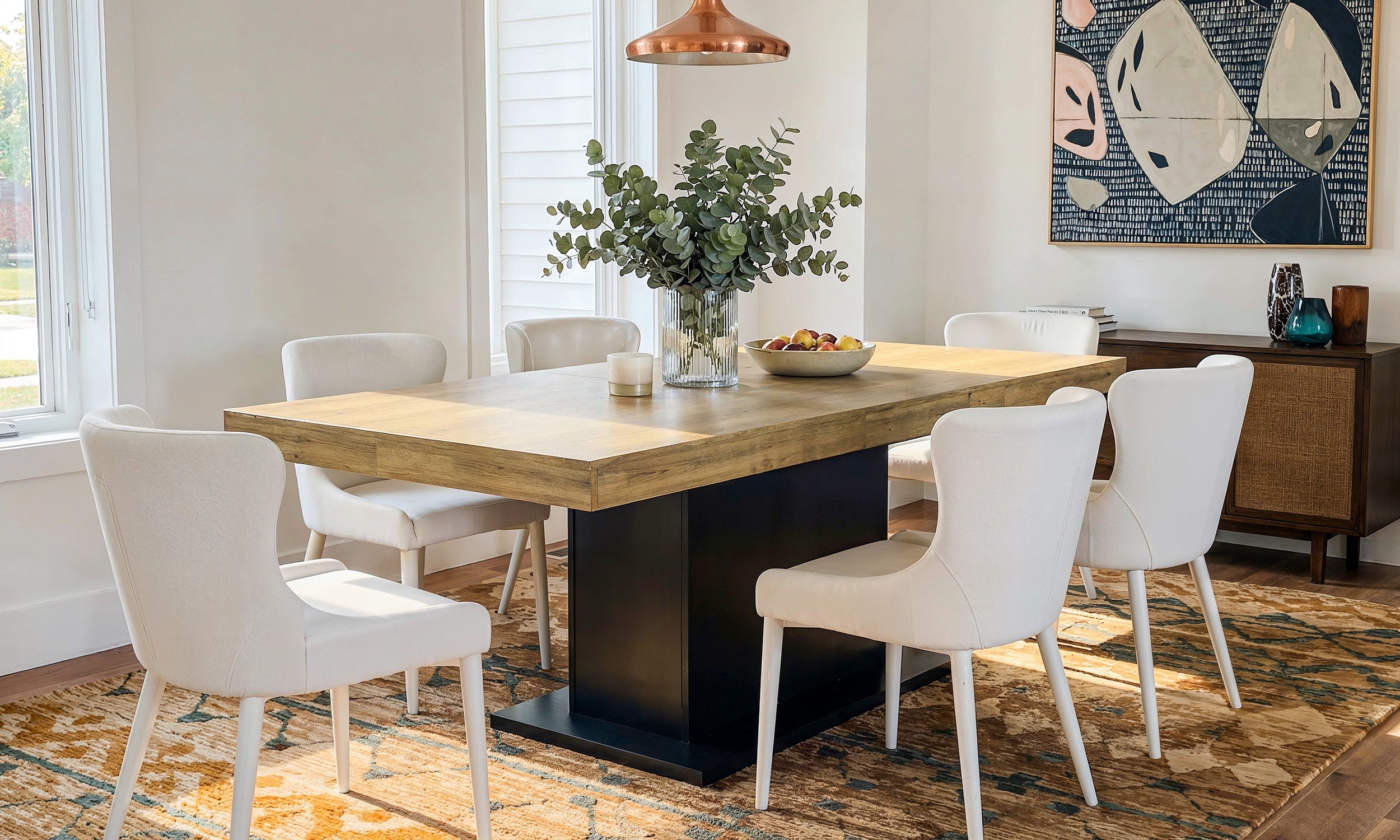
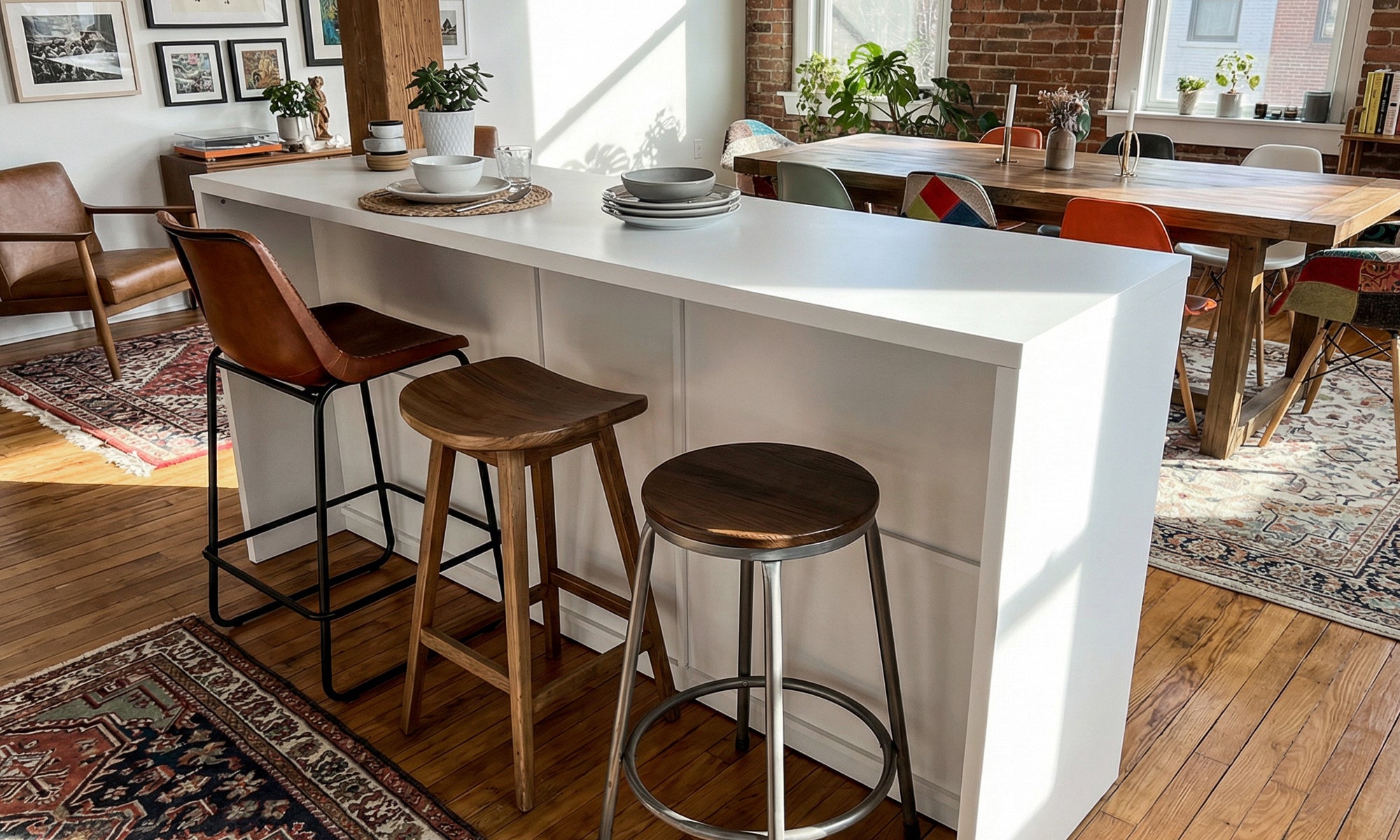
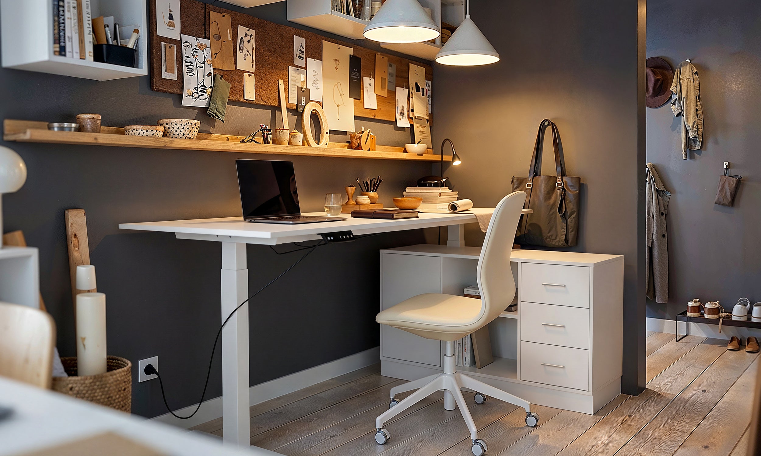
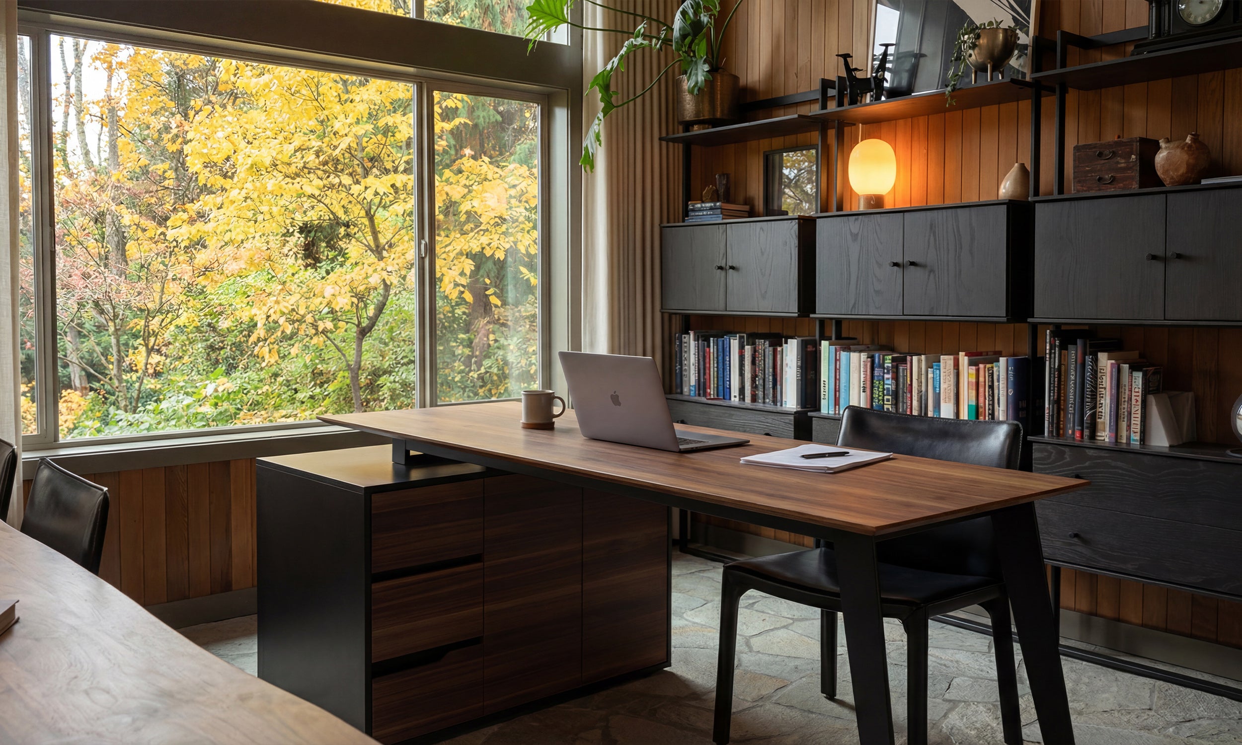


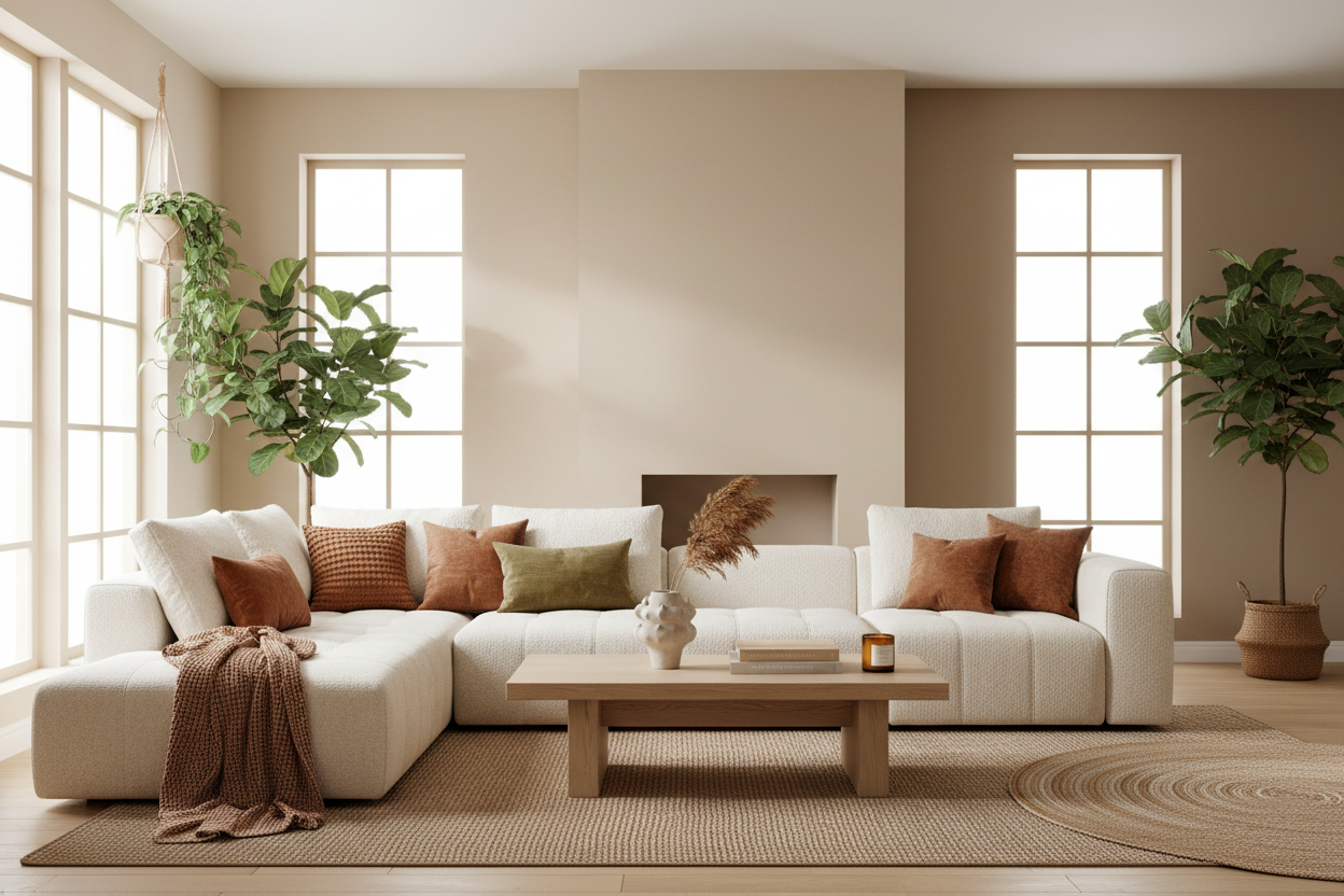
Cool grays are out. Creamy beiges, golden taupes, and earthy tans are in. Here are the exact shades designers are reaching for this year — and how to choose the right one for your home.
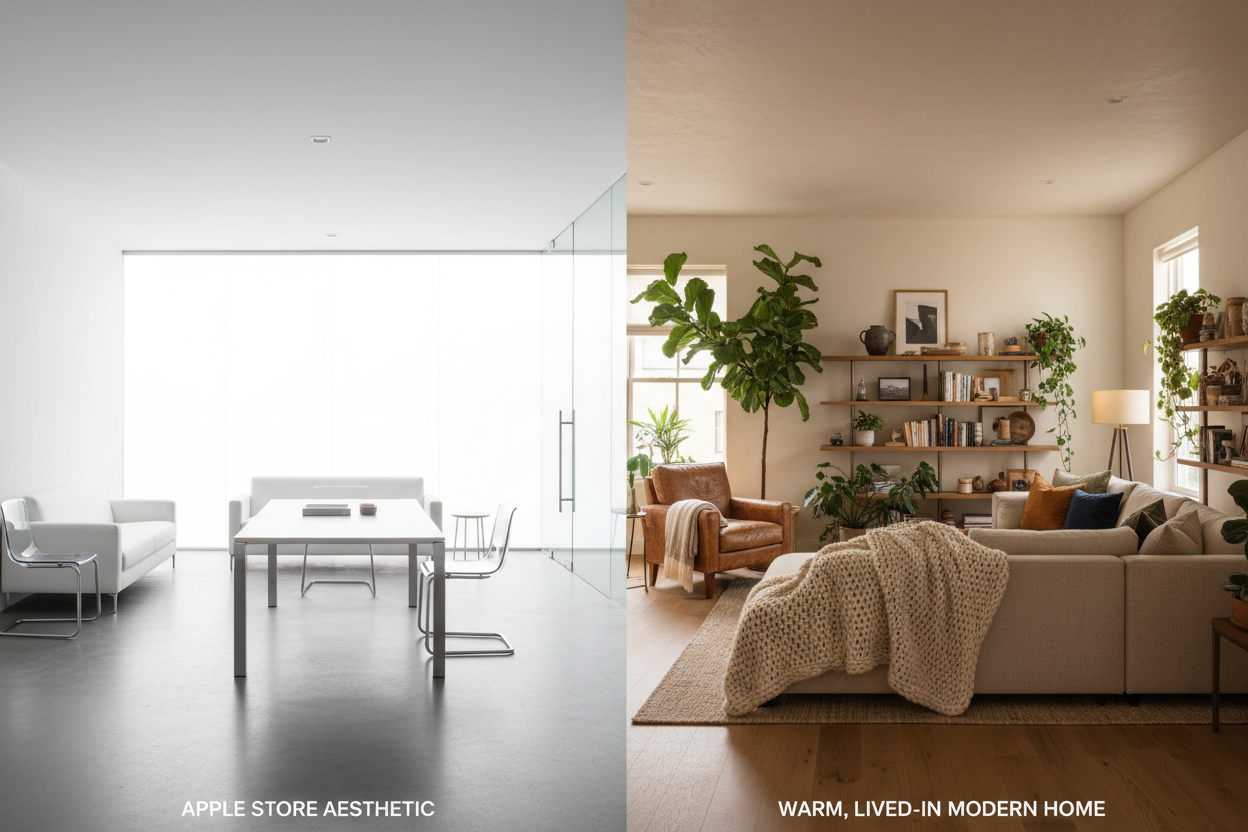
If there's one color story that defines 2026, it's the decisive return of warmth. After more than a decade dominated by cool grays, stark whites, and what the industry bluntly calls "millennial gray," homeowners and designers have collectively moved on. The new foundation of interior design is warm neutrals — colors that carry the quiet presence of sand, clay, linen, and sunlit stone.
This isn't a subtle shift. Sherwin-Williams named Universal Khaki their 2026 Color of the Year. Benjamin Moore went deeper with Silhouette, a rich espresso-charcoal. Pantone chose Cloud Dancer, an airy warm white. Across every major paint brand, the message is consistent: warmth is the new baseline.
But "warm neutral" is a broad category. The difference between a color that transforms your room and one that makes it feel muddy often comes down to a single undertone. This guide breaks down the best warm neutrals of 2026 by brand, by depth, and by the room they work best in — so you can skip the guesswork and go straight to sampling.
What Makes a Neutral "Warm"?
Before diving into specific colors, it helps to understand the mechanics. Every neutral paint color carries an undertone — a subtle secondary hue that becomes visible on large surfaces and under different lighting conditions. Warm neutrals carry undertones in the yellow, red, orange, or pink family. Cool neutrals lean toward blue, green, or purple.
The practical difference is enormous. A warm neutral makes a room feel inviting, grounded, and sun-touched, even on a cloudy day. A cool neutral can feel crisp and modern, but also sterile or flat if there's not enough natural light to support it.
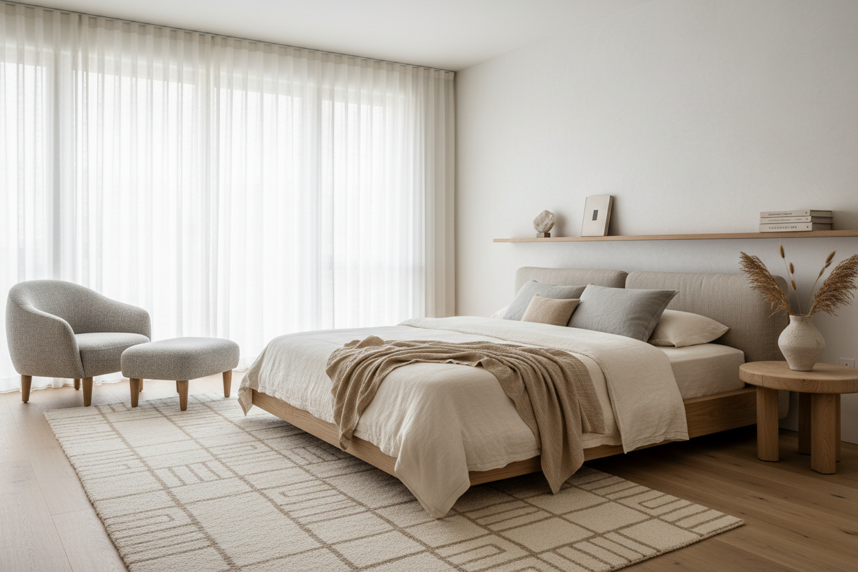
In 2026, the shift toward warm undertones is driven by a broader desire for homes that feel lived-in and comforting rather than staged and photogenic. Warm neutrals don't compete with furnishings — they support them. They make wood tones look richer, brass hardware look more intentional, and natural textiles like linen and wool feel at home.
The 2026 Colors of the Year: A Warm Neutral Foundation
Three official picks from major brands anchor this year's warm neutral conversation. Each occupies a different depth on the spectrum, giving you a natural starting point depending on how bold you want to go.
Sherwin-Williams: Universal Khaki (SW 6150)
This is the workhorse of 2026. Universal Khaki is a mid-tone neutral that sits between beige and taupe, with a subtle green undertone that keeps it from reading too yellow. Sherwin-Williams describes it as "tailored and timeless," and that's accurate — it has the kind of quiet authority that works in virtually any room without demanding attention.
Universal Khaki is best understood as the 2026 answer to Accessible Beige, which dominated the late 2010s. It's warmer, slightly more saturated, and carries more personality, but it's equally versatile. It pairs naturally with wood tones, organic textures, and both warm and cool accent colors.
Best for: Living rooms, hallways, exteriors, open floor plans where you need one color to carry multiple spaces.
Pairs with: White Dove (trim), natural oak, brass hardware, deep green or navy accents.
Benjamin Moore: Silhouette (AF-655)
Benjamin Moore went darker and moodier for 2026. Silhouette is a deep, complex neutral that blends espresso brown with subtle charcoal and a whisper of plum. With a low light reflectance value, it absorbs light and creates an enveloping, intimate atmosphere.
This is not a color for every room, and that's the point. Silhouette works best in spaces designed for focus, conversation, or rest — home offices, dining rooms, bedrooms, and libraries. It's a statement neutral: rich enough to carry a room on its own, complex enough to shift between warm and cool depending on the light.
Best for: Dining rooms, bedrooms, accent walls, home offices, powder rooms.
Pairs with: Cream whites like White Dove or Simply White, warm terra cottas, muted greens, aged brass, natural linen.
Pantone: Cloud Dancer (13-0002)
Pantone's pick sits at the lightest end of the warm neutral spectrum. Cloud Dancer is an airy, slightly warm white — softer than pure white but brighter than most creams. Pantone positioned it as a color of simplification and calm, a visual palate cleanser for an overstimulating world.
For practical purposes, Cloud Dancer is best thought of as a ceiling or trim color, or as a whole-room treatment in spaces with excellent natural light. It's the kind of white that feels warm without feeling yellow — a crucial distinction.
Best for: Ceilings, trim, south-facing rooms, bathrooms, rooms where you want maximum brightness with a touch of softness.
The Best Warm Neutrals by Brand: Specific Recommendations
Beyond the Colors of the Year, here are the specific shades that designers and color consultants are recommending most frequently in 2026 — organized by brand and by depth from lightest to darkest.
Sherwin-Williams
Light Depth (LRV 60+):
Alabaster (SW 7008) — The go-to soft white for 2026. Alabaster has a subtle creamy warmth that prevents it from feeling harsh or clinical. It works beautifully on both walls and trim for a seamless, enveloping effect. Unlike stark whites, it doesn't create a jarring contrast with warm-toned furnishings.
Natural Linen (SW 9109) — A very light tan with balanced warmth. Natural Linen has enough body to read as a color (not just "off-white") while staying light enough for smaller rooms. It's particularly beautiful with red-toned wood floors and stains.
Mid Depth (LRV 40–60):
Accessible Beige (SW 7036) — Still relevant in 2026, though not as dominant as it was five years ago. Accessible Beige is a reliable greige (gray-beige blend) with warm undertones. It's the safe choice for resale staging and open floor plans, but many designers are now steering clients toward colors with more character.
Balanced Beige (SW 7037) — A step deeper than Accessible Beige with more golden warmth. This is one of the best "true beiges" in the Sherwin-Williams lineup — warm without being yellow, rich without being heavy. Excellent for living rooms and bedrooms.
Shiitake (SW 9173) — The breakout warm neutral of 2025 that's carrying strong into 2026. Shiitake is a moderately warm greige with mushroom-like earthiness. Popular on both walls and kitchen cabinets, it feels contemporary and grounded.
Deeper Depth (LRV 20–40):
Universal Khaki (SW 6150) — See Color of the Year above.
Loggia (SW 7506) — A rich, warm tan that's been gaining popularity on exteriors and in rooms with high ceilings. Loggia has enough depth to anchor a space while still reading as a neutral.
Benjamin Moore
Light Depth:
White Dove (OC-17) — Benjamin Moore's most beloved soft white. White Dove carries a barely perceptible creamy warmth that prevents it from ever looking cold. It's the go-to choice for trim, cabinetry, and whole-room applications in modern interiors. A slight gray undertone keeps it from reading yellow, even in bright south-facing light.
Muslin (OC-12) — A gentle beige-cream that feels like warm sunlight on old plaster. Muslin is one of the more versatile light neutrals in the Benjamin Moore lineup, working equally well in traditional and contemporary settings. It's warm without being assertive.
Manchester Tan (HC-81) — A classic from Benjamin Moore's Historical Collection. Manchester Tan has a golden undertone that makes rooms feel sunny and welcoming. It's deeper than Muslin, lighter than Grant Beige, and reliably beautiful in living rooms and bedrooms.
Mid Depth:
Grant Beige (HC-83) — A rich, sandy beige with warm golden undertones. Grant Beige has the kind of depth that makes a room feel enveloped without going dark. It's one of the best beiges for dining rooms and bedrooms where you want warmth and sophistication simultaneously.
Stone Hearth (984) — A warm greige that leans slightly more toward taupe than pure beige. Stone Hearth is popular in kitchens and bathrooms where you want warmth without sweetness. Its gray component keeps it feeling modern.
Pashmina (AF-100) — A warm, deep greige that feels rich and comforting. Pashmina is darker than most neutrals but still soft enough for everyday use. It transforms beautifully between daylight and evening, deepening into a cozy, enveloping tone after sunset. Excellent for bedrooms and home offices.
Deeper Depth:
Silhouette (AF-655) — See Color of the Year above.
Farrow & Ball
For homeowners willing to invest in premium paint, Farrow & Ball's warm neutrals are in a category of their own. Their pigment-rich formulations react to changing light in ways that mass-market paints simply cannot replicate.
Jitney (No. 293) — A relaxed, earthy brown-based neutral that sits between the more traditional Oxford Stone and the grayer Elephant's Breath. Despite being muted, Jitney feels surprisingly uplifting — its name comes from the bus that carries New Yorkers to the sandy beaches of the Hamptons, and the color carries that same sun-warmed, seaside quality. Works beautifully in living rooms, bedrooms, and kitchens.
Oxford Stone (No. 264) — The darkest of Farrow & Ball's warm neutrals, inspired by the Cotswold cottages of Oxfordshire. Oxford Stone is a classic dark taupe brimming with depth. Because it's a red-based neutral, it counteracts the blue light in north-facing rooms — making it one of the most versatile deeper neutrals for UK and northern climates. Stunning with white trim, dark wood furniture, and warm textiles.
Setting Plaster (No. 231) — A gentle, pink-tinged neutral that evokes the color of freshly dried plaster. It reads as a warm blush in bright light and settles into a soft warmth at night. Setting Plaster is particularly beautiful in west-facing rooms, where it catches golden afternoon light. A favorite for bedrooms and bathrooms.
Slipper Satin (No. 2004) — A versatile neutral white with a barely-there pink warmth. Slipper Satin is Farrow & Ball's answer to the "warm white that isn't yellow" problem. It's an exceptional choice for trim, ceilings, and rooms where you want brightness without coldness.
How to Choose: A Room-by-Room Framework
The same warm neutral can look dramatically different depending on the room's orientation, natural light, and function. Here's a practical framework for matching the right warm neutral to the right space.
North-Facing Rooms (Cool, Blue-Tinted Light)
North-facing rooms receive indirect light with a cool, bluish cast. Cool neutrals will look even colder here; warm neutrals are essential.
Choose: Colors with yellow or red undertones that counteract the blue light. Manchester Tan, Oxford Stone, and Setting Plaster all perform well. Avoid anything with even a hint of gray or blue undertone — it will look washed out.
South-Facing Rooms (Warm, Abundant Light)
South-facing rooms get the most direct sunlight, which amplifies yellow and warm undertones. Colors can look significantly warmer and more saturated than the swatch suggests.
Choose: Slightly cooler warm neutrals that won't turn too yellow in strong light. White Dove, Slipper Satin, and Stone Hearth are safe choices. If you want depth, Shiitake and Universal Khaki hold their balance well in bright conditions.
East-Facing Rooms (Warm Morning, Cool Afternoon)
These rooms shift character dramatically throughout the day — golden in the morning, cool and shadowy by afternoon.
Choose: Mid-depth neutrals that read well in both warm and cool light. Balanced Beige, Muslin, and Jitney all handle this duality gracefully.
West-Facing Rooms (Cool Morning, Golden Evening)
The opposite of east-facing: cooler in the morning, dramatically warm in the late afternoon and evening.
Choose: Colors that won't become overwhelming in golden hour light. Lighter neutrals like Alabaster and Natural Linen stay balanced. Setting Plaster and Pashmina become particularly beautiful in west-facing rooms as the light deepens.
Pairing Warm Neutrals: The 2026 Playbook
Warm neutrals rarely exist in isolation. Here's how to build a cohesive palette around them using the materials, finishes, and accents that define 2026 interiors.
With Wood Tones
Warm neutrals and natural wood are the defining combination of 2026. The key is matching the warmth level: pair golden-toned neutrals (Manchester Tan, Universal Khaki) with honey or oak woods, and deeper neutrals (Pashmina, Oxford Stone) with walnut, cherry, or dark-stained woods. The pairing should feel like the color and the wood grew up in the same place.
With Hardware and Metals
Brass and aged bronze are the natural partners for warm neutral walls. Their golden and amber tones echo the undertones in the paint, creating a seamless warmth. Polished nickel and chrome can also work, but choose matte or brushed finishes — anything too reflective creates a temperature clash.
With Textiles
Linen, wool, cotton, and jute all thrive against warm neutral walls. The texture of natural fibers adds dimension that paint alone can't provide. For accent textiles (cushions, throws), consider terracotta, olive, deep rust, or warm cream — colors that exist in the same tonal family.
With Accent Colors
Warm neutrals serve as a grounding base that allows bolder colors to sing. The most successful accent pairings in 2026 include deep teal or forest green (a cool-warm contrast that feels sophisticated), muted terra cotta or rust (tonal harmony), navy blue (classic contrast with warmth), and soft blush or mauve (a subtle, tonal layer for bedrooms).
Common Mistakes to Avoid
Choosing based on the swatch alone. A 2-inch paint chip tells you almost nothing about how a color will behave on four walls. Always order a large sample (at least A4 size) or paint a section of your actual wall and observe it at different times of day.
Forgetting the ceiling. A warm neutral wall paired with a bright white ceiling can create a jarring line. Consider painting the ceiling in a lighter version of your wall color, or using a warm white like White Dove or Cloud Dancer to maintain harmony.
Ignoring fixed elements. Your floor, countertop, and built-in cabinets aren't going anywhere. Before committing to a wall color, hold samples against every fixed surface in the room. A beautiful warm beige can clash badly with a cool-toned tile or a pink-toned hardwood.
Going too safe. In 2026, "safe" often means "bland." If you're drawn to warmth, commit to it. A half-step neutral that tries to be both warm and cool often ends up looking indecisive. Pick a direction and trust it.
A Final Word: Warm Neutrals Are Not Boring
There's a persistent misconception that choosing a neutral means settling for something unremarkable. The truth is the opposite. A well-chosen warm neutral does something no bold color can: it makes every other element in the room — the furniture, the art, the light, the people — look better.
The warm neutrals of 2026 aren't a compromise. They're a foundation. And the best foundations don't draw attention to themselves. They make everything built on top of them feel exactly right.
Quick Reference: 2026 Warm Neutral Paint Colors at a Glance
Sherwin-Williams
| Color | Code | Depth | Best Undertone | Best Rooms |
|---|---|---|---|---|
| Alabaster | SW 7008 | Light | Creamy yellow | Trim, whole-house, bathrooms |
| Natural Linen | SW 9109 | Light | Warm tan | Small rooms, with warm wood |
| Accessible Beige | SW 7036 | Mid | Warm greige | Open plans, resale staging |
| Balanced Beige | SW 7037 | Mid | Golden beige | Living rooms, bedrooms |
| Shiitake | SW 9173 | Mid | Mushroom/earth | Kitchens, cabinets, living rooms |
| Universal Khaki | SW 6150 | Mid | Warm taupe | Living rooms, hallways, exteriors |
| Loggia | SW 7506 | Deep | Warm tan | High ceilings, exteriors |
Benjamin Moore
| Color | Code | Depth | Best Undertone | Best Rooms |
|---|---|---|---|---|
| White Dove | OC-17 | Light | Creamy/slight gray | Trim, cabinetry, whole-house |
| Muslin | OC-12 | Light | Beige-cream | Traditional spaces, bedrooms |
| Manchester Tan | HC-81 | Light-Mid | Golden yellow | Living rooms, north-facing rooms |
| Grant Beige | HC-83 | Mid | Sandy gold | Dining rooms, bedrooms |
| Stone Hearth | 984 | Mid | Warm taupe | Kitchens, bathrooms |
| Pashmina | AF-100 | Deep | Warm greige | Bedrooms, offices, dining rooms |
| Silhouette | AF-655 | Very Deep | Espresso/charcoal | Accent walls, moody spaces |
Farrow & Ball
| Color | Number | Depth | Best Undertone | Best Rooms |
|---|---|---|---|---|
| Slipper Satin | 2004 | Light | Pink-warm white | Trim, ceilings, bright rooms |
| Setting Plaster | 231 | Light-Mid | Warm pink | Bedrooms, west-facing rooms |
| Jitney | 293 | Mid | Earthy brown | Living rooms, kitchens, bedrooms |
| Oxford Stone | 264 | Deep | Red-based taupe | North-facing rooms, studies |

Dejar un comentario
Este sitio está protegido por hCaptcha y se aplican la Política de privacidad de hCaptcha y los Términos del servicio.