


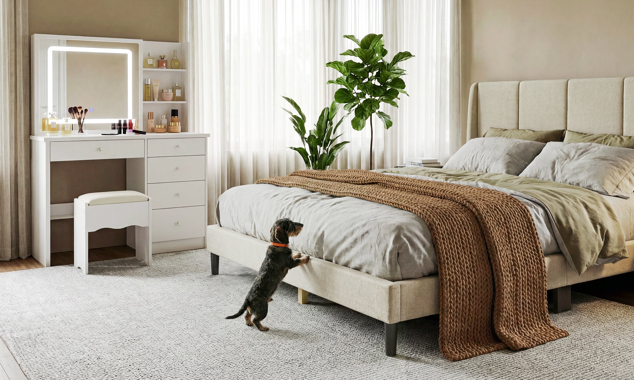
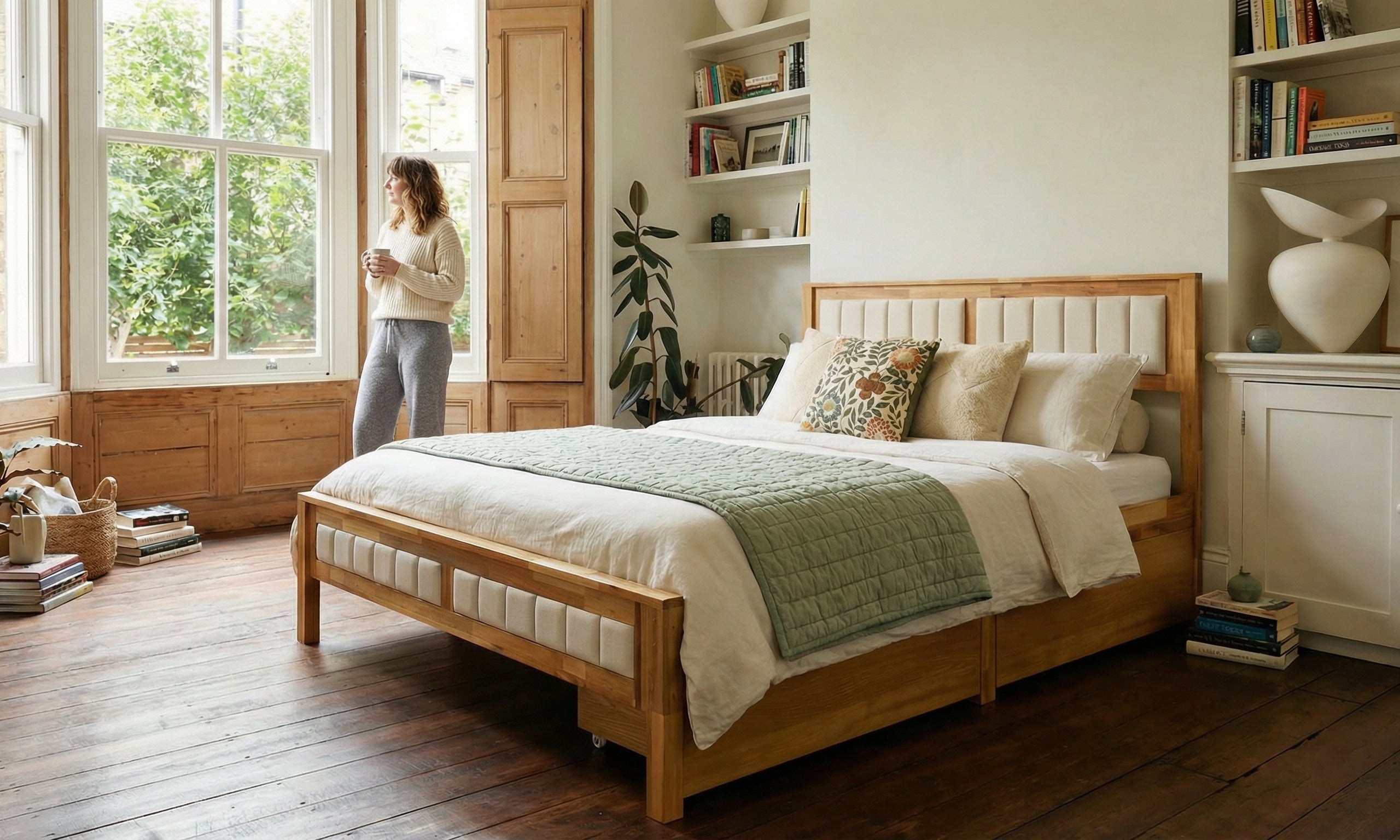
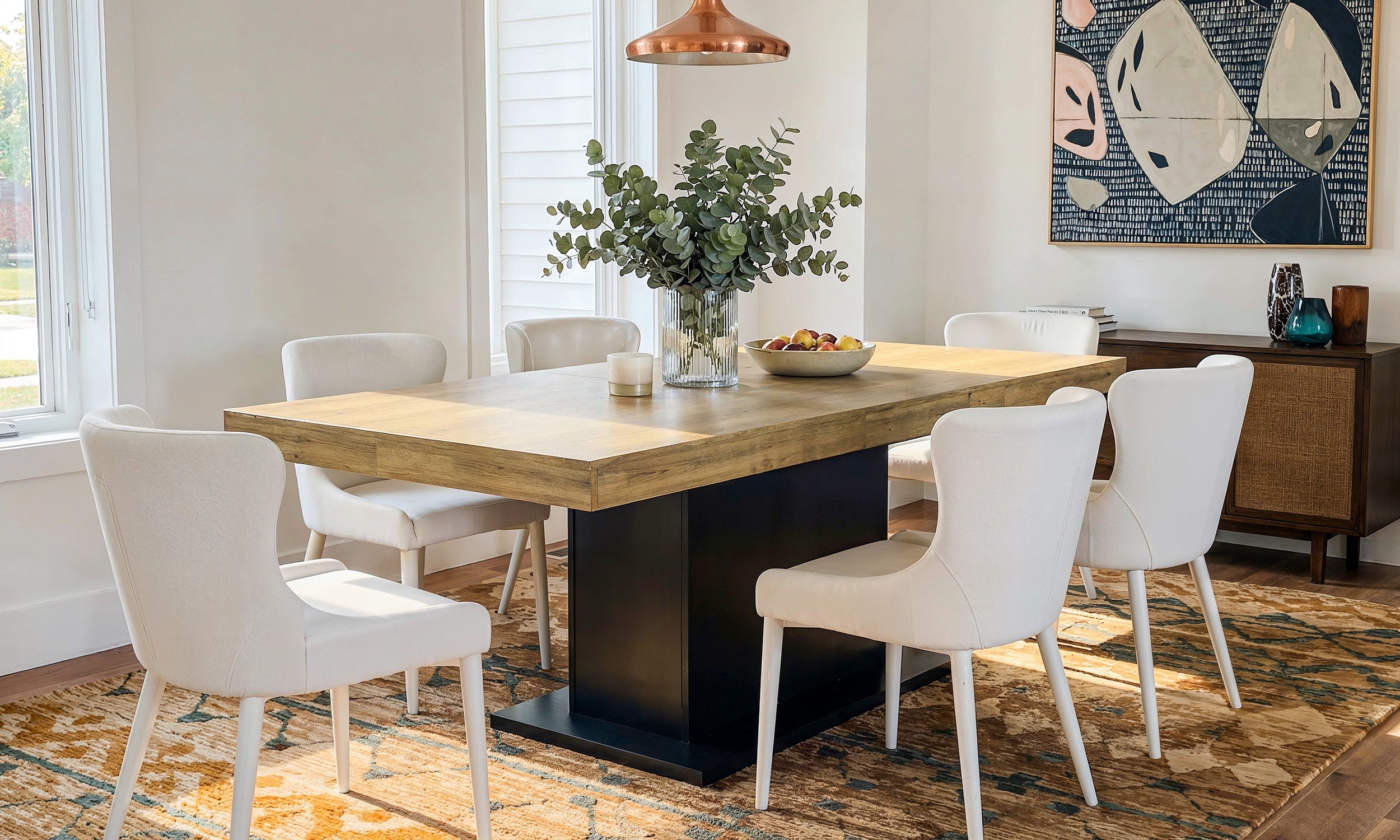
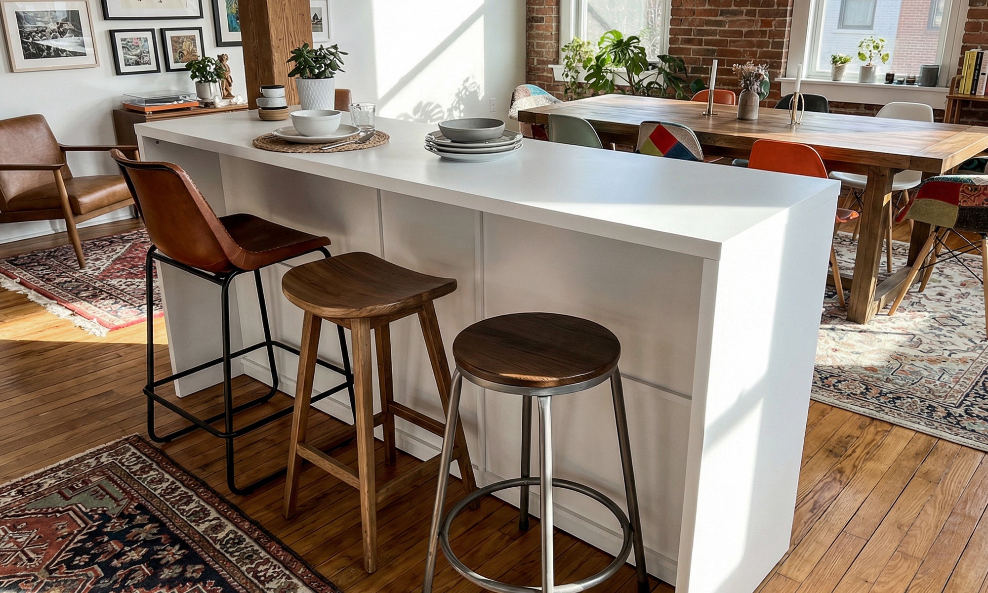
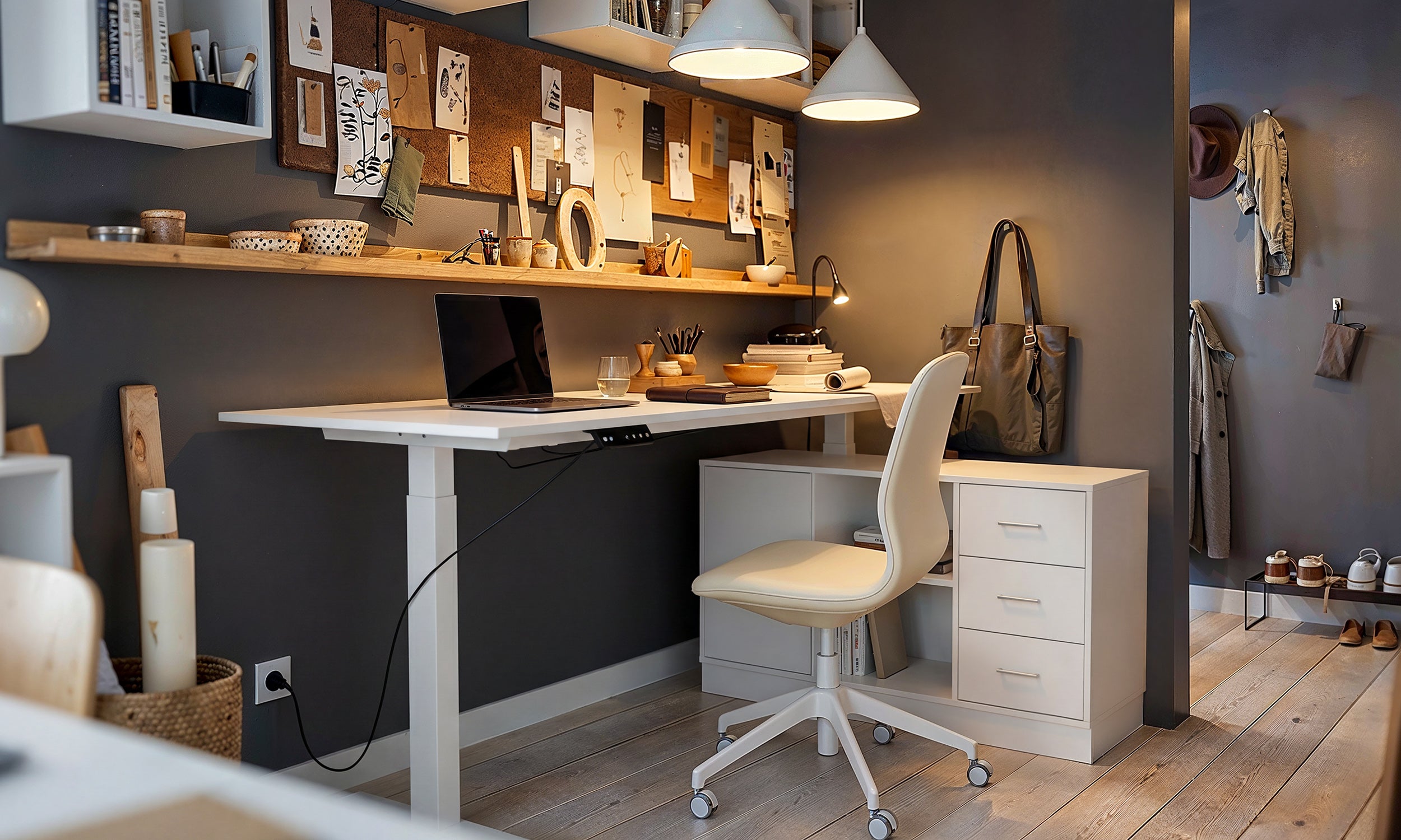
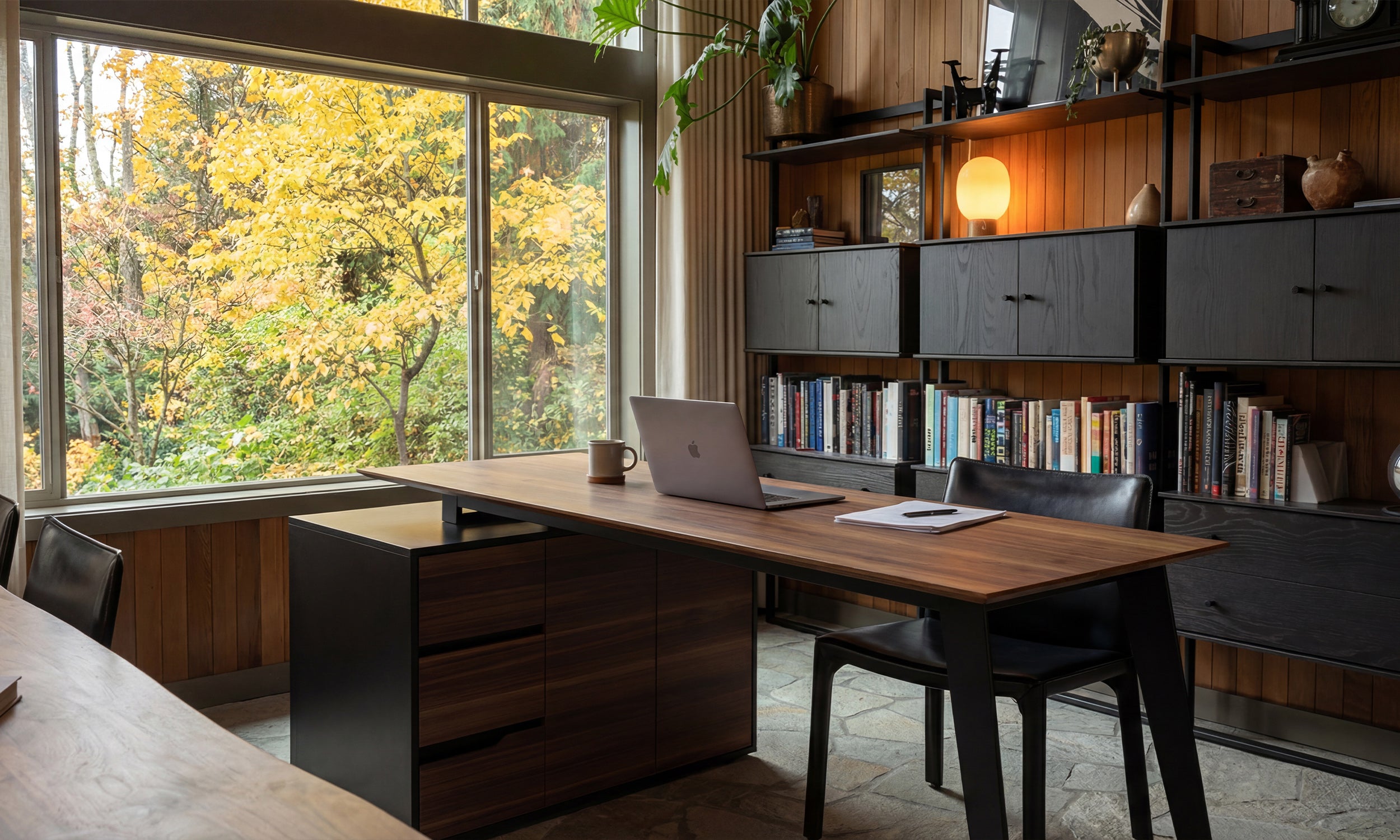


For over a decade, the most admired homes looked like showrooms. In 2026, homeowners are finally asking: where did all the warmth go?
Walk into any Apple Store and the design language is unmistakable: vast expanses of white, seamless surfaces, polished concrete or pale wood floors, devices glowing on clean tables under carefully calibrated lighting. There's nothing extra. Nothing messy. Nothing personal.
Now imagine that same language applied to a living room, a kitchen, a bedroom. For the better part of the 2010s and early 2020s, that's exactly what happened. A generation of homeowners and designers pursued an ideal that prized blankness as beauty, smoothness as sophistication, and whiteness as the ultimate neutral. The result was an era of interiors that looked stunning in photographs but felt curiously hollow to inhabit.
That era has a name — and it's now being used as a diagnosis, not a compliment.
Defining the Apple Store Aesthetic
The term "Apple Store Aesthetic" was popularized by New York-based designer and brand consultant Hans Lorei in a widely cited interview with Dwell at the end of 2025. He described a wave of exhaustion among homeowners who had spent years living inside spaces that resembled retail environments more than homes. The look, he observed, had simply run its course — people were actively seeking interiors with more richness and character.
But the aesthetic didn't emerge in a vacuum. It was born at the intersection of several cultural forces that converged in the 2010s.
Tech culture's influence on taste. As Silicon Valley became the center of global aspiration, its visual language seeped into everything — from fashion to food photography to furniture. The clean, unadorned look of Apple's retail spaces and product packaging became shorthand for modernity, intelligence, and good taste. If your home looked like a device, you were living in the future.
The rise of social media staging. Instagram and Pinterest rewarded images with high contrast, clean sight lines, and bright white backgrounds. All-white kitchens, bare walls, and sparse rooms performed well on screen, which created a feedback loop: what got likes got replicated, and what got replicated became the dominant standard. The home stopped being designed for the person living in it and started being optimized for the camera pointed at it.
Scandinavian minimalism goes mainstream. The Nordic design tradition — with its emphasis on functionality, light woods, and restrained palettes — was already influential among design professionals. But as it filtered through mass-market retailers and lifestyle media, it was often stripped of its warmth and craft. What remained was a flattened version: white walls, light gray sofas, and a conspicuous absence of color, pattern, or personality.
The flipper effect. In the real estate boom of the mid-2010s, house flippers and staging professionals discovered that neutralizing a home — removing all color, texture, and individual expression — made it easier to sell. Gray floors, white quartz countertops, and subway tile became a universal formula. It worked for transactions, but it also taught an entire market that "good design" meant the erasure of personal taste.
The combined effect was a decade-long aesthetic regime defined by a few unmistakable traits: all-white or light gray palettes, smooth and seamless surfaces (no visible grain, no texture, no patina), open floor plans with minimal partitions, furniture that prioritized visual lightness over physical comfort, and an overall feeling of pristine, almost clinical, calm.
Why It Worked — For a While
It would be unfair to dismiss the Apple Store Aesthetic as purely superficial. At its best, it offered real benefits.
It was democratic. You didn't need inherited taste or an art collection to make it work. A coat of white paint, a few clean-lined pieces from IKEA or CB2, and a fiddle-leaf fig could transform almost any rental apartment into something that felt polished and contemporary.
It was calming. After the visual noise of late-2000s interiors — think Tuscan-inspired kitchens, heavy drapery, and overstuffed leather — the minimalist correction felt like a deep breath. Fewer objects, fewer decisions, fewer distractions.
And it was photogenic. In an era when your home increasingly served as a backdrop for video calls, social posts, and remote work, the clean white box was the safest possible set.
But safety, as it turns out, has a shelf life.
The Five Reasons It's Over
1. Emotional Exhaustion
The most commonly cited reason for the backlash is simply this: people got tired of living in spaces that didn't feel like anything. After the pandemic forced millions to spend years inside their own homes, the gap between "looks good" and "feels good" became impossible to ignore. A sterile white room might photograph beautifully, but it doesn't hold you when you're anxious, comfort you on a dark winter evening, or make you feel like you've arrived somewhere meaningful when you walk through the door.
Tokyo architect Keiji Ashizawa captured the sentiment that's now widely shared among designers: the most memorable interiors aren't those with the strongest visual statements, but the ones where people naturally want to stay longer. And staying longer is hard in a room that feels like a waiting area.
2. The Sameness Problem
When everyone follows the same formula, individuality disappears. By the early 2020s, homes in Brooklyn looked identical to homes in Austin, Melbourne, and Stockholm. The same white oak floors, the same concrete-look tiles, the same linen-colored sofa. Interior design had become a monoculture, and the internet accelerated its spread.
Designers now report that clients are coming to them with a specific request: "I don't want my home to look like everyone else's." That desire for differentiation is one of the strongest drivers of the shift toward warm neutrals, richer textures, and spaces that reflect the specific person living in them rather than a generic ideal.
3. The Return of Emotion Through Color
The all-white palette was, in retrospect, a way of avoiding commitment. White is the absence of a choice — the design equivalent of "I'll have whatever everyone else is having." But as confidence returns to residential design, color is coming back with force.
Deep teals, muted greens, burnt caramels, and moody blues are replacing the white-and-gray default. A new painting technique called color capping — applying tonal gradients from floor to ceiling — represents the logical next step: not just adding color, but using it architecturally to reshape how a room feels. Meanwhile, Pantone's 2026 Color of the Year, "Cloud Dancer," signals softness, but the market is clearly moving toward the saturated end of the spectrum.
Even kitchens, the last stronghold of all-white design, are breaking free. Cherry wood cabinetry with warm, reddish undertones is staging an unexpected comeback, and designers report growing demand for painted cabinets in deep jewel tones.
4. Materials Are Getting Real Again
The Apple Store Aesthetic thrived on surfaces that looked manufactured: engineered quartz, porcelain tile made to mimic concrete, laminate floors pretending to be hardwood. Everything was smooth, uniform, and replaceable.
The 2026 response is a full pivot toward materials that are honest about what they are. Natural stone with visible veining. Handmade tiles with slight irregularities. Salvaged wood furniture that bears the marks of its previous life. Plaster walls that shift in texture depending on the light.
This isn't just an aesthetic preference — it's a philosophical one. Designers are increasingly drawn to biophilic materials and the Japanese concept of wabi-sabi, which finds beauty in imperfection, impermanence, and the natural patina of time. A home that ages gracefully is now valued far more than one that tries to look perpetually new.
5. Homes Are Becoming Sanctuaries, Not Showrooms
Perhaps the deepest reason the Apple Store Aesthetic is fading is a fundamental shift in what people want their homes to do. For years, the home was treated as a visual asset — something to be photographed, staged, and eventually resold. In 2026, it's being reconceived as a sanctuary: a place that supports physical health, emotional wellbeing, and genuine human connection.
This shows up in the growing demand for home wellness spaces — rooms dedicated to recovery, exercise, and decompression. It shows up in the popularity of concealed kitchen storage that prioritizes calm over display. And it shows up in the broader philosophy that one designer described as "curated calm" — a state of intentional atmosphere that feels neither empty nor cluttered, but deeply, specifically yours.
What's Replacing It
The post-Apple-Store home doesn't have a single look. That's precisely the point. But the emerging alternatives share a few common threads.
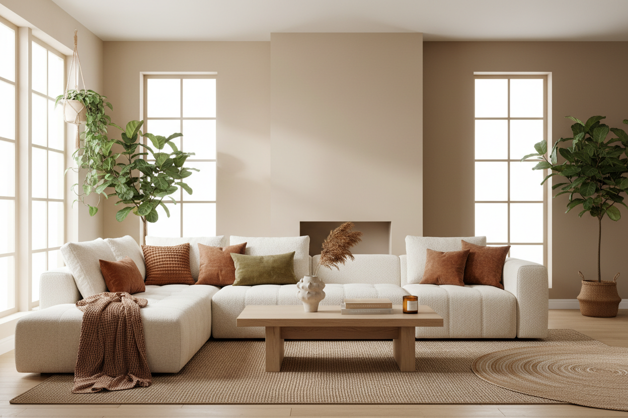
Warm Minimalism. Not the cold, austere minimalism of the 2010s, but a version that keeps the simplicity while adding warmth through natural materials, soft textures, and earthy tones. Think fewer objects, but each one with purpose, patina, and story.
Curated Maximalism. At the other end of the spectrum, some homeowners are embracing layered, collected interiors filled with travel souvenirs, inherited furniture, vintage art, and heirloom-style textiles. The key word is "curated" — it's not clutter, it's biography.
Modern Heritage. A growing movement that blends contemporary comfort with historical character: architectural molding paired with modern furniture, vintage rugs under clean-lined sofas, handmade ceramics alongside industrial lighting.
All three approaches share a rejection of the idea that a home should look like a blank slate. In 2026, the goal is a space that feels unmistakably inhabited — by a specific person, with a specific history, in a specific place.
How to Transition: 5 Practical Steps
If your home currently leans Apple Store and you're ready for something warmer, you don't need a full renovation. Here's where to start.
Step 1: Introduce one warm accent wall. Choose a warm neutral in the caramel, clay, or warm stone family. Even one accent wall can shift the entire temperature of a room.
Step 2: Swap a smooth surface for a textured one. Replace a glass coffee table with a solid wood one. Trade a glossy countertop for natural stone. Switch a synthetic throw for a wool or linen one. Each swap adds a layer of sensory richness.
Step 3: Add one piece with a story. A vintage chair from a flea market. A ceramic bowl made by a local artisan. A framed textile from a trip. One object with provenance can anchor an entire room and give it a narrative that IKEA cannot.
Step 4: Layer your lighting. The Apple Store runs on uniform, overhead illumination. A home shouldn't. Add table lamps, wall sconces, or a floor lamp with a warm-toned bulb. Varied light sources at different heights create atmosphere, which is the single biggest thing a white-box interior lacks.
Step 5: Let something be imperfect. A linen curtain with natural wrinkles. A pottery vase with a slightly uneven glaze. A wood shelf with visible grain. The Apple Store Aesthetic was defined by the elimination of imperfection. Reclaiming it is the fastest way to make a space feel human.
The Bigger Picture
The decline of the Apple Store Aesthetic isn't just a design trend — it's a cultural correction. After a decade of optimizing homes for screens, resale value, and social validation, people are rediscovering that the primary purpose of a home is to be lived in.
The 2026 interior design trends point overwhelmingly in one direction: toward warmth, toward texture, toward individuality, and toward spaces that prioritize how they feel over how they look. The Apple Store will always be a masterpiece of retail design. But it was never meant to be a home — and in 2026, we're finally letting it go.


Dejar un comentario
Este sitio está protegido por hCaptcha y se aplican la Política de privacidad de hCaptcha y los Términos del servicio.