


I spent three weeks staring at forty-seven open browser tabs, all featuring the exact same bleached-wood media consoles. Everything looked like it belonged in a high-end dentist's waiting room—very clean, very Scandi, and very, very boring. I finally snapped and bought a red oak tv stand, and it was the best design pivot I've made since I stopped buying everything in 'Millennial Gray.'
- Red oak offers a warmer, more traditional wood tone that feels 'lived-in' rather than sterile.
- It is often significantly more affordable than the high-demand white oak variety.
- The prominent grain patterns add a texture that flat, pale woods lack.
- Modern matte finishes prevent it from looking like a 1990s relic.
The White Oak Fatigue Is Very Real
For the last five years, white oak has been the undisputed king of the interior design world. It’s the backbone of the 'Organic Modern' look that has dominated every Pinterest board and Instagram feed. While it’s undeniably pretty, it’s also become a bit of a default setting. When every living room looks like a sun-drenched Swedish loft, your home starts to lose its personality.
I realized my living room was starting to feel copy-pasted. It lacked depth. White oak is great for a minimalist vibe, but it can feel thin and cold if you don't layer it perfectly. I wanted something with more 'thump'—a piece of furniture that actually looked like it came from a tree, not a 3D printer. That’s where the often-ignored red oak comes in.
What Actually Is Red Oak? (And Why It's Better)
Red oak gets a bad rap because people associate it with the orange-tinted cabinets of their childhood. But the raw wood itself is stunning. It has these wild, sweeping grain patterns—known as 'cathedrals'—that give it a sense of movement. Unlike white oak, which has a tighter, more linear grain, red oak is expressive and unapologetic about its texture.
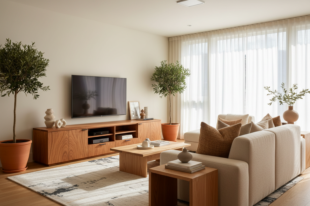
It’s also incredibly durable. This stuff is used for high-traffic flooring and heavy-duty furniture because it can take a hit. If you have kids or pets who treat the media area like a jungle gym, you want that density. When you want to style a high-end oak TV console, that heavy grain actually helps. It catches the light and emphasizes the silhouette of the piece, especially if you go for something with rounded edges or custom joinery.
Styling Red Oak Without Looking Like a 1995 Kitchen
Let’s talk about the elephant in the room: the '90s honey oak nightmare. The reason those old kitchens looked bad wasn't the wood; it was the thick, glossy, amber-toned lacquer they slapped on top of it. To keep a red oak entertainment center looking contemporary, you have to go for a matte or satin finish. A clear water-based finish preserves the natural pinkish-tan hues without turning the whole thing orange.
I paired my stand with sleek, matte black hardware. The contrast between the organic grain and the industrial metal keeps it firmly in the 21st century. Avoid those chunky, ornate wooden knobs. Think slim legs, clean lines, and maybe some fluted detailing on the doors. It’s about letting the wood do the talking while the shape stays quiet.
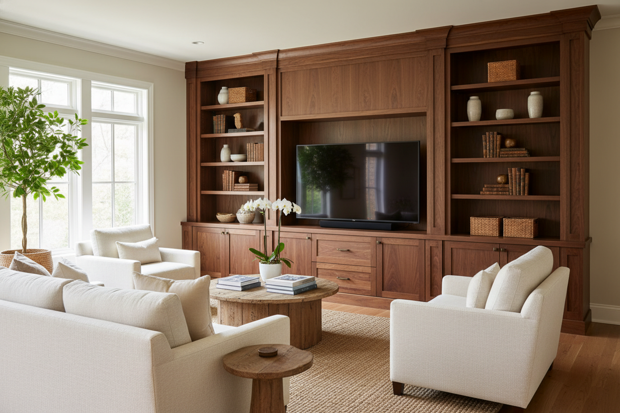
Do You Need a Massive Unit or Just a Simple Console?
Before you buy, be honest about your mess. I used to have a tiny, minimalist 'floating' shelf, but my PS5 looked like a giant plastic eyesore sitting on top of it. I eventually upgraded to a full-sized unit to hide the rat's nest of HDMI cables and power strips. You have to ask yourself: is an entertainment center worth the space in your specific room?
If you live in a 600-square-foot apartment, an 80-inch beast will swallow the room. But if you have a massive 75-inch screen, a tiny 50-inch console will make your TV look top-heavy and ridiculous. I personally love a unit that is at least 10 inches wider than the TV on both sides. It gives you room to place a lamp or a couple of books so the screen isn't the only thing people see.
How to Stop It From Clashing With Your Floors
The biggest mistake I ever made was trying to match my TV stand perfectly to my hardwood floors. It looked like the furniture was melting into the ground. It was a monochromatic disaster. Instead, you want contrast. If you have light maple floors, a medium-toned red oak stand looks intentional and rich.
If your floors are already a similar wood species, use a rug. A chunky wool rug or a vintage-inspired Persian rug creates a 'buffer zone' that breaks up the wood-on-wood crime. It allows the grain of the stand to stand out as a piece of art rather than just more brown stuff in a brown room. Trust your gut—if it feels too 'matchy-matchy,' it probably is.
FAQ
Is red oak more expensive than white oak?
Usually, no. Because white oak is currently the 'trendy' choice, its price has skyrocketed. Red oak is more abundant and generally easier for manufacturers to source, meaning you get more solid wood for your dollar.
Does red oak actually look red?
Not really. It has a slight pinkish undertone when raw, but once finished, it looks like a warm, golden tan. It's much warmer than the grayish-yellow of white oak.
How do I clean a solid oak stand?
Skip the heavy chemicals and aerosol sprays. A slightly damp microfiber cloth is all you need. If you use those oily 'polishes,' you'll just end up with a sticky residue that attracts dust like a magnet.
Dejar un comentario
Este sitio está protegido por hCaptcha y se aplican la Política de privacidad de hCaptcha y los Términos del servicio.