


We have all seen those perfectly styled, monochromatic workspaces that look incredibly chic on a screen. But living and working in a sea of beige or gray eight hours a day? It can drain your energy faster than a back-to-back Zoom schedule. The urge to create a colorful office usually hits when you realize your workspace feels more like a waiting room than a place of inspiration.
However, throwing every bright hue at your walls can quickly turn a productive zone into a chaotic distraction. Today, we are going to look at how to strike the right balance, ensuring your workspace remains both vibrant and highly functional without causing visual fatigue.
Quick Decision Guide
- Respect color psychology: Blues and greens lower heart rates for focused work, while yellows and oranges stimulate creativity and energy.
- Anchor with neutrals: A successful colorful office design requires grounding elements, like warm wood tones or matte black metal, to prevent visual overload.
- Watch your screen glare: Highly saturated, glossy paints behind your monitor can cause severe eye strain over a long workday.
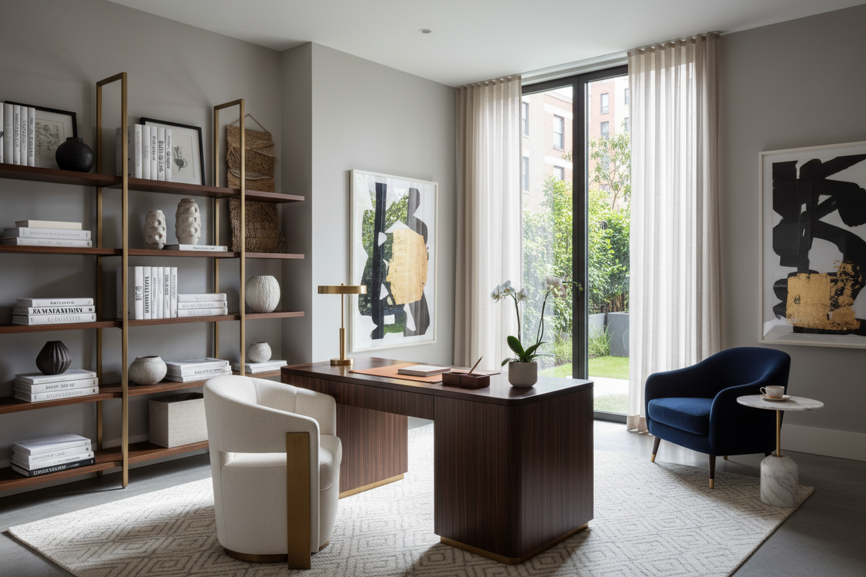
- Use the 60-30-10 rule: Dedicate 60% of the room to a dominant color, 30% to a secondary hue, and 10% to a bold accent.
Mastering Colorful Office Decor and Visual Weight
When clients ask me for colorful home office ideas, they often assume we need to paint all four walls a vibrant shade. In reality, color is about managing visual weight. A bright, saturated color pulls the eye immediately. If everything in the room is shouting for attention, you will struggle to focus on the actual work on your desk.
The 60-30-10 Rule in Workspaces
To keep a colorful office space feeling intentional rather than chaotic, lean on the classic 60-30-10 proportion. Your dominant 60% might be a soft, dusty blue on the walls. The 30% could be a rich navy rug and a warm walnut desk. That leaves 10% for your high-energy pops—think a mustard yellow desk lamp, vibrant abstract art, or a bold upholstered task chair. This layering approach gives you a colourful home office that feels curated rather than cluttered.
Designing a Colorful Home Office for Your Layout
Space planning plays a massive role in how color behaves in a room. In a compact spare bedroom, a dark, moody jewel tone can make the walls recede, creating a cozy library feel. In an open-concept living area, you have to be much more strategic about where the workspace begins and ends.
Zoning with Paint and Rugs
If your desk sits in the corner of a larger room, use color blocking to define the zone. Painting an arch or a wide vertical stripe behind your desk instantly creates a room-within-a-room. Pair this with colorful office decor like an overdyed vintage rug tucked under the desk legs. This grounds the floating furniture and establishes clear boundaries for your work area without needing physical dividers.
Choosing Furniture for a Colorful Office Space
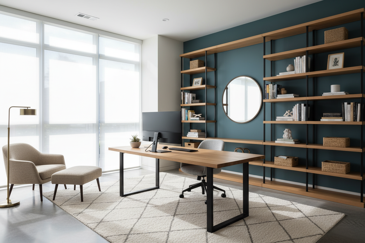
Your furniture choices will either compete with or complement your palette. If you are going heavy on bright wall colors, consider desks and shelving with clean silhouettes and natural materials. Solid white oak or ash brings warmth and texture that softens intense hues. Conversely, if your walls are a muted backdrop, a powder-coated steel desk in forest green or a lacquered credenza can serve as the room's focal point.
Lessons from My Own Projects
Early in my career, I designed a colorful home office for a graphic designer. She loved vibrant hues, so we painted the entire room—including the wall directly behind her monitors—a stunning, high-gloss coral. It looked incredible in the portfolio photos.
A month later, she called me. The afternoon sun was bouncing off the glossy coral paint, casting a pink glare onto her screens and giving her daily headaches. I learned the hard way that ergonomics is not just about the chair you sit in; it is also about visual ergonomics. We ended up repainting that focal wall a flat, muted terracotta and moved the bright coral to the wall behind her, where it served as a gorgeous, energetic Zoom background without destroying her eyesight. Always consider light reflection when choosing your finishes.
Frequently Asked Questions
How do I add colorful office ideas without painting?
If you are renting or simply hate painting, bring in color through large textiles and art. A massive, colorful area rug, floor-to-ceiling drapes in a rich velvet, and an oversized piece of canvas art can completely change the room's palette without touching a paintbrush.
Are bright colors distracting in a colourful home office?
They can be if placed incorrectly. Keep the wall you face while working a slightly more muted or cooler tone (like sage or slate) to promote focus. Save the highly stimulating colors (reds, bright yellows) for the wall behind you, or introduce them through smaller desk accessories.
What is the best way to coordinate colorful office decor?
Pick a single anchor piece—like a patterned rug or a piece of statement art—and pull your color palette directly from it. This ensures your secondary and accent colors naturally harmonize, giving the room a cohesive, designer-finished look rather than feeling like a random assortment of bright items.
Leave a comment
This site is protected by hCaptcha and the hCaptcha Privacy Policy and Terms of Service apply.