Choosing a bold hue for your primary seating is a declaration of confidence, yet many homeowners hesitate, fearing the color will overwhelm the room or appear juvenile. However, in the hands of a thoughtful designer, a vibrant focal point can anchor a living space with warmth and sophistication. If you are considering an ikea sofa orange, you are not just buying furniture; you are curating a specific energy. The secret lies not in the price tag, but in how you integrate the piece into your existing palette and layout to achieve a bespoke aesthetic.
Key Features to Consider Before Buying
- The Undertone: Distinguish between a bright "safety orange" (casual, pop-art) and a burnt sienna or rust (sophisticated, earthy).
- Fabric Texture: A flat cotton weave offers a modern, clean look, while velvet or structured blends add necessary depth and hide wear.
- Modularity: Check if the series allows for configuration changes, essential for adapting an ikea orange sectional to future homes.
- Leg Hardware: The standard legs often betray the price point; look for frames compatible with third-party leg upgrades.
Mastering the Palette: Rust vs. Tangerine
When selecting your sofa, understanding chromatic balance is crucial. IKEA often rotates their fabric collections, moving between vibrant, citrus-forward tones and deeper, terracotta hues. From a design perspective, the deeper, muted tones—often found in the Söderhamn or Kivik custom slipcover options—offer greater longevity.
Treat a rust-colored sofa as a neutral. It pairs exceptionally well with navy blues, forest greens, and even charcoal grays. If you opt for a brighter tangerine, you must balance it with ample negative space and white walls to prevent visual fatigue.
Layout and Spatial Planning
A bold sofa commands attention, so its placement dictates the room's flow. Avoid pushing a bright orange sofa into a dark corner; it needs light to render the color accurately.
Zoning with an IKEA Orange Sectional
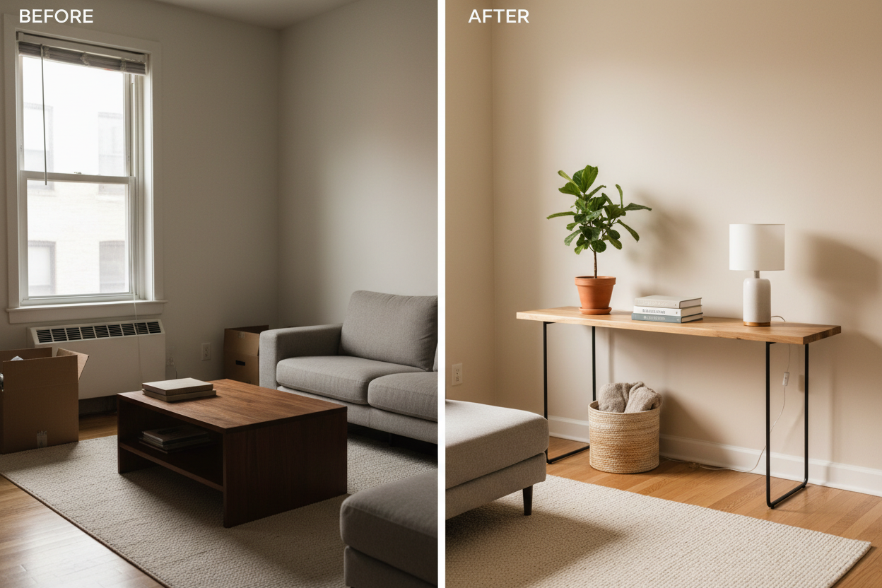
In open-concept floor plans, an ikea orange sectional acts as a superb room divider. Because the color creates a strong visual boundary, it eliminates the need for physical partitions. Ensure the back of the sofa is aesthetically pleasing if exposed. I often recommend placing a console table behind the sectional to layer lighting and books, softening the transition between the kitchen and living areas.
Elevating the "Box Store" Aesthetic
To move away from the showroom look, you must customize. The silhouette of IKEA furniture is often blocky and minimalist. To introduce a sense of luxury:
- Upgrade the Legs: Swapping standard plastic or birch legs for walnut or brass alternatives instantly changes the furniture's profile.
- Textural Layering: Orange is a warm color. Enhance this by layering with cool-toned throws in boucle or linen. This tactile contrast breaks up the solid block of color.
- Lighting: Warm ambient lighting (2700K bulbs) will make a rust sofa glow, whereas cool daylight bulbs can make synthetic orange fabrics look harsh.
Lessons from My Own Projects
I recently styled a renovated mid-century modern living room where the budget was tight, but the client wanted a "conversation pit" vibe. We opted for a modular IKEA series with custom burnt-orange covers. Here is the unvarnished truth about living with this specific choice: micro-contrast is everything.
During the installation, I noticed that the specific polyester blend of the orange cover attracted lint like a magnet, and on that terracotta background, every speck of white dust was visible. It looked messy within hours. My fix wasn't design-related, but practical: we treated the fabric with a high-quality anti-static spray immediately. Furthermore, we found that the seat cushions on this specific model tended to slide forward because the fabric had a sleek finish. We solved this by applying heavy-duty velcro strips under the cushions—a $10 hack that saved the client daily frustration. It’s these small, tactile details that determine whether a budget piece feels like a luxury staple.
Conclusion
Embracing a bold color choice like an orange sofa requires a shift in perspective. It is not merely a seating arrangement; it is the anchor of your design narrative. By paying attention to texture, upgrading hardware, and managing the surrounding color palette, you can transform a standard flat-pack item into a stunning centerpiece that defies its price point.
Frequently Asked Questions
How do I tone down an orange sofa if it feels too bright?
Anchor the sofa with a rug in cool, desaturated tones like slate blue or sage green. Additionally, use throw pillows in neutral creams or dark greys to break up the large expanse of orange fabric.
Is an orange sofa practical for homes with pets?
It depends on the specific shade and fabric weave. Darker rust or terracotta tones hide dirt well, but be aware that light-colored pet hair will stand out significantly against the dark orange. A tight weave or velvet is generally more resistant to claw snags than a loose linen weave.
Can I fit an IKEA orange sectional in a small apartment?
Yes, but focus on the silhouette. Choose a model with slim arms and raised legs (visual airiness). Seeing the floor beneath the sofa tricks the eye into thinking the footprint is smaller than it actually is.


Leave a comment
This site is protected by hCaptcha and the hCaptcha Privacy Policy and Terms of Service apply.