


We have all experienced the fatigue that creeps in around 3:00 PM—the headache behind the eyes and the sudden drop in focus. While many blame the chair or the workload, the culprit is often poor illumination. As a designer, I see clients treating the light for office environments as an afterthought, relying on a single, harsh bulb to do the work of three. Correcting this doesn't just improve the aesthetic of your workspace; it fundamentally changes how you work, blending visual comfort with architectural beauty.
Key Features to Look For
- Color Temperature (Kelvin): Aim for 3500K to 4000K for a balance between warmth and alertness.
- Layering Capability: Ensure you can mix ambient, task, and accent lighting.
- CRI (Color Rendering Index): Look for 90+ CRI so finishes and fabrics look true to life.
- Glare Control: Choose fixtures with diffusers to prevent monitor reflection.
- Dimmability: Essential for transitioning from deep focus to relaxed reading.
Mastering the Layers: Beyond the Single Bulb
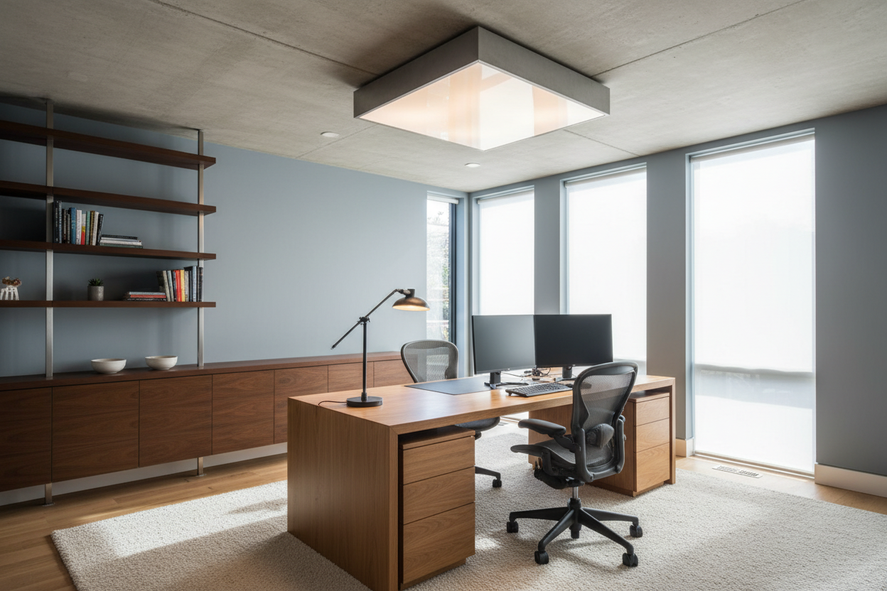
In interior design, we never rely on a single source of illumination. A well-lit office requires a symphony of layers. Your base layer is usually the ceiling light office setup. This provides the general ambient luminescence that fills the room. However, relying solely on this creates a flat, uninspiring environment that can actually strain your eyes by creating harsh contrast between your bright screen and dark corners.
Ideally, you want overhead lighting for office spaces that is diffused. Think of semi-flush mounts with linen drums or recessed lighting with baffles. This softens the shadows and reduces the severity of the light hitting your desk surface.
Selecting the Right Temperature and Material
The Kelvin Scale
The "temperature" of your light dictates the mood. For a home office, stay away from the clinical 6000K daylight bulbs often found in commercial cubicles; they are too sterile for a residential setting. Conversely, the 2700K warm white used in bedrooms is too relaxing for productivity. I always recommend my clients land in the "cool white" range of 3500K to 4000K. It mimics natural daylight enough to keep serotonin levels up without feeling like a hospital.
Materiality and Visual Weight
When selecting ceiling lights in office designs, consider the material's impact on the room's silhouette. A heavy, solid metal pendant directs light strictly downward—great for a conference table but terrible for general room lighting. For smaller offices, I prefer glass or acrylic fixtures that allow light to escape in all directions, making the room feel larger. If your office has hard surfaces (wood desk, hardwood floors), introduce a fabric pendant to absorb sound and add texture.
Ergonomics and Glare Reduction
Placement is just as critical as the fixture itself. A common error is placing a bright overhead fixture directly behind the office chair. This casts a shadow over your work and creates a glare on your monitor. Instead, position your overhead lighting slightly in front of the desk or use track lighting that can be angled toward walls to wash the room in light rather than spotlighting the floor.
Lessons from My Own Projects
I learned the hard way about "sculptural" lighting versus "functional" lighting early in my career. I once specified a stunning, clear glass globe chandelier for a client's home office. It looked incredible in photos and added a mid-century modern flair that matched the walnut desk perfectly.
However, two weeks later, the client called me. The clear glass meant the bulb filament was exposed, creating distinct, sharp shadows everywhere. Worse, during Zoom calls, the fixture created a harsh "hot spot" on the camera lens and cast unflattering shadows on her face. I had to go back and swap it for a fixture with a frosted opal shade. It wasn't quite as edgy, but the light diffusion was buttery smooth, and the glare vanished. It was a reminder that in a workspace, visual comfort must always precede pure ornamentation.
Conclusion
Transforming your workspace isn't about buying the most expensive lamp; it is about understanding how light interacts with your space and your eyes. By prioritizing color temperature, diffusion, and proper layering, you can create a light for office setup that energizes you in the morning and settles you in the afternoon. Treat your lighting as a tool for productivity, and your design will follow suit.
Frequently Asked Questions
What is the best brightness (lumens) for a home office?
For general ambient lighting, aim for roughly 1,000 to 2,000 lumens depending on the room size. However, the key is task lighting; your desk lamp should offer an additional 500 to 800 lumens focused directly on your work surface.
Can I use a chandelier as my main office light?
Yes, but be careful with the drop height. Ensure the bottom of the fixture is at least 7 feet off the floor if you walk under it. If it hangs over the desk, ensure it is high enough not to obstruct your view or cast shadows on your writing area.
Why do my walls look different colors with my new lights?
This is likely due to the Color Rendering Index (CRI). Low CRI bulbs (under 80) wash out colors, making wood look grey or paint look muddy. Always invest in high CRI bulbs (90+) to ensure your paint and furniture finishes look rich and accurate.
Leave a comment
This site is protected by hCaptcha and the hCaptcha Privacy Policy and Terms of Service apply.